Bringing structure and accessibility to a constrained SaaS platform
LirEncor — French-American Digital Reading Program
Estimated reading time: 7 minutes
Summary
Industry: Non-Profit Organization
Timeline: 2022 (Initial design: 4–5 months)
Ongoing support: 2023–Present (annual and monthly updates)
Role: Lead Product Designer · Accessibility & Inclusive Design Lead · Brand & Digital Identity
Scope: UX strategy · Brand system · WordPress implementation · Vendor integration · Email & social templates · Video tutorials
Platforms: WordPress · Google Workspace · Zoom · 1Password
Design Software: Figma · Adobe Illustrator
Accessibility Tools: Stark · Color Contrast Analyzer · WCAG 2.1 AA guidelines
Launched in 2022, LirEncor is a California-based cultural nonprofit running a digital reading program that offers access to recent French-language novels.
As Visual Communications Lead, I oversee brand consistency and platform evolution. My role combined brand design, UX strategy, WordPress implementation, and accessibility to support a clear and consistent experience over time.
Key Achievements
- Built a cohesive brand system
- Embedded WCAG 2.1 AA/AAA standards into the design system
- Designed and integrated LirEncor’s WordPress front-end
- Delivered a white-label integration within a closed SaaS environment
- Reduced repetitive support questions through practical tutorials and video resources
- Supported platform evolution without requiring a structural rebuild, reducing redevelopment effort
Overview
LirEncor is a French-American nonprofit offering access to recent French-language books through a fully digital reading program. Launched in 2022, it first relied on a Canadian white-label platform before evolving into a partnership with Bibliothèque Orange, a long-established international reading network.
As Visual Communications Lead, I support the platform’s evolution across brand, content, and digital experience.
For French speakers living in the United States, access to recent publications in their native language is often limited and expensive, making digital lending particularly valuable.
Beyond access, the platform supports a reading culture and helps maintain a shared connection to language and contemporary literature. Monthly book club discussions extend this experience. They offer a space to share impressions and, for some members, to simply practice French.
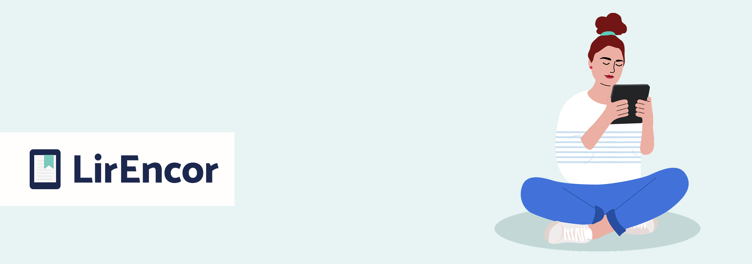
LirEncor is a portmanteau derived from the French phrase “lire encore,” which means “keep reading.”
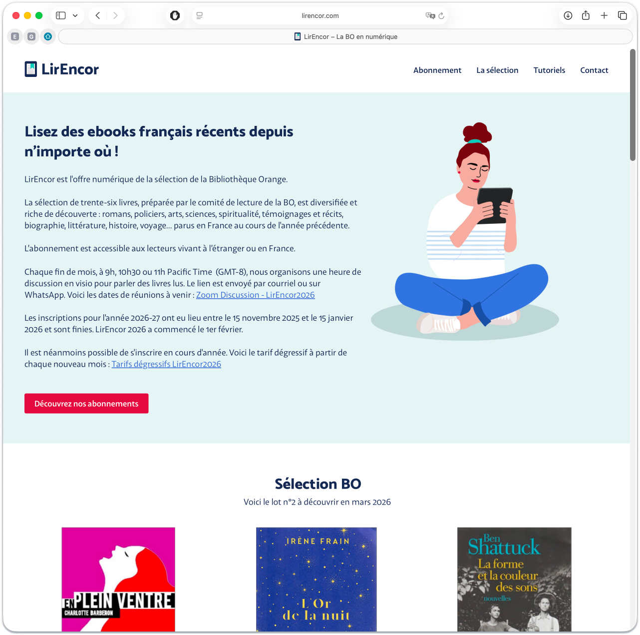
Current LirEncor homepage (March 2026), reflecting the platform’s mature structure and positioning.
Challenges
Bridging traditional reading habits with digital access
For an audience unfamiliar with digital borrowing, the shift to tablet-based reading could easily be perceived as a barrier and required reassurance as much as instruction.
Designing for mixed levels of digital confidence
The core audience included members with varying levels of digital confidence. The interface had to work for all users, from tech-savvy readers to members unfamiliar with installing apps or importing digital books. This reflection shaped the tone, the structure of the content, and the overall interface of the platform.
Brand Foundation
Evolving the brand for digital reading
The original logo had been created internally but lacked contrast and legibility, especially on smaller screens.
Rather than replacing it entirely, I approached the redesign as an evolution, focusing on clarity, stronger typographic structure, and improved contrast. Pairing the book and the tablet became a central idea, framing digital reading as a continuation of existing habits.
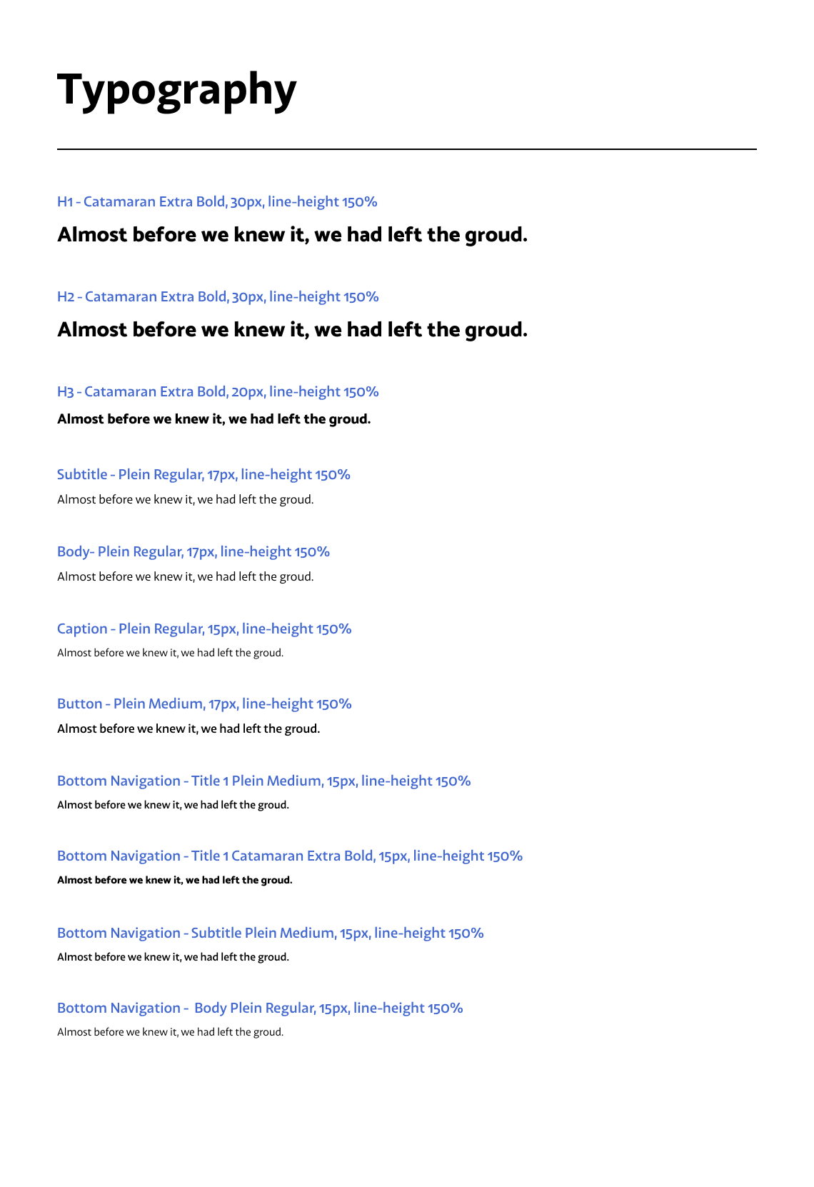
The typographic system relied on open-source Google Fonts (Plain and Catamaran), ensuring consistent and sustainable use across platforms. The horizontal logo format was designed to maintain legibility across responsive layouts. I delivered a concise brand guide and a shared asset library to ensure consistency across platforms.
This helped position the platform as familiar and accessible, rather than technical.
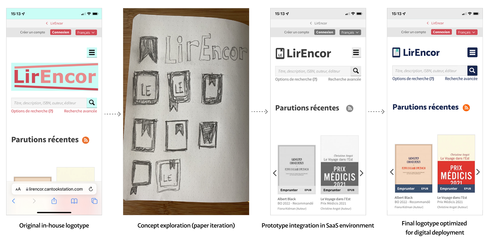
From the original in-house logo to a mobile-optimized final version.
White-Label Constraints
Designing for a white-label SaaS environment
Based on past experience, I expected structural limitations and approached the project with a pragmatic mindset. This platform operated with strict constraints:
- No technical documentation was available
- Fixed layout zones
- Limited UI customization
- No access to CSS
- Customization requests were not supported by the vendor
Working Without Platform Documentation
With no available documentation, I conducted my own audit to understand the system’s constraints. Once those limits were clear, I avoided investing in customizations that were unlikely to be approved.
Instead, I defined clear integration guidelines, covering logo dimensions, color codes, and accessible contrast ratios, to ensure consistent implementation within the platform.
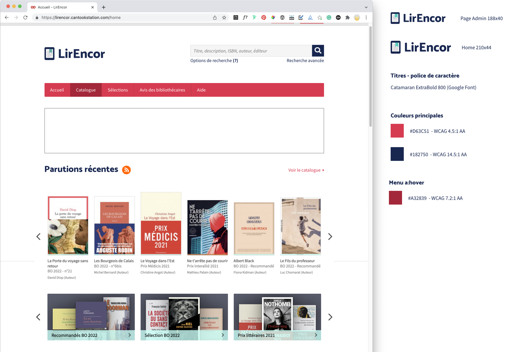
Integration documentation prepared for the Saas Vendor, specifying logo dimensions, color codes, and WCAG-compliant contrast ratios to ensure accurate deployment.
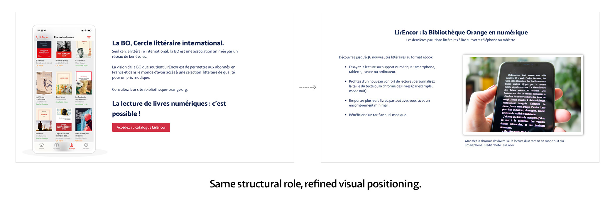
Integrated Editorial Promotion
Within the partner’s fixed layout zones (960×250 format), I designed a serie of recurring promotional modules integrated directly into the platform landing page.
These modules were created before the design system was fully defined, during an early phase of the project.
They served as a real-world exploration of the visual direction, helping shape the system while introducing the Reader character and establishing a consistent visual language.
Embedding accessibility
Designing for accessibility and inclusion from the start
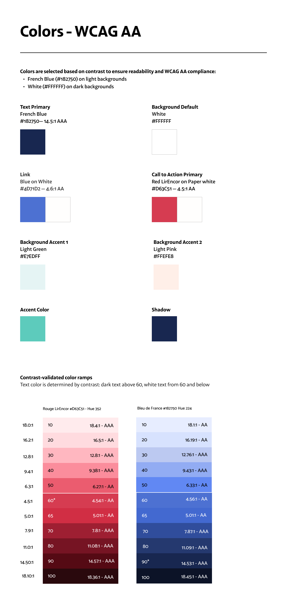
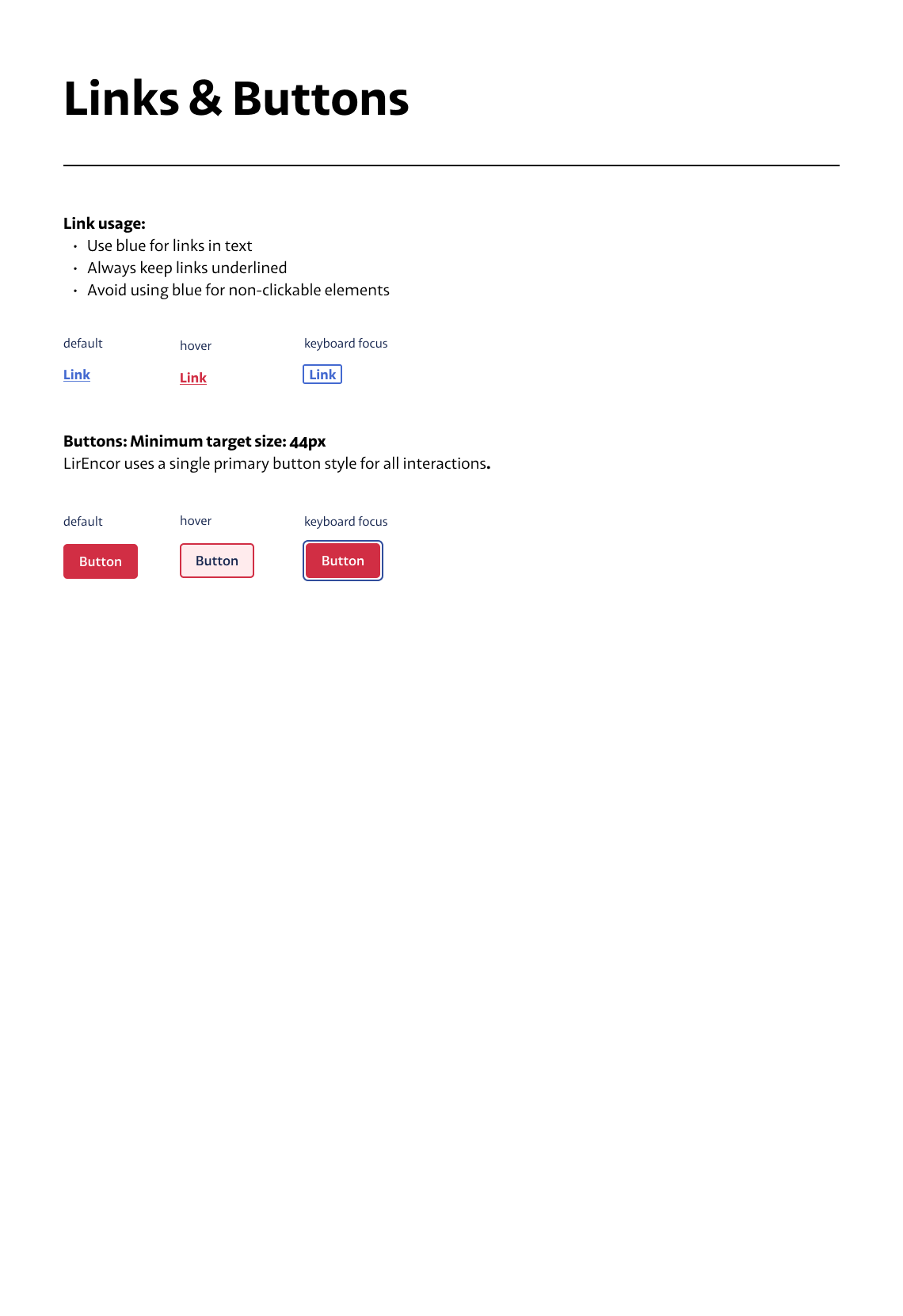
Accessibility was embedded into the design from the start, rather than treated as a final compliance check. Color contrast ratios were validated against WCAG 2.1 AA/AAA success criteria and built directly into the design system.
Key decisions included:
- Clear information hierarchy
- 16px base body text with 150% line height
- Simple, supportive illustrations
- Fully responsive layout
Beyond guidelines, I validated decisions through real-world checks with users to ensure readability and contrast worked in practice.
Inclusive Content
To support readers less familiar with digital tools, we produced practical editorial videos and tutorials demonstrating core reading app functions.
The tone was intentionally instructional rather than promotional, reflecting a product education approach during an early phase of digital adoption.
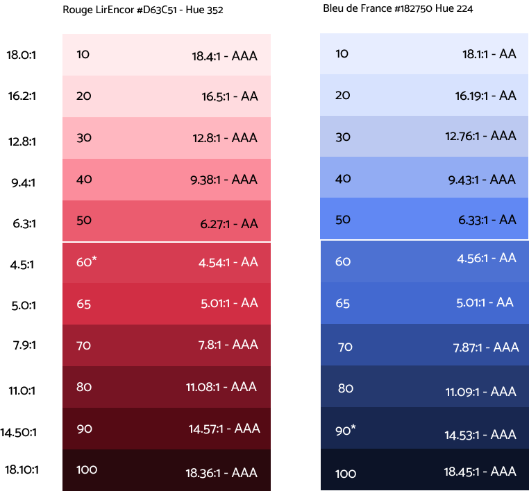
Built a WCAG-validated color ramps integrated into the design system to ensure consistent, accessible contrast across components.
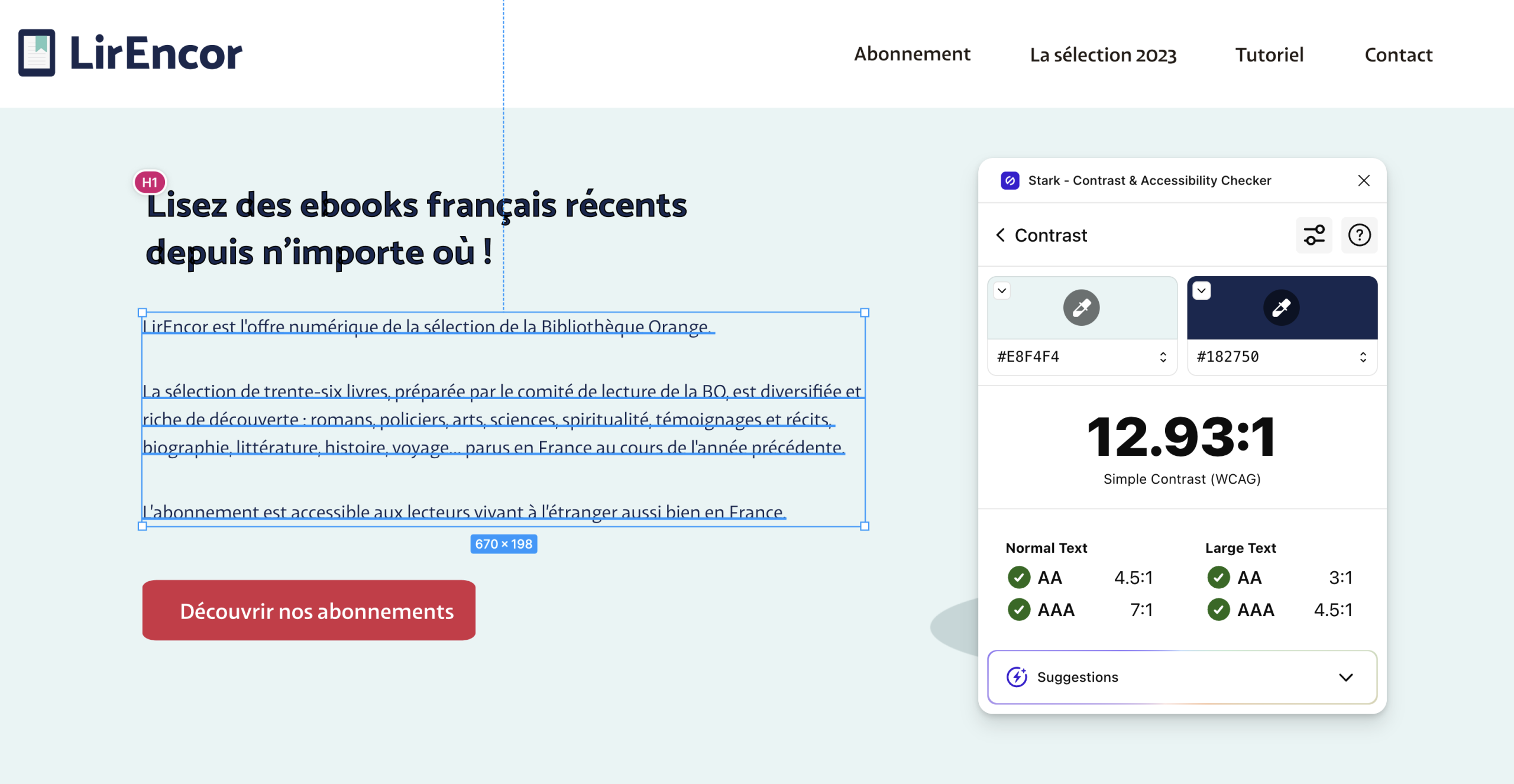
Contrast ratios validated during design (WCAG 2.1 AA/AAA), embedded directly into the visual system.
Design System
The design system was established with the first version of the site and evolved over time through regular updates, including a major strategic redesign in 2023. Even with a relatively simple structure, maintaining it helped ensure consistency over time.
The version presented here reflects the March 2026 update, with a stronger focus on accessibility, including upcoming keyboard focus states.
The design system uses WCAG-validated color scales and minimal components.
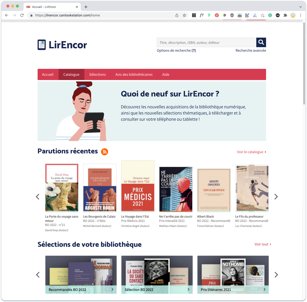
Shifting from product to experience
Early high-fidelity mockups explored a more product-driven imagery, using devices to communicate the digital nature of the service. However, this direction felt too technical and startup-oriented for the association’s audience. We shifted toward a more human-centered direction, moving the focus from the device to the experience of reading.
Introducing “The Reader”
Instead of showing a device, we introduced a character absorbed in her book. This a feeling that most readers instantly recognize. The Reader represents the pleasure of reading, simply transported into a new format. The joy remains unchanged.
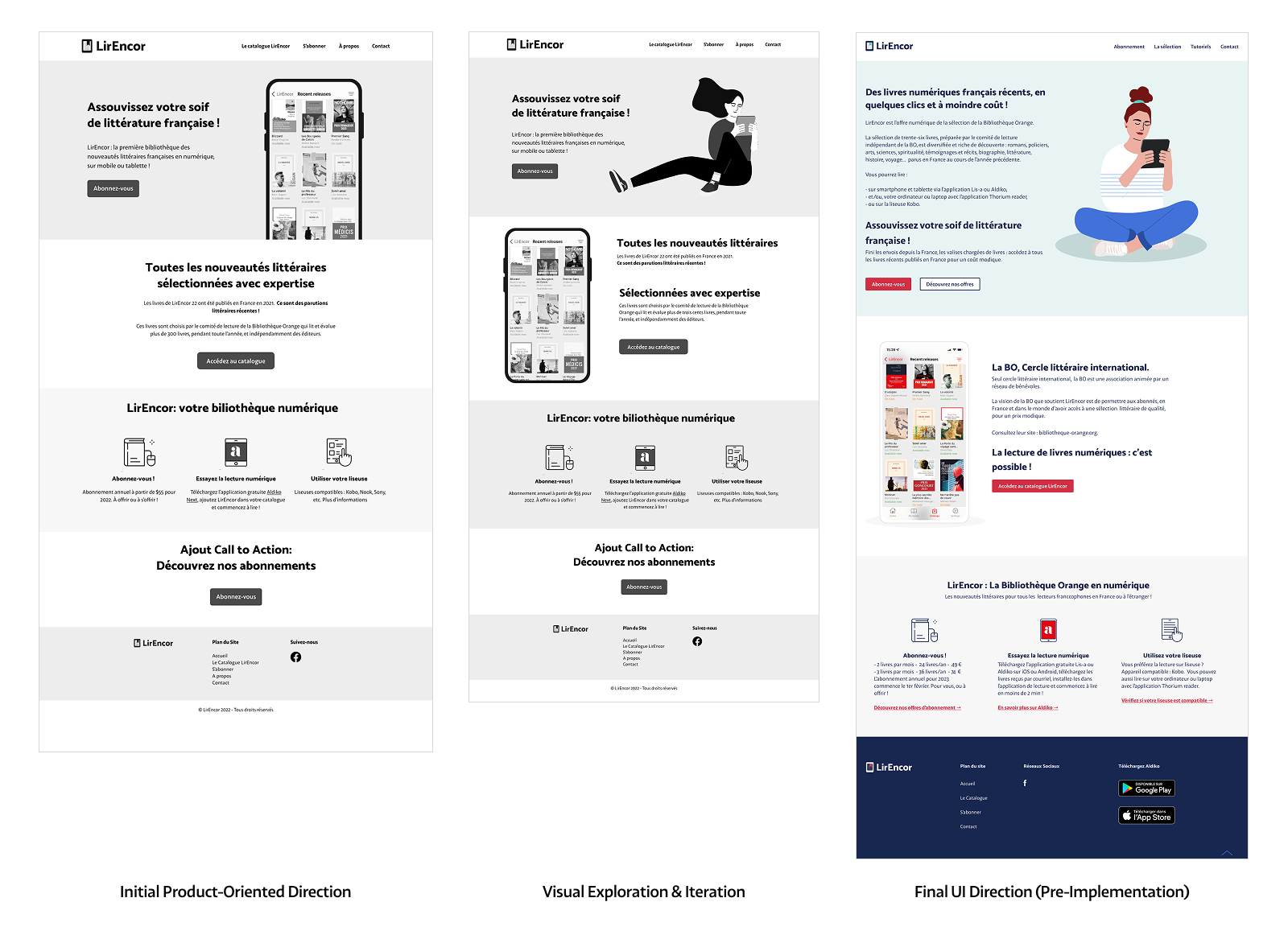
From the original mockup to final UI Direction.
Out of my comfort zone
Producing educational videos
To support less digitally confident readers, I designed and produced a step-by-step video tutorial explaining core actions.
This required stepping beyond my usual design role, including scripting, recording, and narrating the video.
Key design decisions included:
- Calm, intentionally paced narration
- Scriptwriting and custom captions
- Clear pointer cues to remove ambiguity
- Use of native accessibility features during the demonstration
The goal was to make each step easy to follow and complete independently.
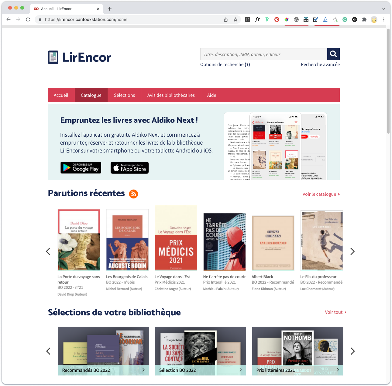
Video tutorial: How to add the LirEncor catalog to the Aldiko Next app
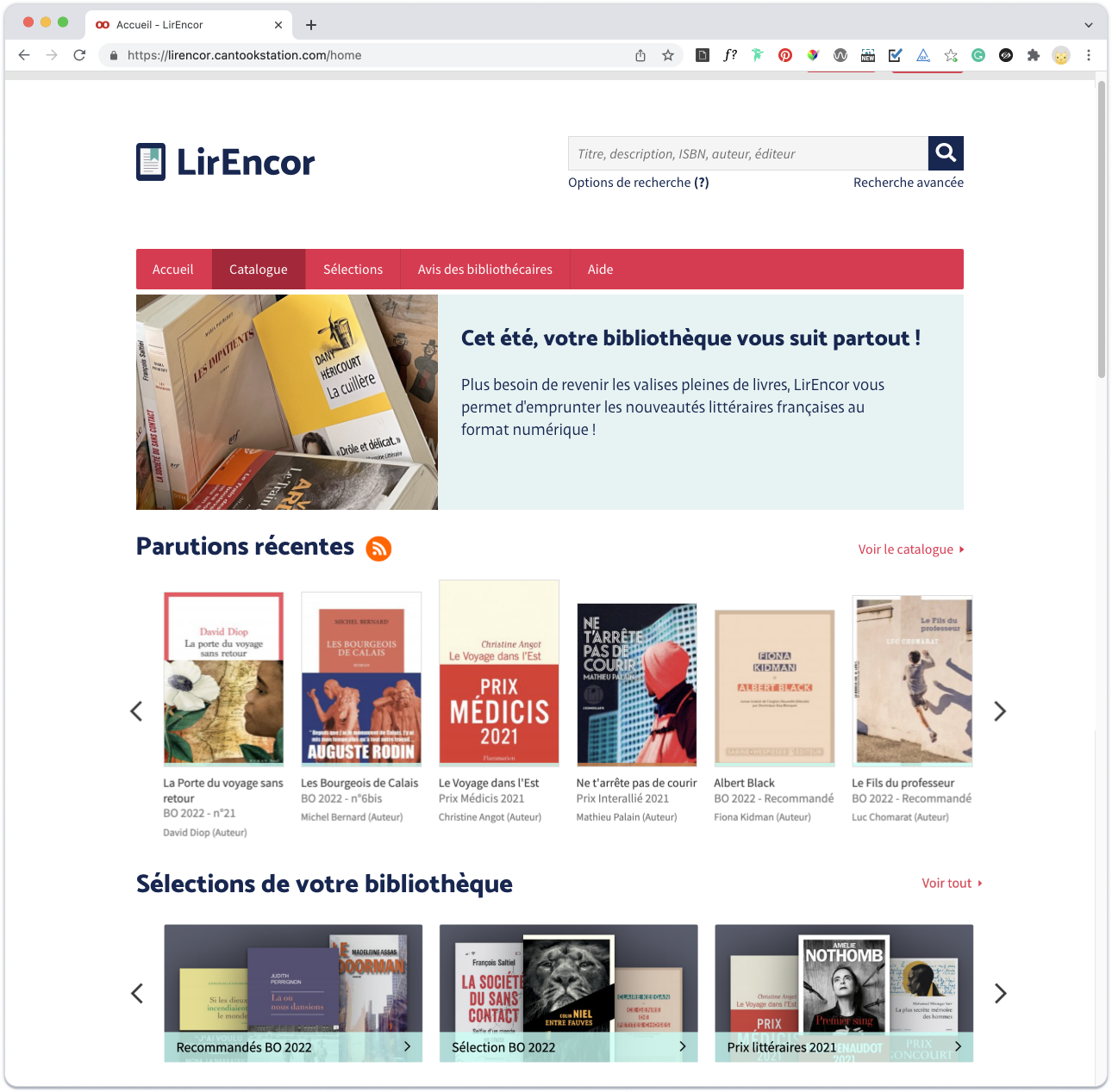
Evolving the platform without rebuilding
After its first year, LirEncor entered a new phase, with changes in its technical and distribution model. This growth called for a refinement of content strategy and positioning. Instead of rebuilding, I adapted the existing structure to support these changes:
- Refining content strategy and information architecture
- Strengthening visual credibility through original photography
- Improving SEO with more contextual and authentic imagery
Because the system had been designed for flexibility, these adjustments required minimal redevelopment.
Visit the website: lirencor.com
Original photography: Stephanie Lesperance
Research-Informed Offer & Naming Strategy
To ground the 2023 transition in real reading behaviors (not assumptions), I used national research from the Centre National du Livre (CNL) and Ipsos, a global market research firm, on French reading habits to make clear product decisions.
These insights informed product and content decisions:
- Defining two subscription models aligned with reading patterns
- Adjusting tone and messaging
- Clarified what each subscription includes
- Introducing “Numivores” to describe high-volume digital readers in a culturally relevant way
This ensured the subscriptions felt clear, relevant, and aligned with members’ expectations.
Extending the Brand
Each month, subscribers receive a newsletter highlighting the book selection of the month. I designed and integrated a structured newsletter template in Mailchimp.
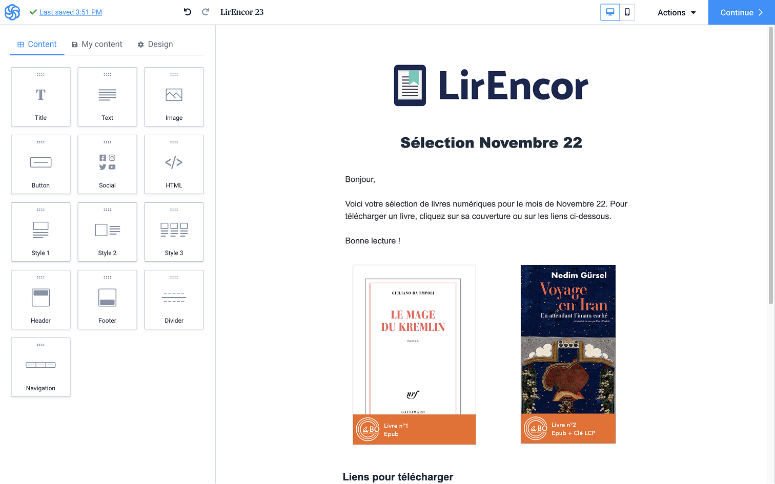
Design and implementation of a reusable email template in Mailchimp
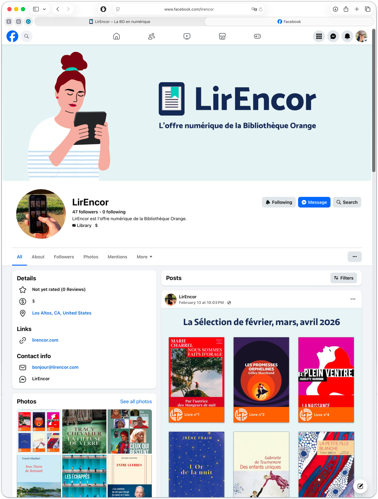
LirEncor Facebook Presence (March 2026)
Social Media presence
While social engagement was secondary to email and website, maintaining a consistent presence remained important for visibility and credibility.
I designed the Facebook cover and a recurring visual system for seasonal book selections. Although content publishing was managed by the founder, the visual framework maintained brand coherence across channels.
Conclusion
This project reinforced something I already believed: accessibility works best when it’s part of the foundation, not an afterthought.
Seeing readers gain confidence with digital reading also highlighted the importance of clarity, reassurance, and thoughtful design.
It also confirmed that building flexible structures may require more thought upfront, but it always pays off. When change comes, and it always does, teams don’t have to start over. Designing for change, for me, simply means building things that can grow without breaking.
⁂
Currently open to the right opportunity.
© 2026 Stephanie Lesperance
Original Illustration by Leni Kauffman via Blush.design