Accessibility Audit
DemocracyLab website
Estimated reading time: 5 minutes
Summary
Timeline: 2020 (~6 months)
Industry: Non-Profit Organization
Software & Platforms: Figma, Google Workspace, Slack, Zoom
Tools: Color Contrast Analyzer, WCAG 2.1 AA guidelines
DemocracyLab is a nonprofit civic technology platform connecting skilled volunteers with mission-driven projects. As the organization scaled, accessibility had been acknowledged as important but lacked structure, ownership, and integration into the design process.
I joined the UX team and initiated a comprehensive accessibility audit with the goal of moving beyond compliance conversations.
Key Achievements
While a full design system overhaul was not completed during my engagement, the initiative delivered meaningful progress:
- Identified and prioritized 32 accessibility issues across key user journeys
- Delivered targeted UX and UI improvements through Quick Wins
- Integrated accessibility guidance into weekly design team reviews.
- Helped shift perspectives and sparked genuine interest in inclusive design
- Enabled designers to independently use tools such as Stark and make more intentional UI decisions
Challenges & Obstacles
The challenges were not only technical, they were personal, collective, and strategic.
Stepping Into Ownership
Although I had worked with accessibility principles before, this was my first time leading a full audit independently. This personal milestone laid the foundation for everything that followed.
Reframing Accessibility as Strategy
An accessible website benefits to all users, disabled or not. One challenge is that marketing, engineering and UX teams often prioritize quantitative, audience-based data. Tools like Google Analytics, doesn't mesure if users has a disability or rely on assistive technologies such as screen readers or a Braille keyboards. Positioning accessibility in terms of measurable user impact and product quality helped shift the conversation from compliance to usability, increasing stakeholder engagement over time.
Navigating Product Constraints
At the time, a site redesign was already underway, and the decision was made not to modify the existing design system. This meant accessibility improvements had to be approached incrementally within the live product.
To demonstrate feasible improvements within existing constraints, I explored targeted visual and CSS adjustments.
“Her documentation and audits were comprehensive and incredibly helpful. She significantly increased accessibility awareness across our design and engineering teams.”
— Lead Designer, DemocracyLab
Accessibility Audit
Why Conduct an Accessibility Audit?
Accessibility audits go beyond checking surface-level issues such as color contrast. They often uncover deeper usability barriers related to navigation, error recovery, and overall understandability. While the audit initially focused on accessibility compliance, it also surfaced broader UX and UI inconsistencies. This reinforced how closely accessibility aligns with universal design principles and overall product quality.
Auditing the DemocracyLab Website
I began by reviewing key user journeys to build a comprehensive view of the site’s accessibility. I used the WAVE Chrome extension alongside guided manual testing.
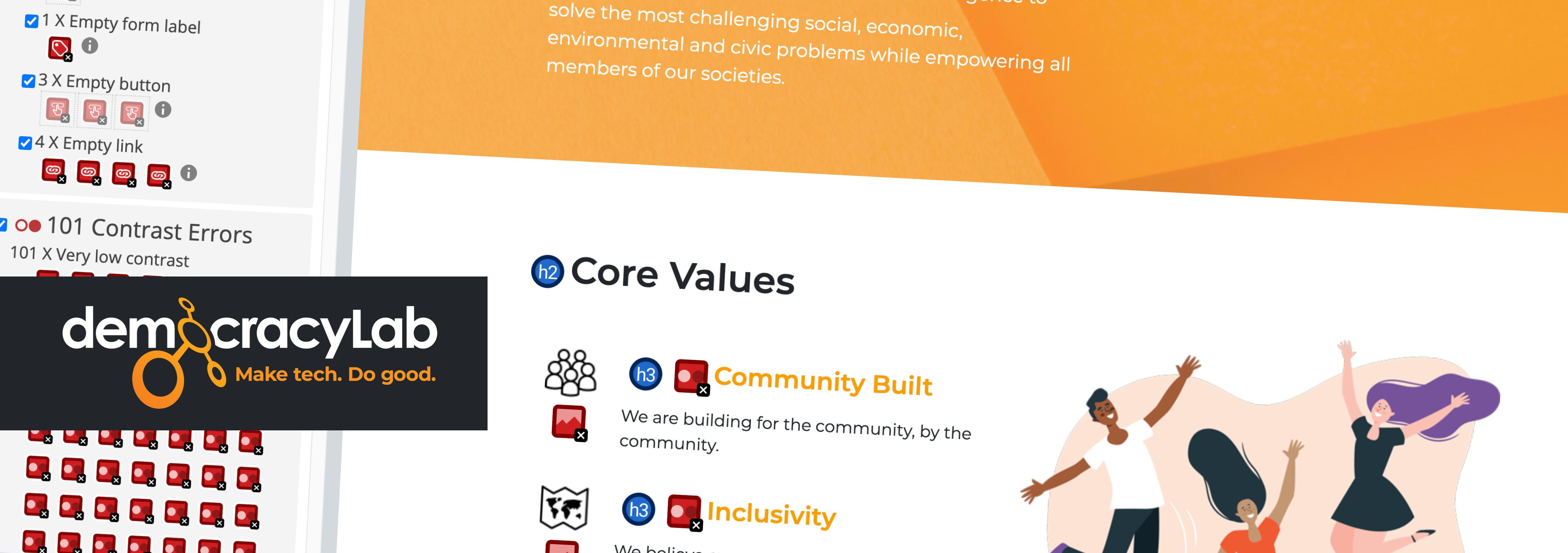
Findings were documented in a structured audit spreadsheet to support prioritization, cross-team visibility, and stakeholder discussions. In total, I identified 32 accessibility issues, and for each finding I provided at least one actionable recommendation. Issues were mapped to relevant WCAG 2.1 Level AA success criteria. Among the issues identified:
- Use of Color (WCAG 1.4.1)
- Contrast Minimum (1.4.3)
- Headings and Labels (2.4.6)
- Visual Presentation (1.4.8)
- Text Spacing (1.4.12)
View detailed audit log (Google Spreadsheet)
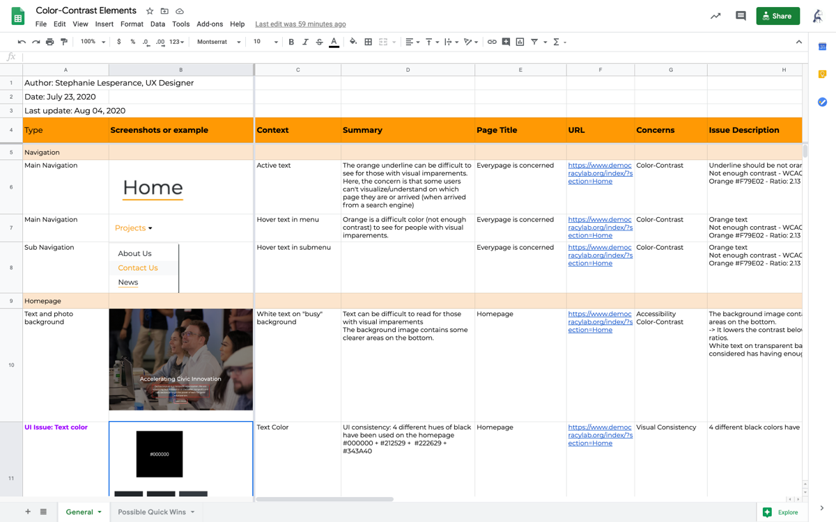
Excerpt of the accessibiliy audit - I listed 32 accessibility issues.
Process and Team Alignment
I presented the findings and recommendations during weekly Design team meetings. The audit helped prioritize a series of Quick Wins initiatives focused on improving UX, UI, and accessibility without requiring a full redesign.
The Importance of an Accessible Design System
In this audit, approximately 80% of the visual accessibility issues were rooted in the UI component library, highlighting the importance of addressing accessibility at the system level. A unified, accessibility-first component library would have prevented a significant portion of the problems identified.
Three impactful key findings
I prioritized issues based on user impact, implementation effort, and alignment with the existing product roadmap. Here were the three most critical issues I found, they concerned both accessibilily and usability.
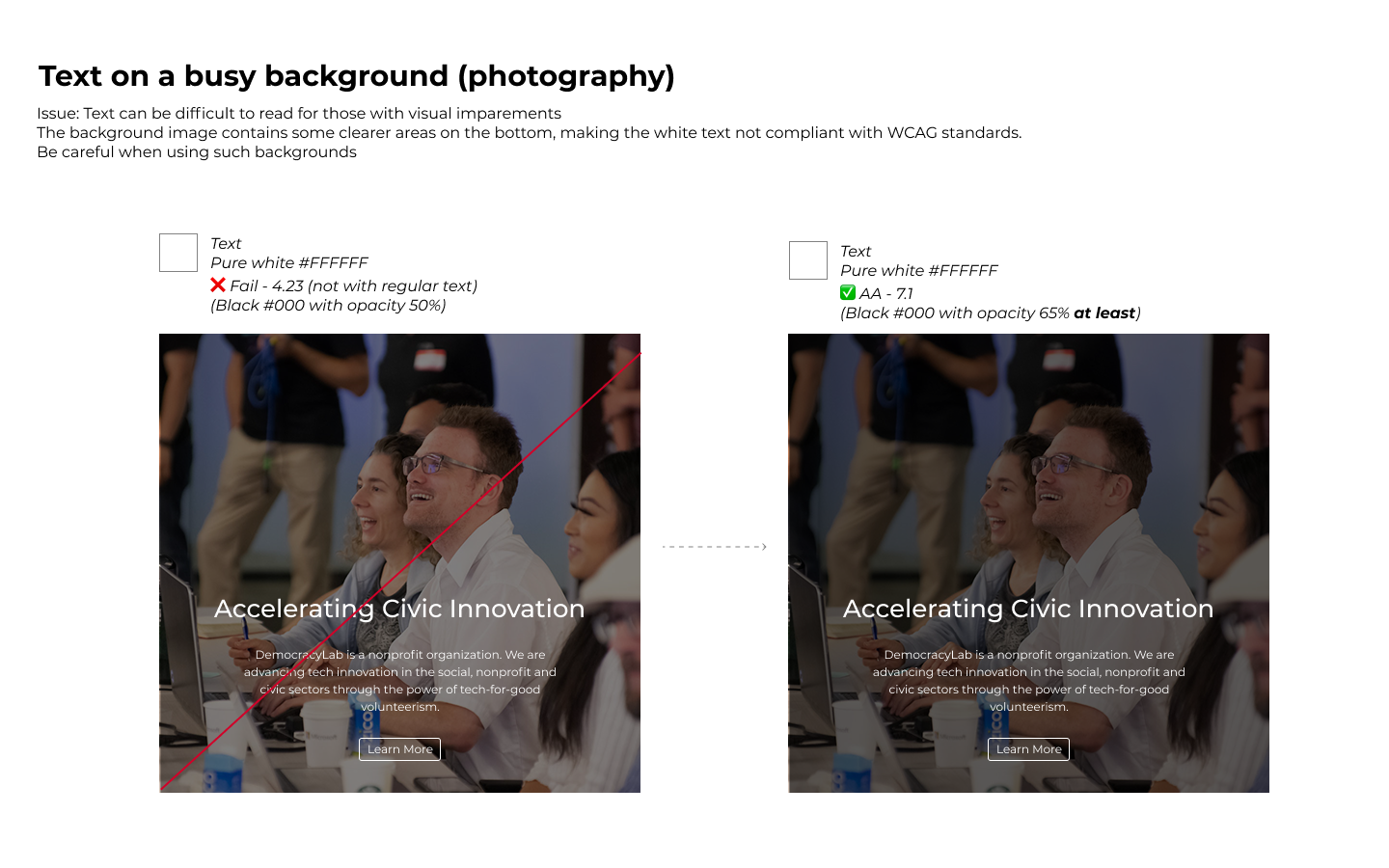
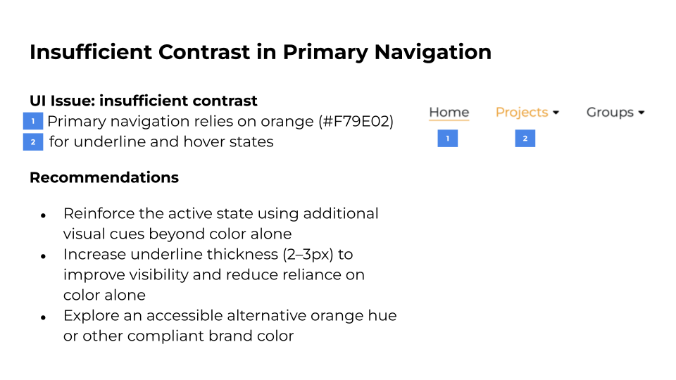
- Finding #1: Insufficient contrast in primary navigation
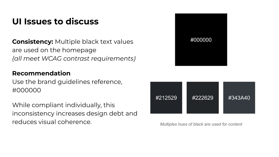
The key navigation states relied on orange text that failed WCAG AA contrast requirements, reducing visibility for low-vision users. - Finding #2: lack of visual inconsistency in text colors
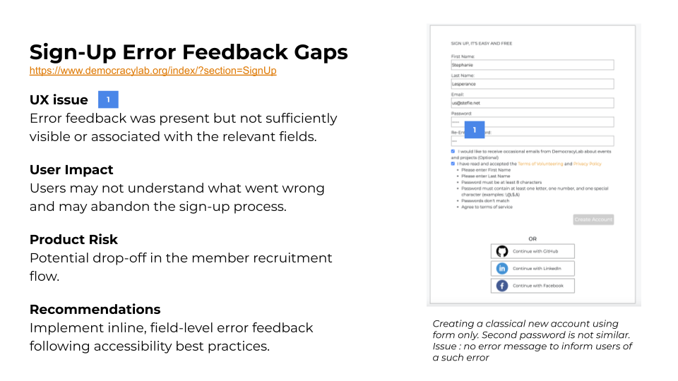
Four different hues of black have been used, despite using and following the brand guidelines. This issue introduced unnecessary design debt and reducing visual coherence. - Finding #3: Insufficient visibility of form error feedback
Error messages were technically present but displayed below a long form without clear visual association to the affected fields. This reduced error discoverability for all users and created additional barriers for keyboard and assistive technology users.
Findings were documented in a structured audit spreadsheet and synthesized into visual slides to better support cross-functional teams and stakeholders with varying levels of familiarity with audit documentation.
From findings to action
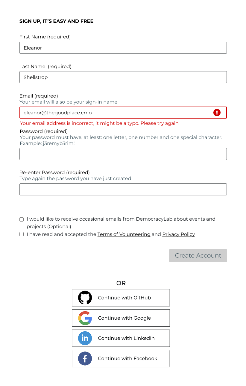
Lightweight prototype deamonstrating inline, field-level error feedback to improve visibility and reduce form friction.
Interactive Prototype: Inline Error Feedback
To help the Design and Dev teams understand and validate the proposed improvements, I created a lightweight prototype demonstrating inline, field-level error feedback.
The form was rethought with accessibility in mind, and keyboard navigation considerations were reviewed with the team during a weekling team meeting.
View the complete interactive prototype (full screen)
Training & Education
Working Across Different Levels of Awareness
Team members came with varying levels of familiarity and sensitivity toward accessibility topics.
Instead of expecting immediate alignment, I focused on explaining the “why” behind each recommendation and grounding discussions in real user scenarios and documented standards. I focused on clarifying concepts and adapting my communication style to different motivations and levels of awareness.
Operational Mentoring
For example, some designers asked me to walk them through contrast checks live in Figma, sharing my screen and demonstrating how to use plugins to validate color ratios. What initially felt complex or intimidating became manageable, sometimes even surprisingly simple! These hands-on moments helped turn abstract guidelines into practical, repeatable skills.
Team members increasingly brought accessibility questions to me during meetings. When I did not have an immediate answer, I followed up with researched, documented responses in our shared Slack channels. This ensured that knowledge was not only shared in the moment, but made visible and reusable.
In some cases, framing accessibility as a growing professional skill helped generate interest and engagement where ethical arguments alone did not resonate.
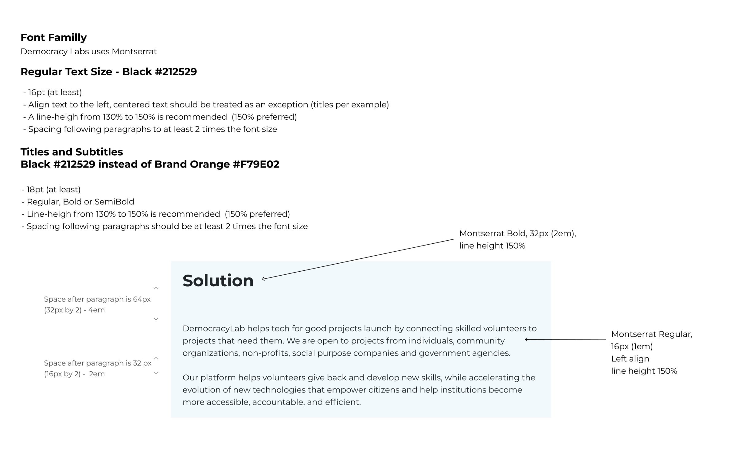
Guideline about typography (size, line-height, alignement)
Best practice guideline for form design
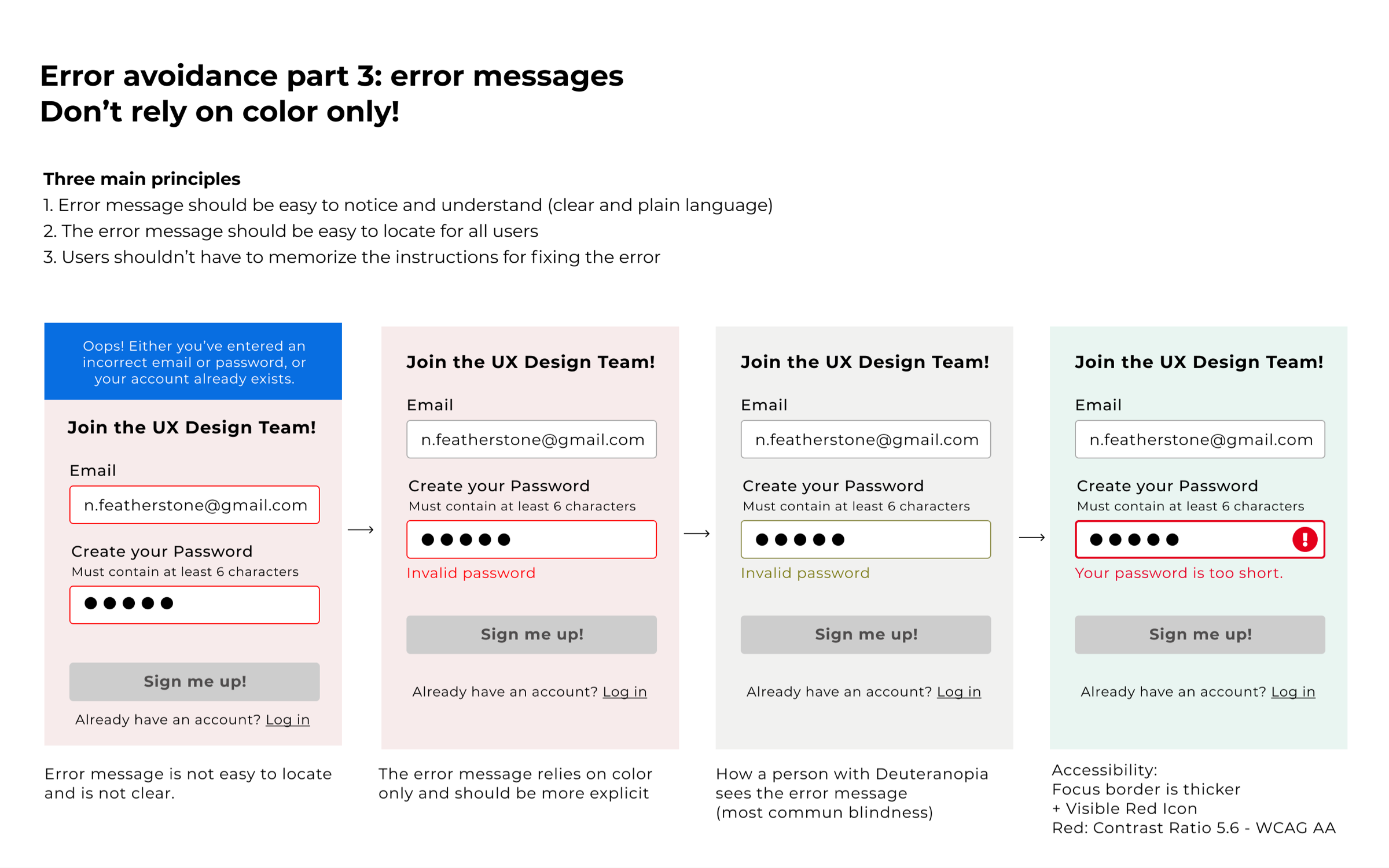
Here, an illustration about why it’s important to not use color only to convey information
Conclusion
Designing for everyone is often less about complexity and more about intention and consistency.
This audit helped initiate a series of targeted Quick Wins addressing key accessibility gaps. I also mentored designers and reviewed project work, partnering with the team to iterate toward more accessible solutions.
This experience reinforced how challenging, and rewarding, it can be to drive accessibility improvements within an existing organization. While there were natural growing pains, the work created meaningful opportunities to advocate for accessibility across both design and stakeholder groups.
Looking ahead, I’m particularly interested in contributing to teams that are committed to strengthening accessibility practices and improving inclusive design processes. I’m also motivated to continue supporting and empowering designers in building more accessible products and services.
Some example of prototypes where I helped designers with accessibility questions.
⁂
Currently open to the right opportunity.
© 2026 Stephanie Lesperance
Original illustration by Leni Kauffman