Transforming a grassroots initiative into a professional digital presence
Club BD ADDA — A Graphic Novel Initiative
Estimated reading time: 7 minutes
Summary
Industry: Non-Profit Organization
Timeline: 2024 (~8 weeks effective delivery)
Ongoing support: 2024–Present (quarterly updates)
Role: Lead Product Designer · Brand & Visual Identity Designer · Digital Experience Designer
Scope: Product strategy · Brand identity · Information architecture · UX & interface design · Accessible UI design · Site integration & launch · Content templates · Print materials
Platforms: Google Workspace · Zoom
Design Software: Figma · Adobe Illustrator · Adobe InDesign
Accessibility Tools: Stark · Color Contrast Analyzer · WCAG 2.1 AA guidelines
Launched in 2017, Club BD ADDA is a volunteer-led French-American cultural program promoting French-language graphic novels across California.
I led the information architecture, UX strategy, visual identity, and post-launch quality processes, transforming a multi-page Google document into a structured, accessible, and scalable digital platform.
Key Achievements
- Transformed a multi-page Google document into a structured, scalable digital platform
- Defined a sustainable content model aligned with a volunteer-run organization
- Designed a visual identity and system used across digital and print materials
- Enabled long-term maintainability through clear structure, patterns, and QA workflows
- Supported multiple structural evolutions without requiring a full redesign
- Delivered and launched the platform ahead of the annual program kickoff
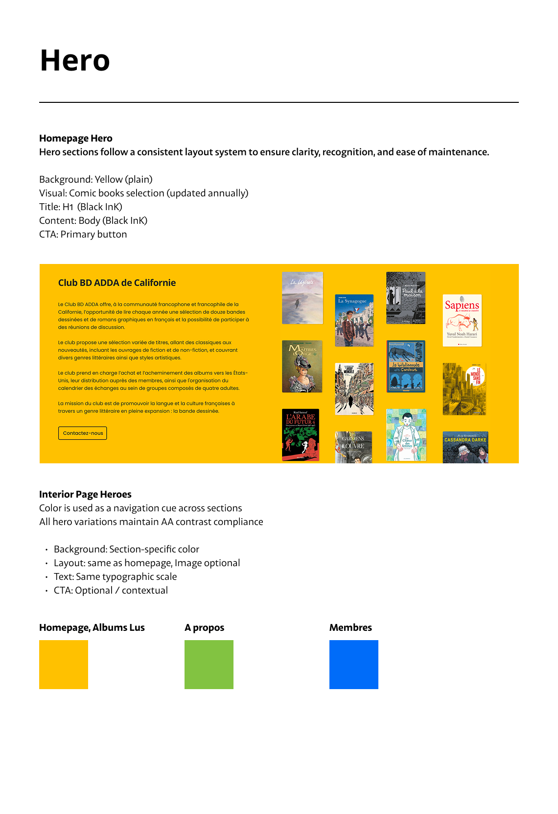
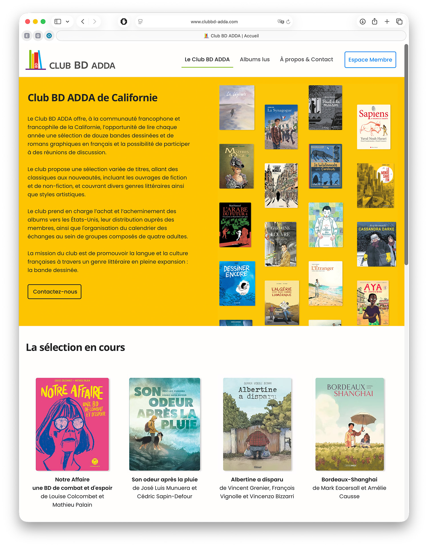
Overview
Club BD ADDA is a volunteer-led French-American cultural program promoting French-language graphic novels through curated reading selections and community discussions.
When I joined the project, its online presence consisted of a multi-page Google Docs document. The goal was not just to “create a website,” but to transform this document into a usable platform that volunteers could maintain over time.
I led the transformation of this document into a structured, accessible digital platform, and designed a visual identity aligned with the Club’s cultural mission.
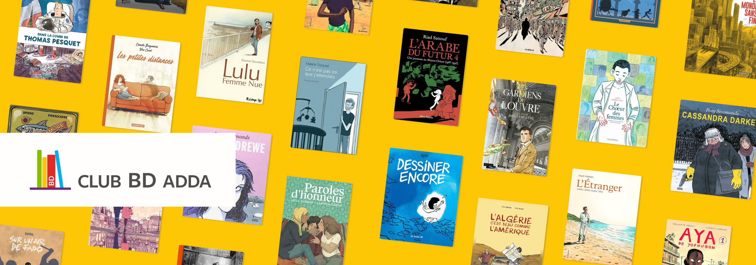
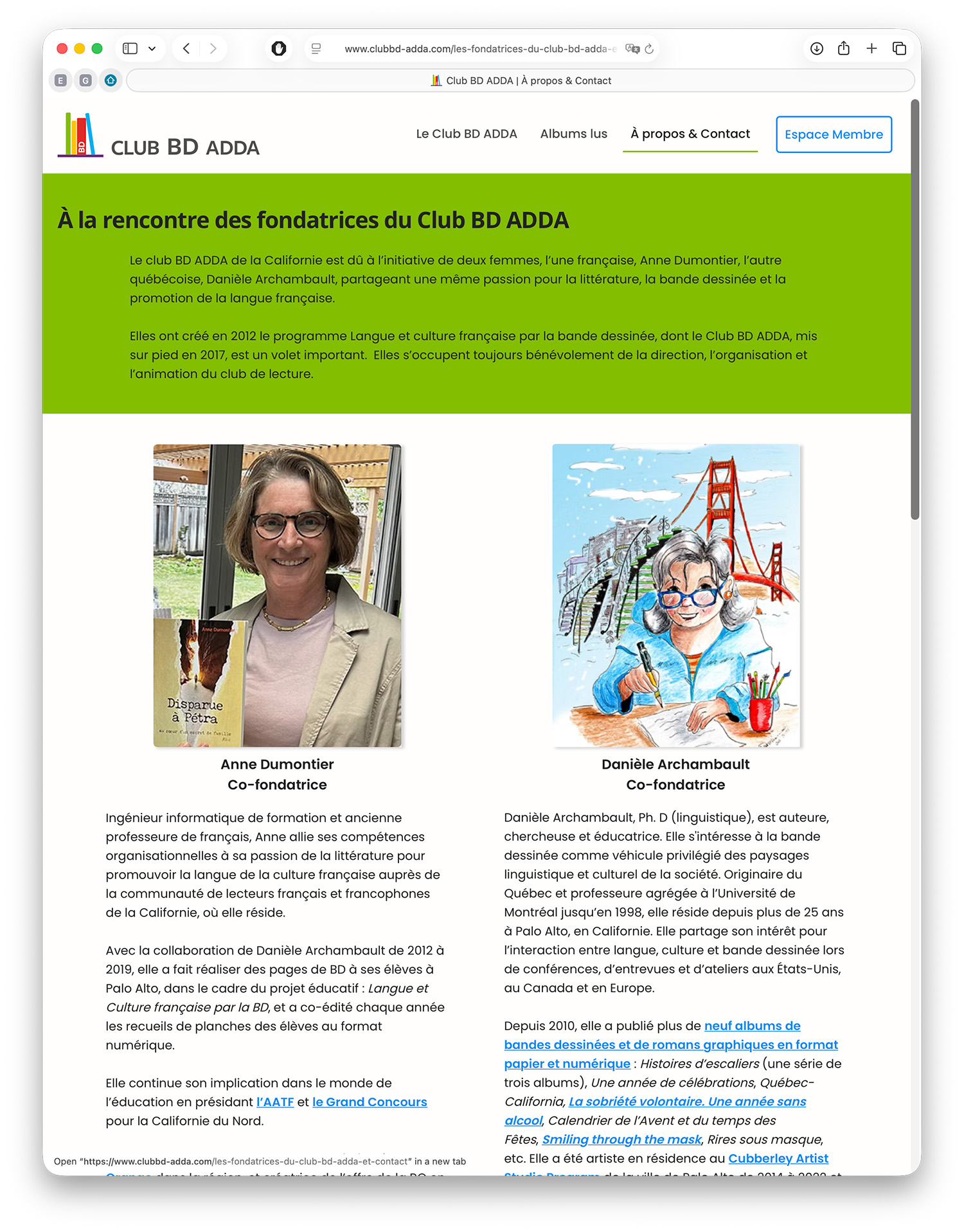
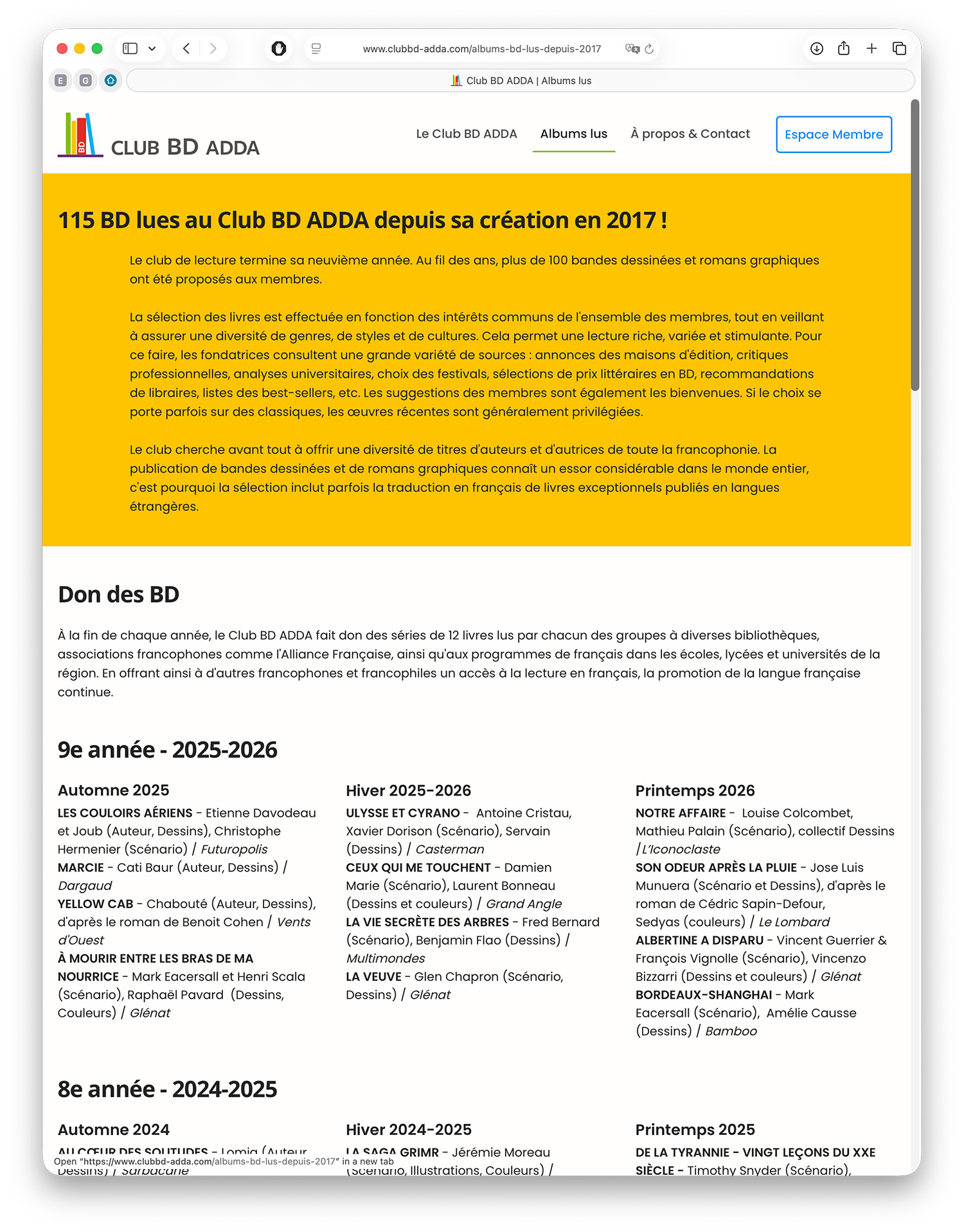
The transformation is illustrated below, from the original document to the live platform.
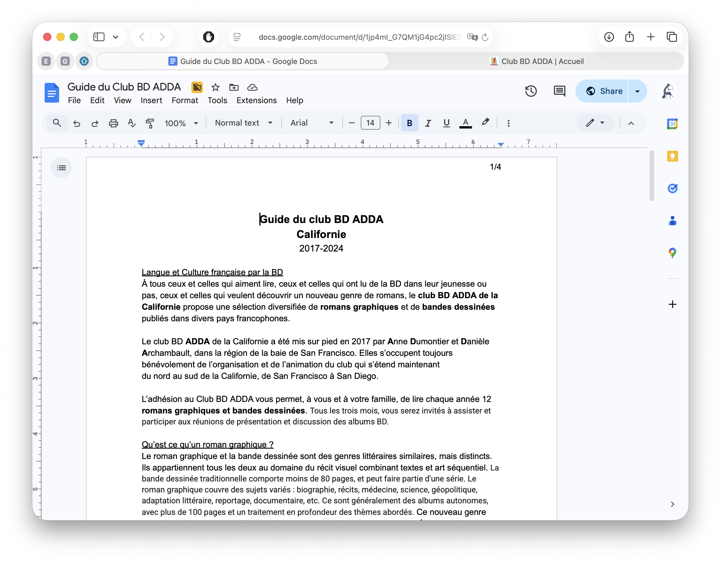
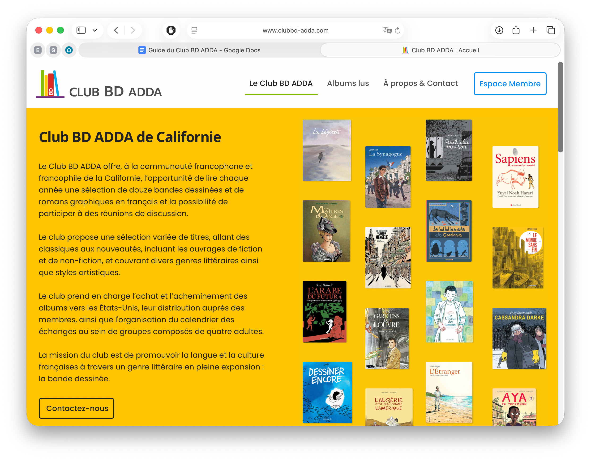
From the initial presence to the actual live website (February 2026) updated by the volunteer-team.
Challenges
Designing for a volunteer-run organization
The Club operates through a volunteer team, with limited time available for content production and ongoing updates. Early discussions included ambitions such as a blog, newsletter, and expanded content sections. However, these directions quickly raised questions around who would realistically produce, update, and maintain this content over time.
The challenge was not only to improve the Club’s visibility, but to define a scope that could be sustained within this setup.
My Role from UX to Product Strategy
Building on my previous collaboration with LirEncor, I was invited to lead the creation of the Club BD ADDA digital platform, visual identity, and supporting materials.
I led the project end-to-end, from early structuring decisions to implementation and post-launch support. My role covered product definition, information architecture, visual identity, and front-end integration.
This included defining a sustainable content structure, evaluating CMS options, and implementing the site in Wix based on the team’s existing familiarity. I also established shared assets and simple guidelines to support ongoing updates by the volunteer team.
Beyond the initial launch, I introduced a lightweight QA framework and continued to support the team through quarterly updates.
Brand Strategy
A lightweight and usable foundation
The goal was not to create an extensive brand system, but to establish a clear and usable visual foundation that volunteers could easily apply across both digital and print materials.
Given the organization’s structure and limited resources, I prioritized simplicity and accessibility:
- open-source typography
- a defined color system
- ready-to-use assets shared in a central library
This allowed contributors to create and update materials independently.
An accessible visual identity
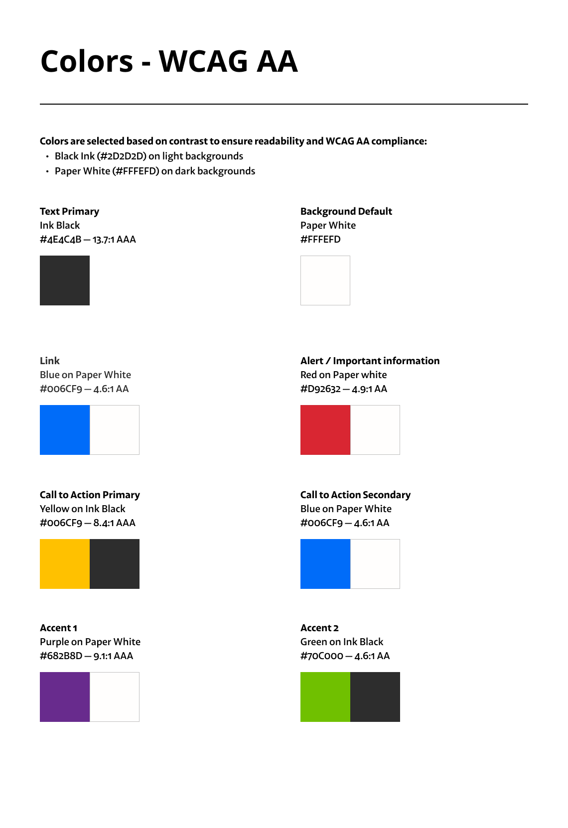
The logo color palette draws inspiration from La Francophonie, the global French-speaking community and cultural celebration, reflecting the Club BD ADDA’s mission to promote the diversity of French-speaking authors.
Colors were defined across Pantone, CMYK, RGB, and Hex formats to ensure consistency across print and digital use. All combinations were validated against WCAG AA contrast requirements.
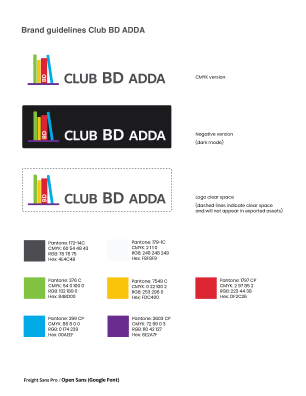
I developed lightweight brand guidelines to support consistent implementation for print/digital touchpoints.
Information Architecture
Making structure and workload visible
The information architecture was the true starting point of the project. Before any visual design work began, I mapped the full site structure to clarify scope, user flows, and content ownership. Early ideas included a blog, newsletter, and additional content sections. However, in a volunteer-run context, each new feature also meant additional content to produce and maintain.
To support these discussions, I created a working structure that mapped the site content alongside the documents used to produce and update it. This made it easier to see how each section would be maintained over time, and helped ground decisions in what the team could realistically manage. It also supported internal discussions around roles and responsibilities, helping clarify who would produce, update, and publish each piece of content.
This helped shift discussions from “what could be built” to “what could realistically be maintained.” Designing the structure was therefore as much about defining scope as it was about organizing content.
This approach made trade-offs easier to discuss and align with stakeholders.
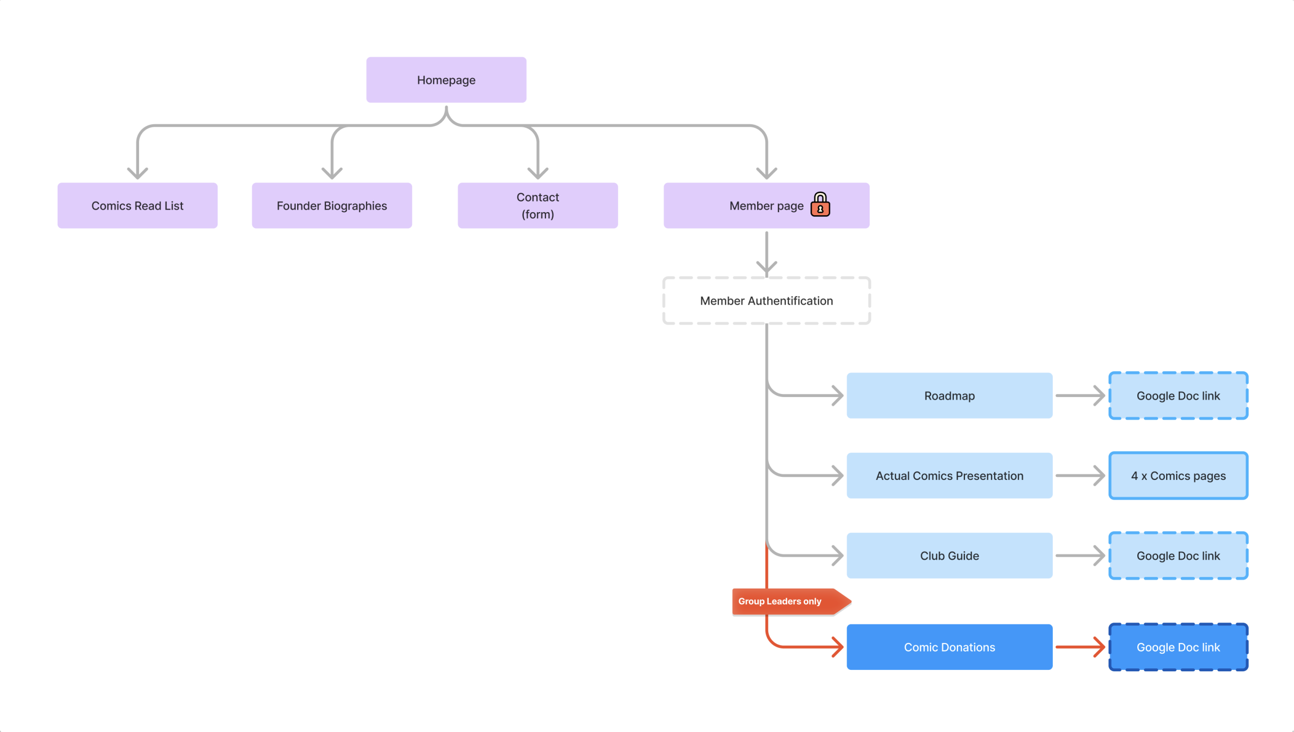
The diagram shown here reflects a working version of the information architecture used during scope definition. It evolved through several iterations as priorities were refined and operational constraints became clearer.
Design System
I created a structured and accessible design system to ensure consistency across the site and support ongoing updates. It follows standard design principles, but was scoped and documented so it could be used by a volunteer team without dedicated design support.
Accessibility was integrated directly into these patterns, helping keep content clear and consistent over time.
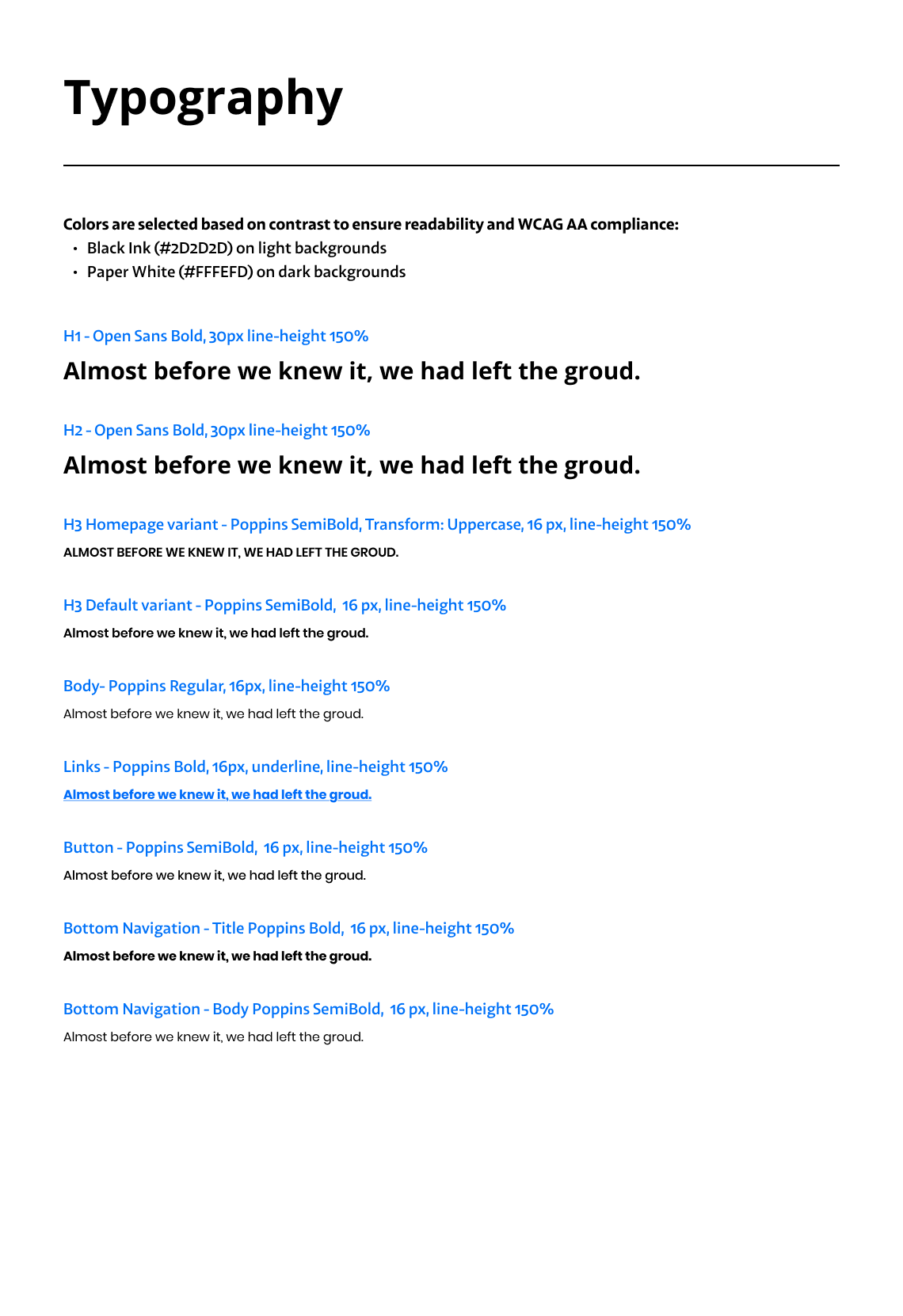
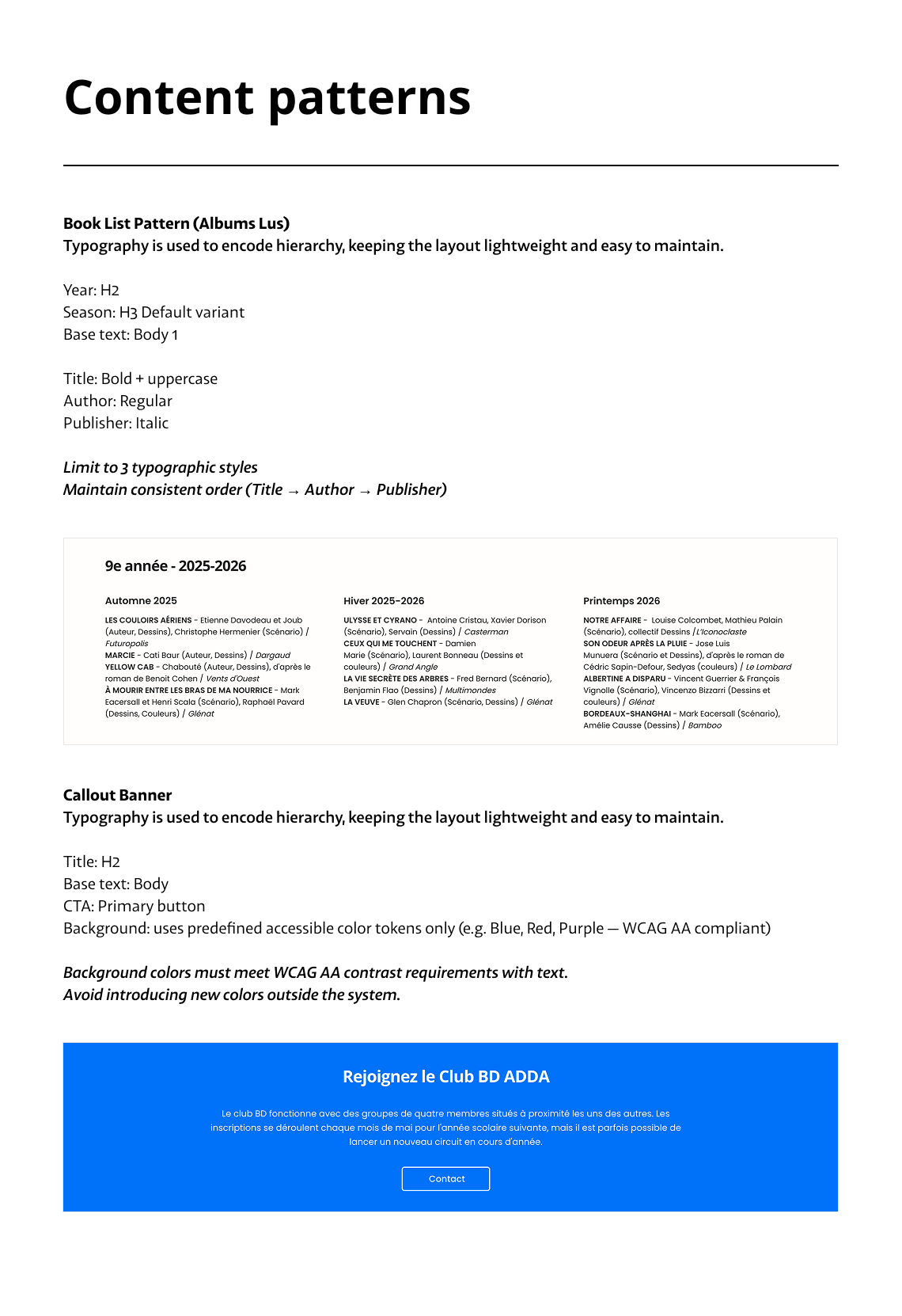
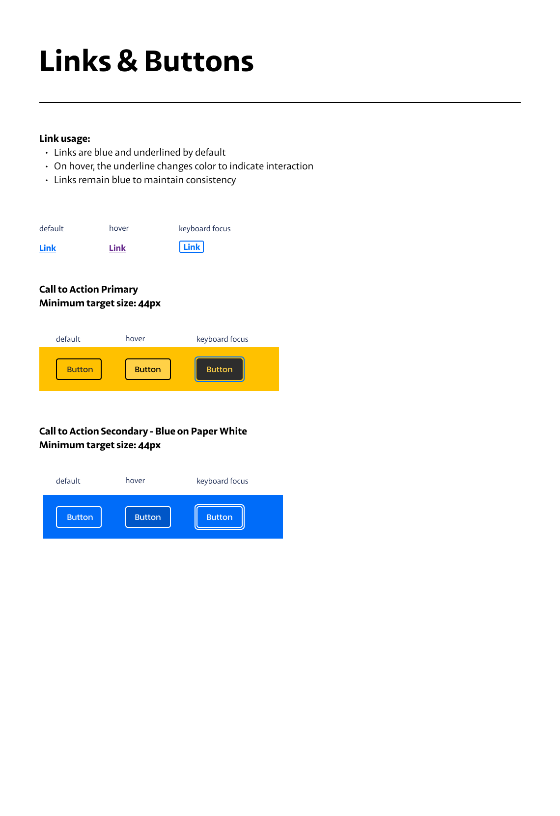
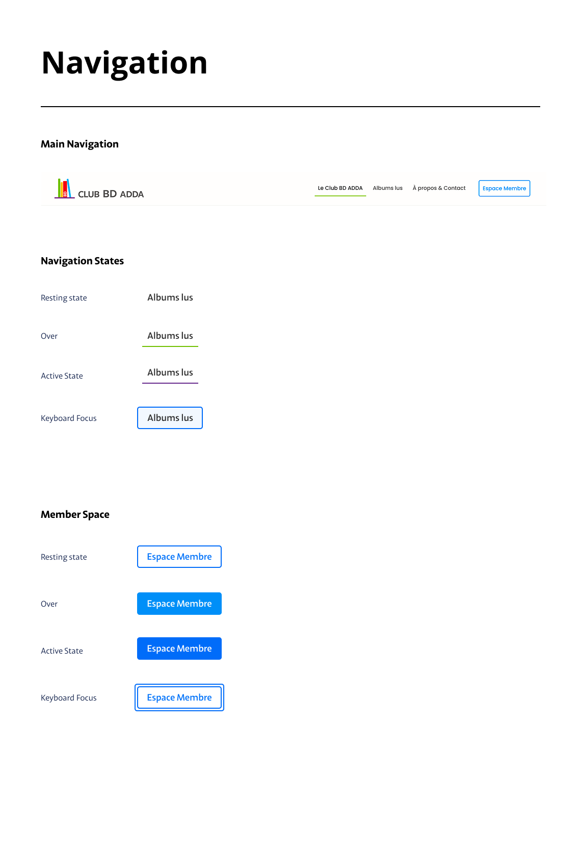
A lightweight, accessible system designed for clarity and ease of use.
Iterative Wireframing
During early discussions, one proposed direction was to display the full archive of 100+ titles directly on the homepage to showcase the Club’s history.
Through wireframe exploration, I tested different layout approaches, including grid density, grouping, and hierarchy. These quickly showed that placing the full archive on the homepage would create excessive vertical depth and make the page harder to navigate.
By visualizing these options, we were able to make the trade-offs clear and align on a more sustainable solution: moving the archive to a dedicated page, and keeping the homepage focused and easy to scan.
The archive page itself went through multiple iterations before reaching its final structure.
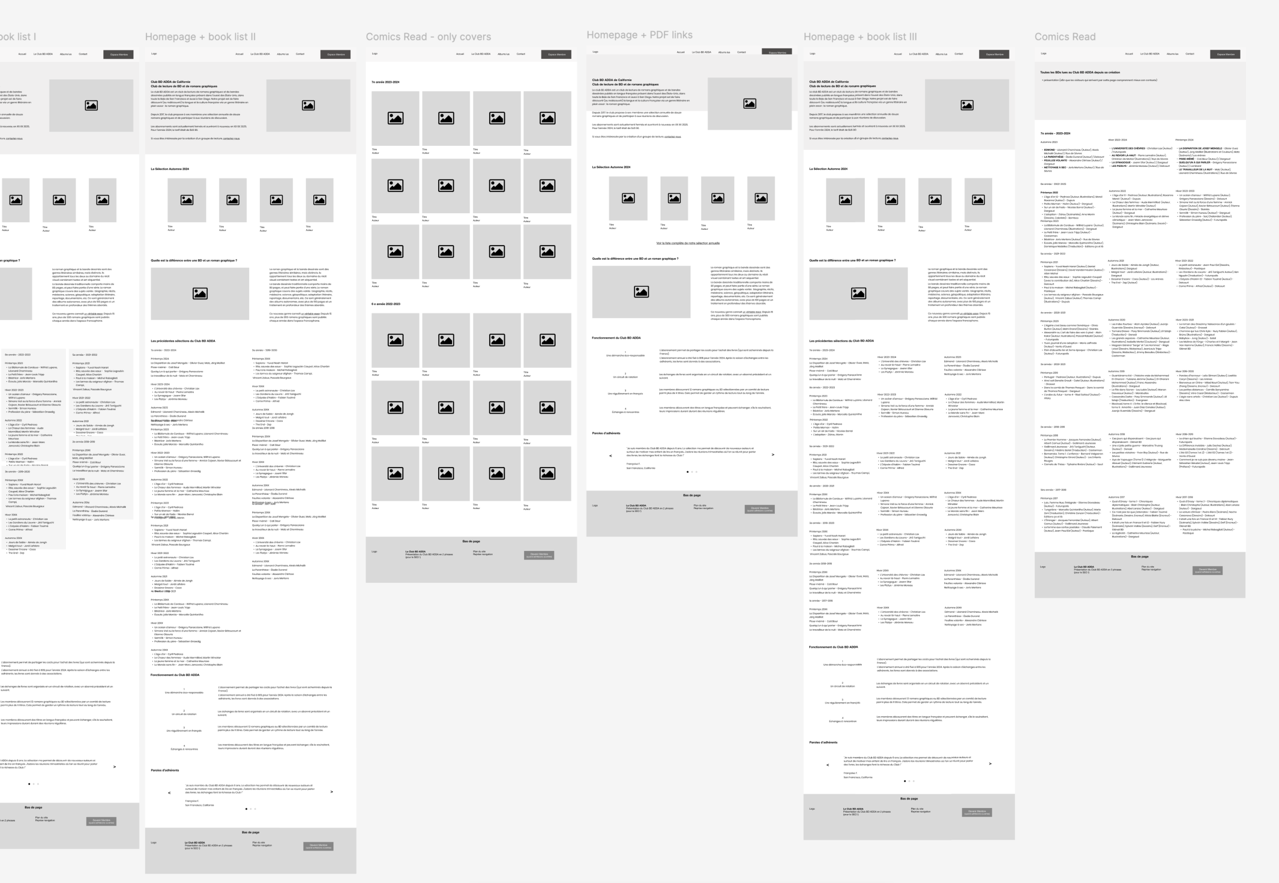
Early explorations tested the feasibility of displaying the full reading archive on the homepage.
The resulting layouts demonstrated excessive vertical depth, diluted hierarchy, and reduced scannability.
Final Design
The final interface reflects the key decisions made throughout the project: prioritizing clarity, reducing cognitive load, and keeping the structure manageable for a volunteer team.
The homepage is designed to be easy to scan, with a clear entry point into the Club’s activities and content. Secondary pages follow the same logic, using consistent layouts and simple patterns to support both navigation and content updates.
The design focuses on guiding users through a smaller set of well-structured content, making the experience easier to use and maintain.
Brand Extension
Extending the experience beyond the website
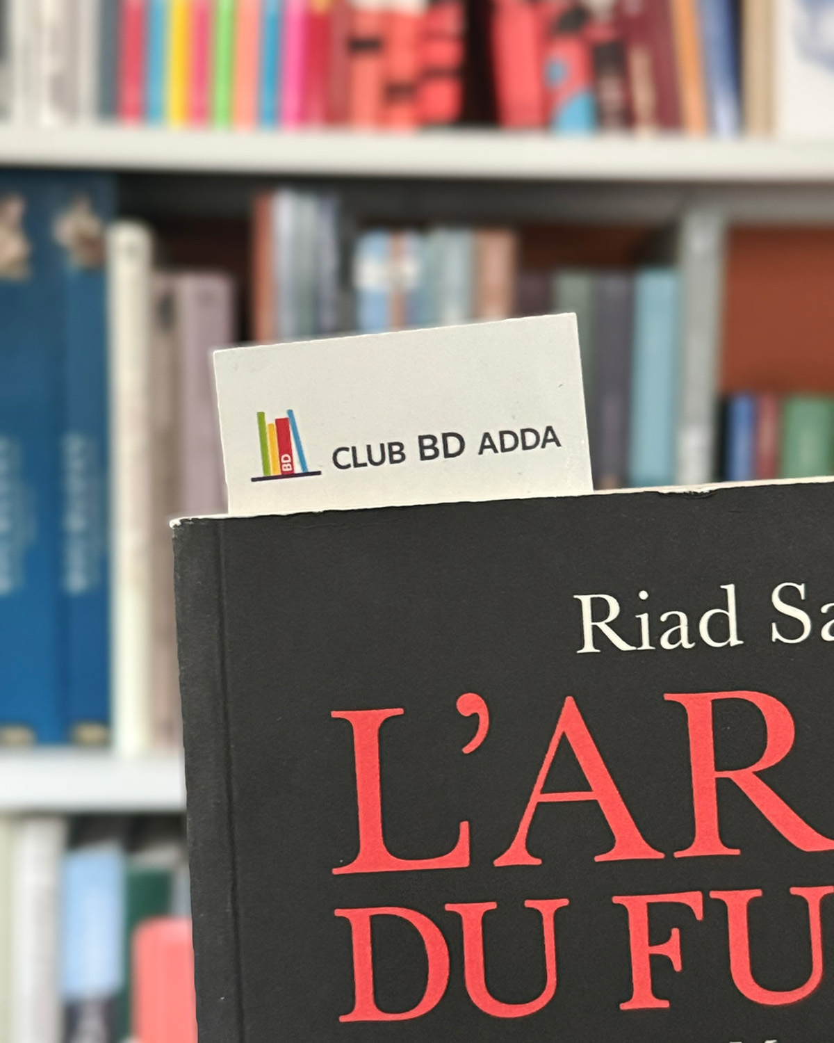
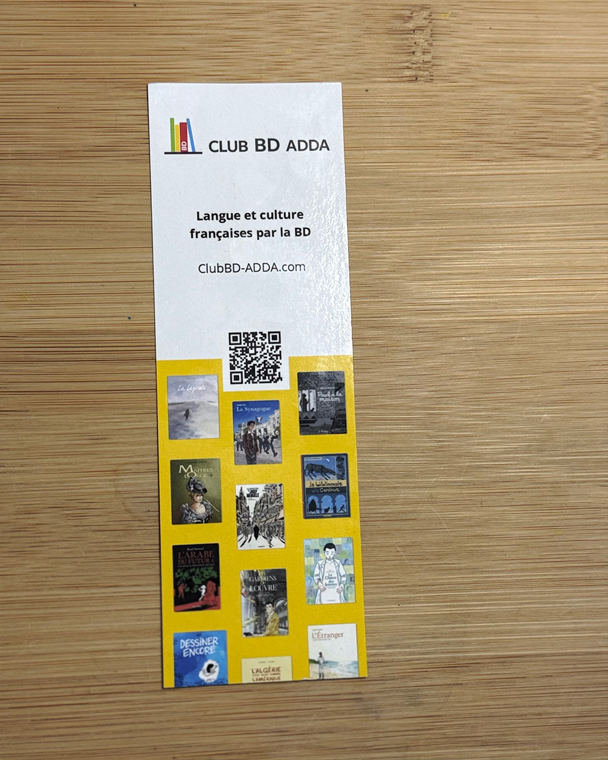
To extend the Club BD ADDA identity beyond the website, I designed a branded bookmark distributed with each book. This simple physical touchpoint reinforced the connection between the Club’s in-person activities and its digital presence.
Post Launch
Adapting to real usage
The initial product direction included creating a dedicated page for each graphic novel presented during the Club’s quarterly sessions, with detailed content similar to a product page. Early on, I flagged that this approach would introduce a significant editorial workload. The team chose to proceed, and I designed a reusable template and implemented the first set of pages.
After two update cycles, it became clear that maintaining these pages required more effort than anticipated. The team decided to return to their previous solution using Google Slides.
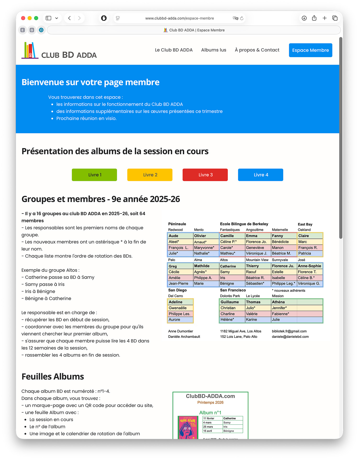
Following this, I redesigned the Member page to better align with how the Club actually operates, simplifying the structure and reducing the effort required for updates.
This example reinforces the importance of aligning feature scope with real editorial capacity.
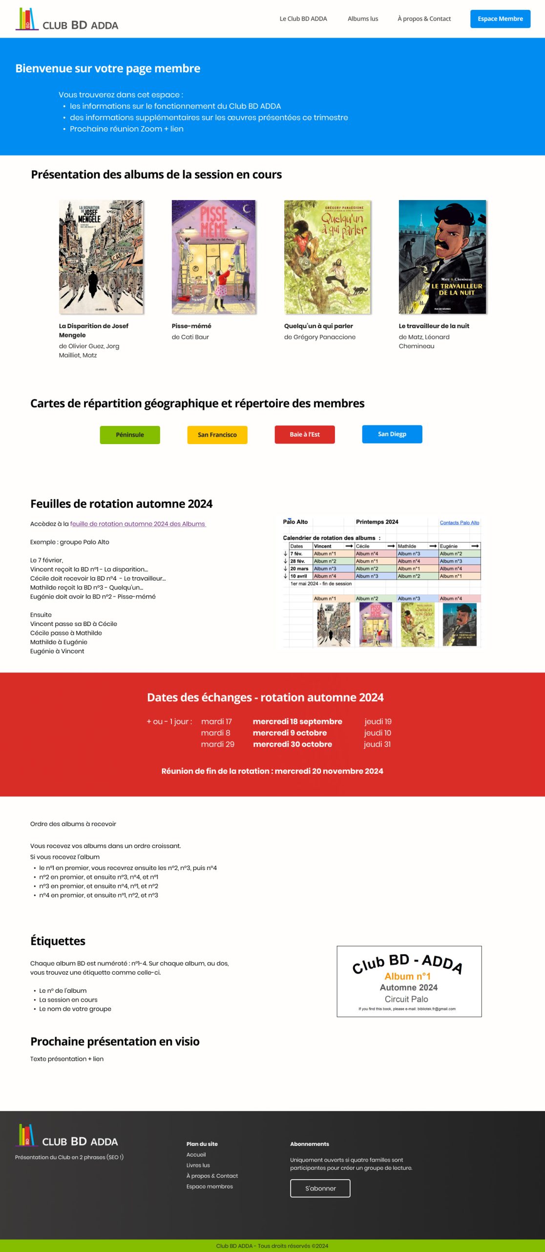
Member Page: Launch Version
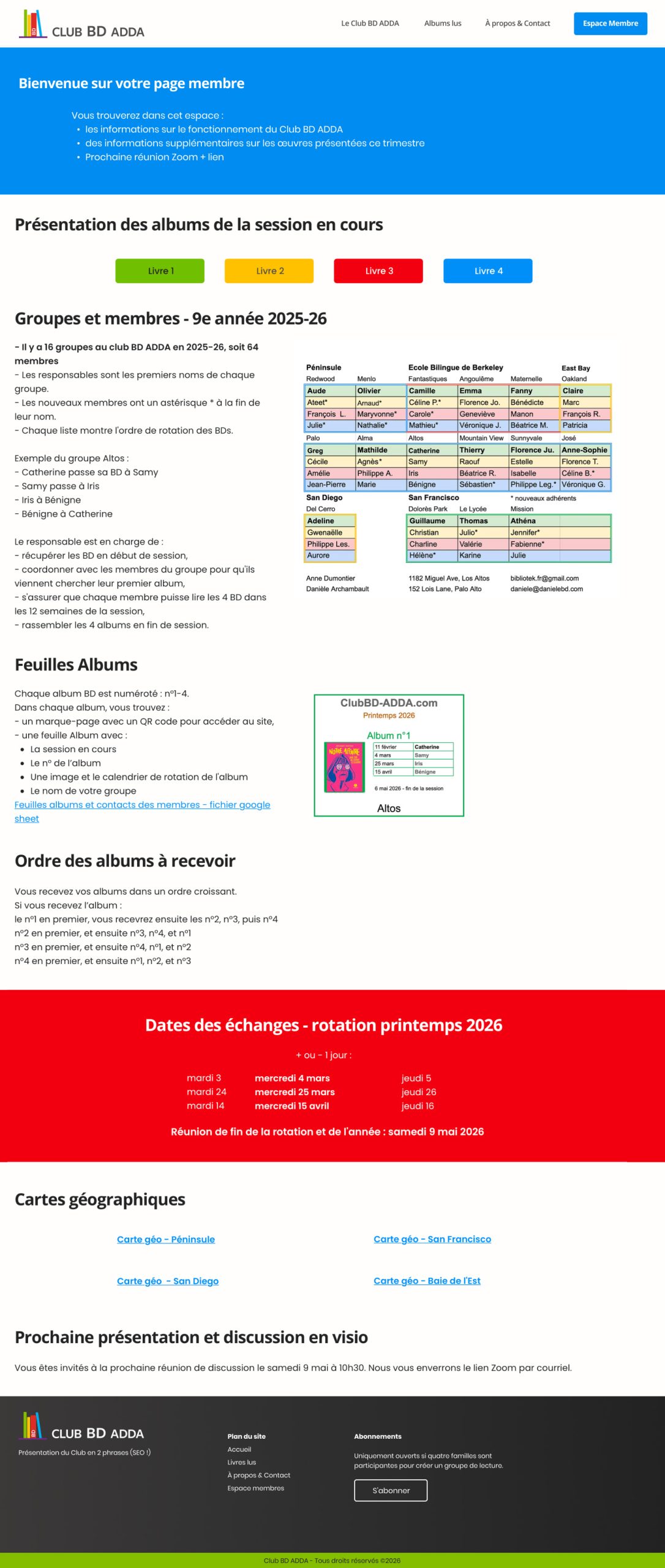
Member Page: After Two Quarters of Use
Establishing sustainable QA Workflows
As the site began to evolve through quarterly updates, I conducted regular reviews to ensure consistency and identify potential issues across content, layout, and functionality.
These reviews highlighted the need for a more structured approach to quality control. I introduced a simple QA checklist covering responsive behavior, accessibility, and key user flows.
This process significantly reduced regression risk across updates and helped preserve design and content consistency as the site evolved.
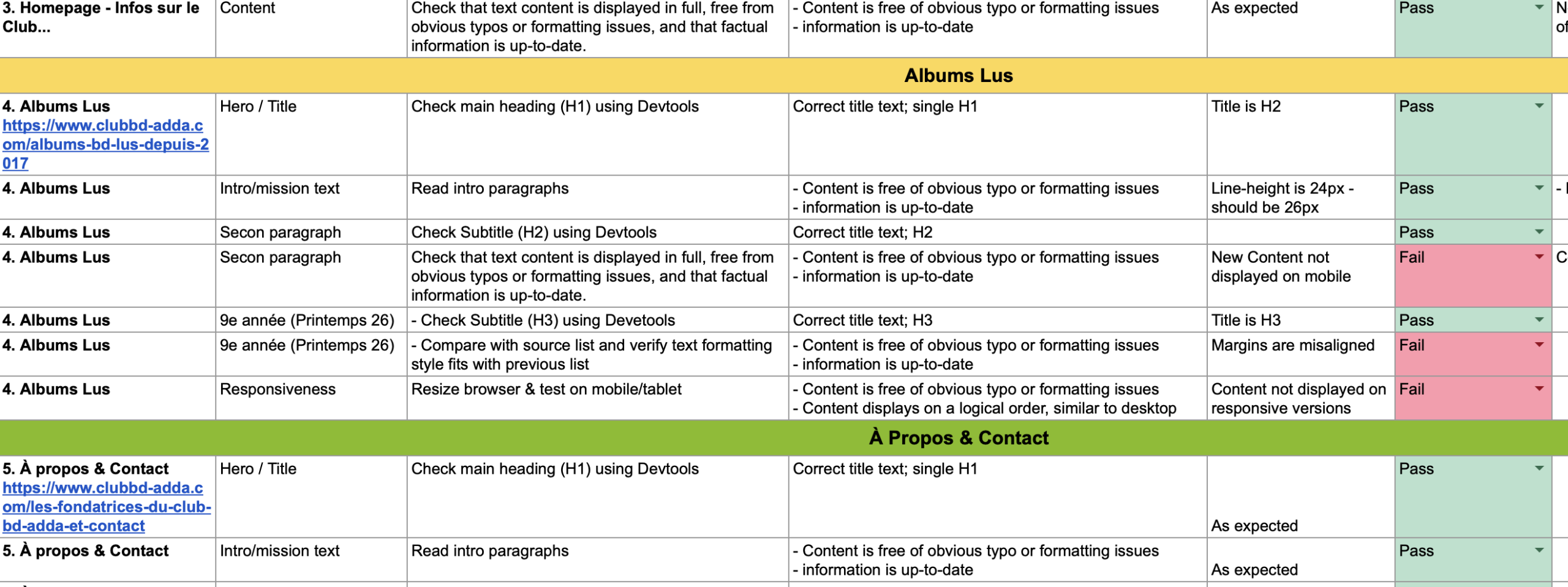
Excerpt from the last structured QA checklist used to monitor cross-device consistency and content quality across quarterly updates.
Conclusion
This project reinforced a principle central to my practice: digital products are built not only for users, but also for the teams who maintain them.
This experience strengthened my belief that product design is about creating systems that support people, and it confirmed my interest in mission-driven, community-focused work.
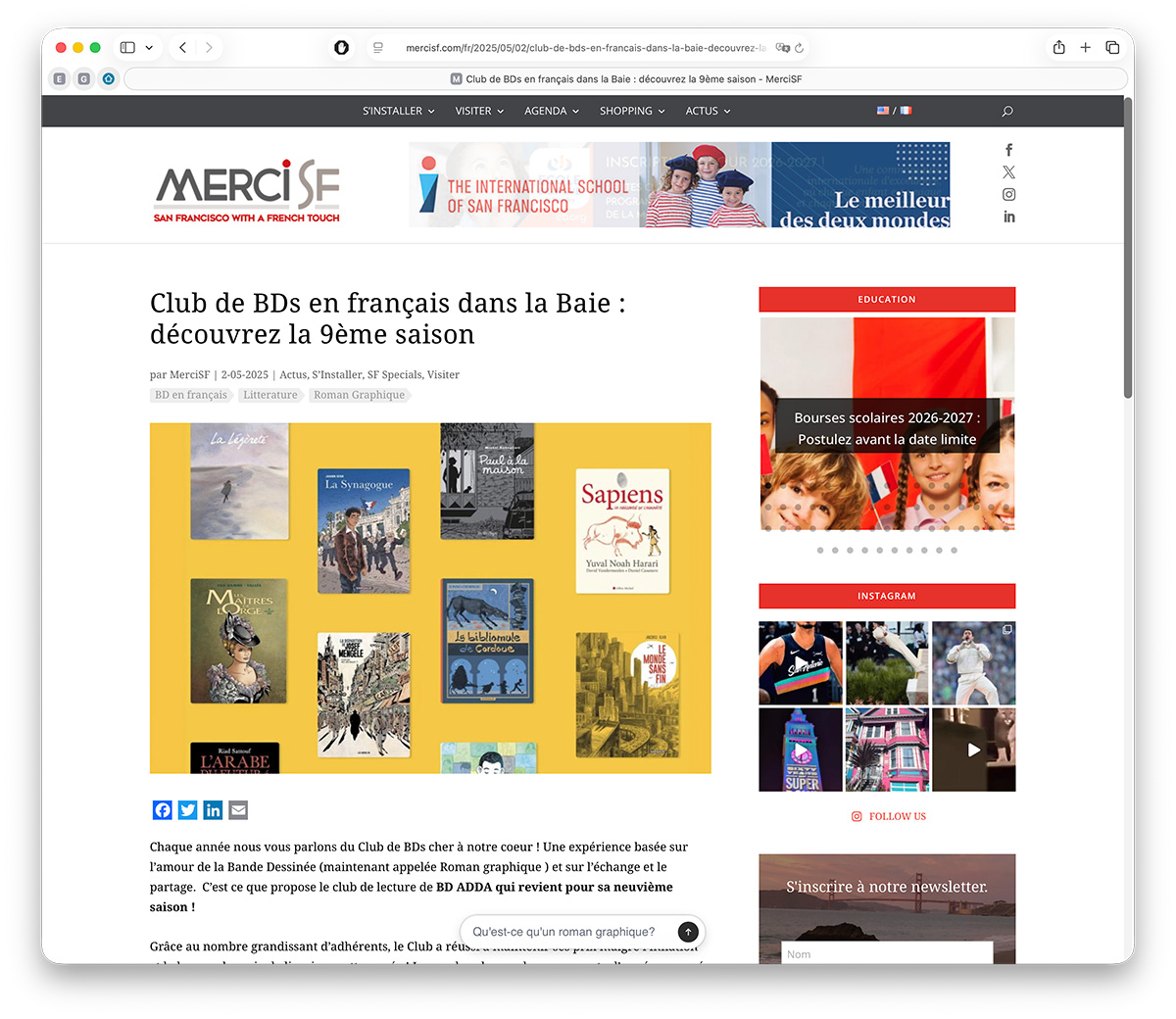
The launch of the platform contributed to increased visibility within the Bay Area French-speaking community, including coverage in MercisF.
⁂
Currently open to the right opportunity.
© 2026 Stephanie Lesperance
Original Illustration by Leni Kauffman via Blush.design