Building a cohesive product ecosystem for a security startup
Design SHIFT
Estimated reading time: 4 minutes
Summary
Industry: Consumer Electronics, Secure Computing
Timeline: 2016-2017 · Contractor (18 months)
Role: Lead Product Designer · Brand & Visual Identity Designer · Product Launch Design
Scope: Product communication · Brand system foundations · Hardware documentation · Packaging & printed manuals · Marketing & investor materials
Design Software: Adobe Photoshop · Adobe Illustrator · Adobe InDesign · OmniGraffle
Platforms: Mailchimp
Production: Product photography (studio setup & lighting) · Print production workflow
I served as the sole designer supporting secure hardware products in a highly regulated environment, translating complex security requirements into coherent visual systems across physical devices, digital touchpoints, and field marketing environments.
I established design ownership, defined standards, and put in place a system that ensured consistent design across teams.
Due to confidentiality constraints, certain product-level visuals cannot be displayed. This case study highlights publicly released marketing and event materials.
Key Achievements
- Led the repositioning and visual rebrand of ORWL, aligning it with enterprise and high-trust security markets
- Partnered directly with executive leadership on investor-facing materials supporting fundraising efforts
- Oversaw the art direction of the ORWL e-commerce platform to ensure alignment with the updated brand positioning
- Consolidated cross-team asset workflows to improve execution consistency across product, marketing, and trade environments
Overview
Design SHIFT was a hardware engineering firm operating in high-trust, regulated markets. The company developed hardware products for industry leaders, collaborating across distributed teams with engineering based in the United States and Taiwan, and marketing support in France.
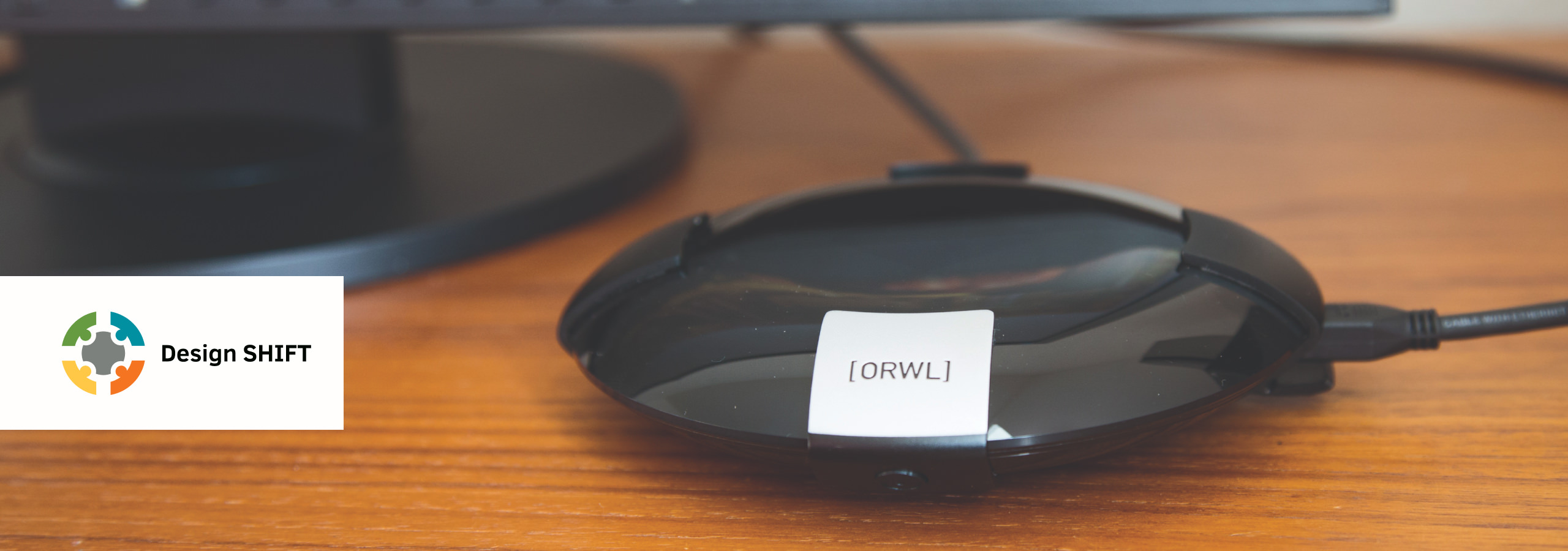
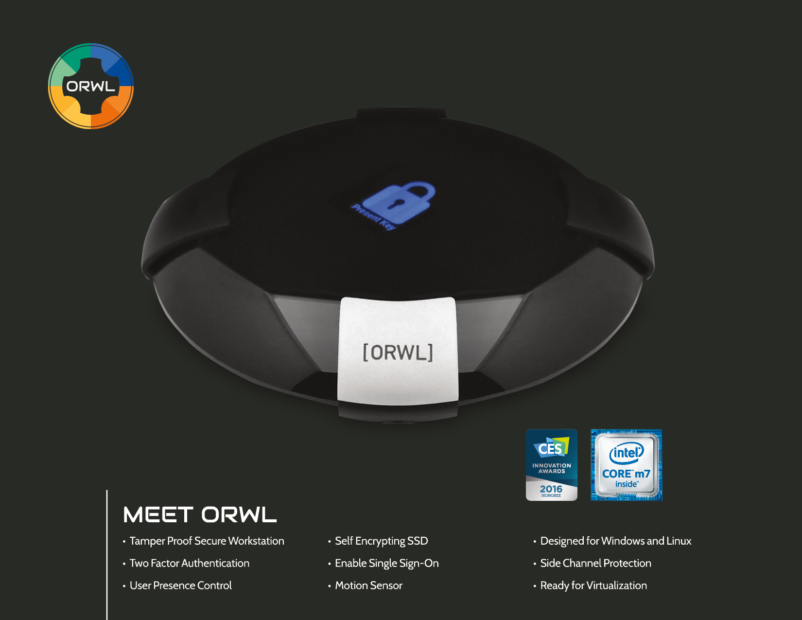
ORWL was a physically secure computer designed to protect sensitive data through hardware-based authentication and encrypted storage. The project was successfully funded on Crowd Supply, raising over four times its goal.
I joined Design SHIFT during the product launch phase to help establish the brand, design the first user documentation, and support the product’s go-to-market strategy.
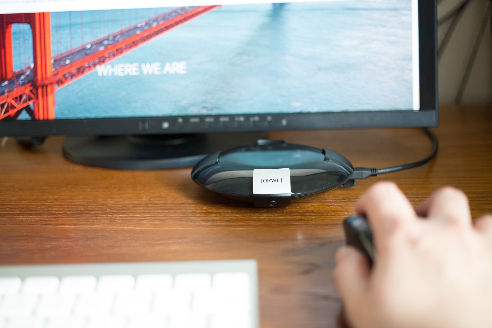
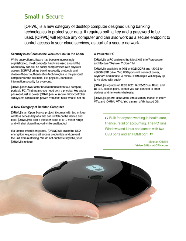
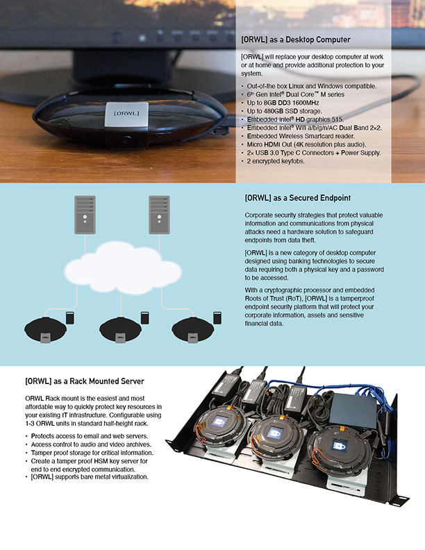
ORWL is a physically secure computer that requires a keyfob to activate and runs on both Windows and Ubuntu.
Photo Credit: Stephanie Lesperance for Design SHIFT
Challenges
When I joined, there was no clear design ownership or structure:
- No centralized brand system, leading to inconsistent outputs across teams
- A strong technical product without a clear narrative for enterprise adoption
- A brand misaligned with the company’s shift toward commercialization, requiring repositioning
Additional Challenge: domain fluency
I entered the project without prior experience in secure hardware, and quickly developed the domain fluency needed to translate complex technical systems into clear, credible design outputs.
Design Objectives
The design work focused on three core objectives:
- Supporting the repositioning of ORWL from product launch to enterprise and high-trust security markets
- Making a complex hardware-based security model understandable and credible across both technical and non-technical audiences
- Building a coherent design system across hardware, packaging, documentation, and digital environments to ensure consistency at scale
Brand System Rationalization
Building a foundational brand system from a fragmented environment
When I joined, there was no usable brand system: no validated assets, no clear rules, and no shared source of truth. Rather than simply producing new assets, I focused on building a usable foundation that teams could rely on:
- Reconstructed the logo as a validated vector asset and defined clear usage rules
- Established a practical brand guideline tailored to engineering and distributed teams
- Defined typography hierarchy and a consistent color system to ensure cross-platform coherence
- Structured a centralized asset library to create a single, reliable source of truth
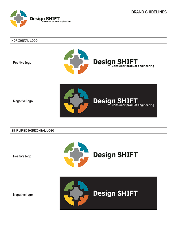
First structured brand guideline consolidating logo usage and core visual standards.
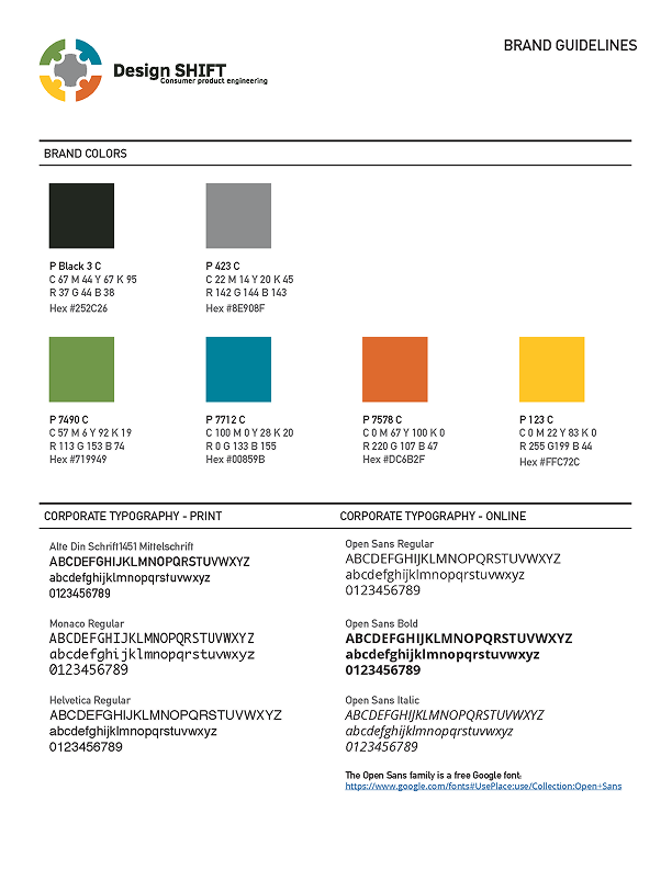
Defined typography hierarchy and standardized color system to ensure cross-platform consistency.
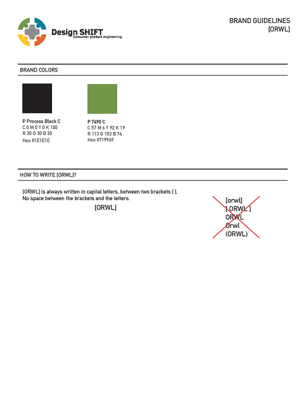
Established naming conventions and brand usage rules to reduce inconsistencies across teams.
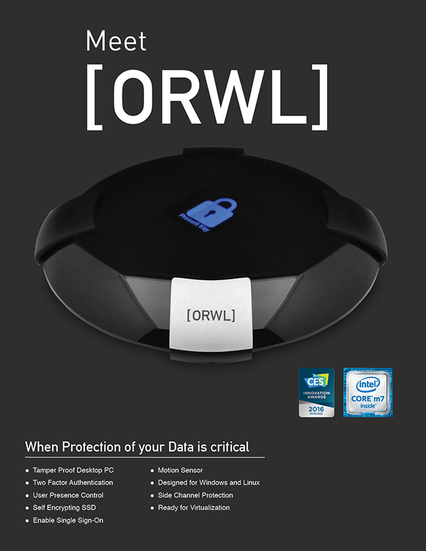
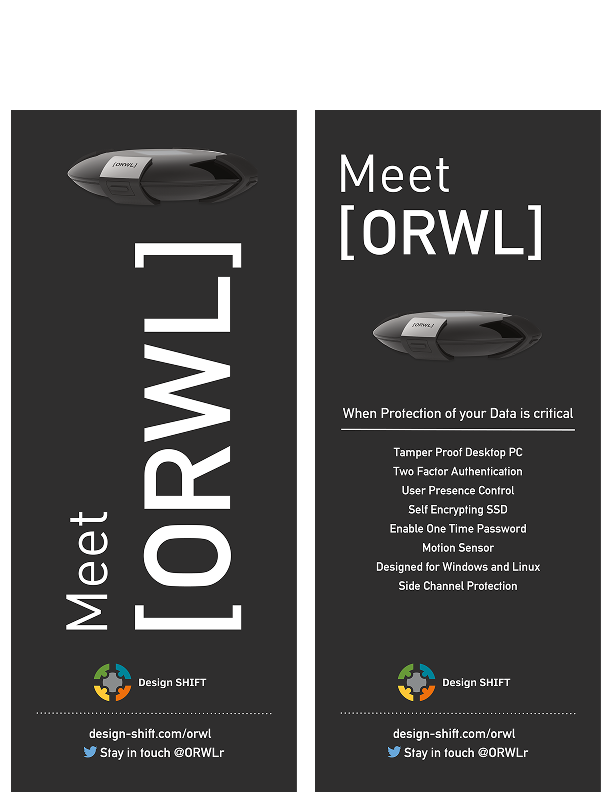
Brand ORWL – Launch Materials
Launch & Field Marketing System
I inherited an existing but undocumented visual direction and transformed it into a cohesive communication system supporting ORWL’s public launch and trade presence.
Scope of work:
- Defined a clear and consistent launch narrative across print and digital channels
- Designed and optimized the main sales brochure for both physical distribution and email campaigns
- Created a modular datasheet template to support ongoing product updates
- Developed field-ready assets (including a 4’×6’ trade show banner) aligned with high-trust security markets
- Maintained the minimal, high-contrast visual language aligned with ORWL’s early audience (security practitioners)
4’x6’ double-sided trade show banner
Bridging Engineering & Brand
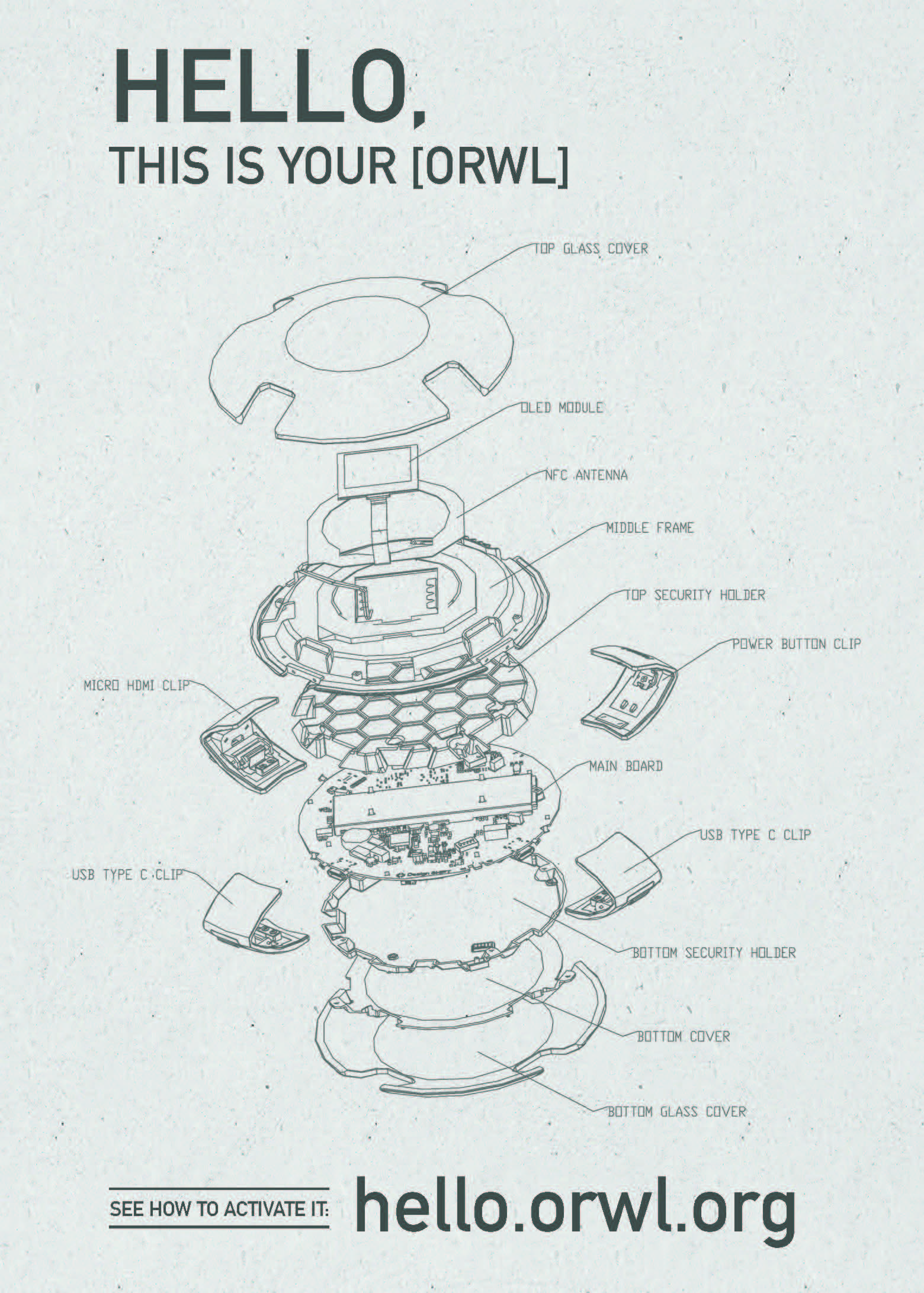
The exploded AutoCAD view used in several customer-facing artifacts.
Turning internal engineering artifacts into product storytelling
As part of the product launch, I transformed an internal exploded AutoCAD view from the Taiwanese engineering team into a customer-facing asset.
When I first saw the exploded CAD view, I immediately recognized its potential beyond its technical purpose, it was too strong to ignore. I used it as a storytelling element, showcasing both the product’s precision and the expertise behind it.
This was a deliberate choice to highlight the engineers’ work: the exploded view revealed both the elegance of the design and the precision behind its engineering.
What began as an internal engineering artifact became a key product asset, making the system’s precision visible and meaningful to external audiences. This approach helped bridge engineering and brand, reinforcing a shared sense of ownership across teams.
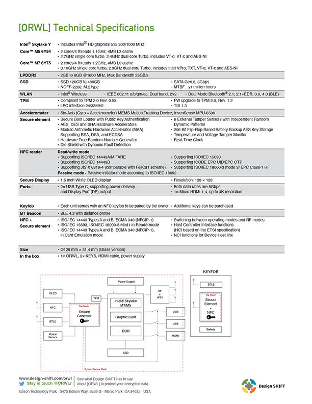
Product Documentation & Compliance Integration
I designed the official user manual to be integrated directly into ORWL product packaging. This documentation was a critical requirement for product compliance and shipping. It demanded a clear and structured approach to ensure usability without compromising regulatory standards (CE, FCC, Industry Canada).
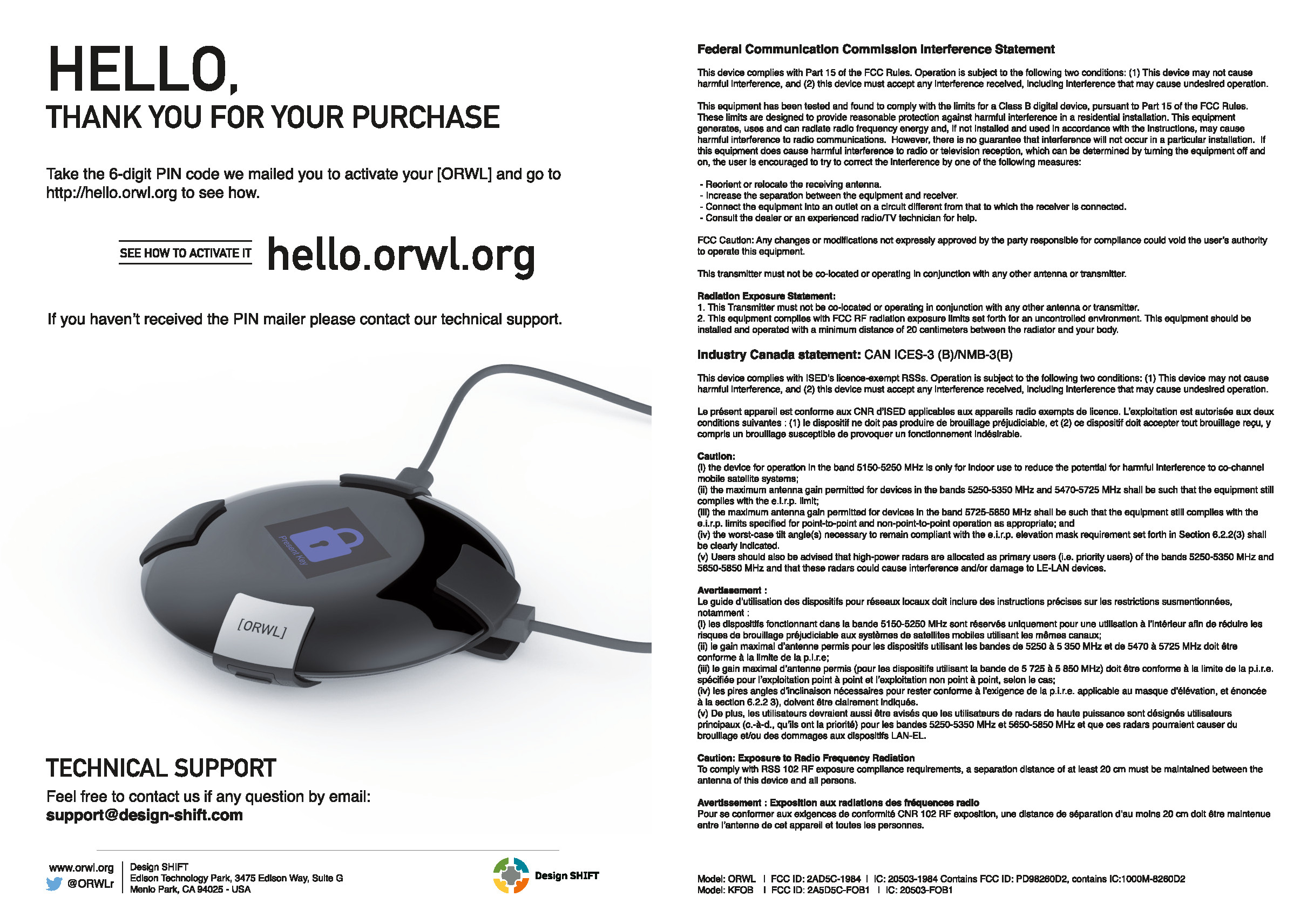
Designed a compact manual integrating CE, FCC, and Industry Canada requirements while maintaining visual clarity and brand consistency.
(Interior pages)
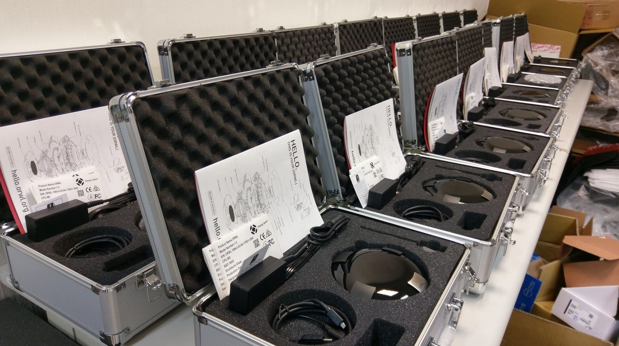
First production units of ORWL, shipped to early backers in an aluminum carrying case with the user manual I designed.
Photo credit: Design SHIFT, Taiwan Team
Brand Repositioning
As ORWL entered security-driven enterprise markets, the brand required stronger alignment with Design SHIFT’s positioning and credibility.
I led the repositioning of ORWL from a product-led launch identity to a brand capable of operating in high-trust enterprise environments.
What Changed
- Designed new ORWL logo aligned with parent brand (Design SHIFT)
- Simplified visual language to reduce marketing noise and improve clarity
- Shifted from conceptual security metaphors to a more direct, technically credible expression
- Introduced a modular layout system for cross-sector adaptation
Extract of the new brochure - repositionning ORWL for high-trust technical audiences.
Thales Security Partnership
Designed a scalable template for long-form technical thought leadership, supporting ORWL’s positioning in high-trust security markets.
Building credibility through co-branded technical communication
As ORWL expanded into government and defense-adjacent markets, external partnerships became key to reinforcing its positioning.
I supported this phase by designing structured, co-branded communication systems aligned with Thales’ standards and expectations.
- Designed a scalable white paper template to support ongoing technical thought leadership
- Structured long-form content for both print and digital distribution
- Defined a visual language aligned with security-focused, high-trust audiences
- Developed a co-branded communication system across email and social channels to support partnership-driven campaigns
Co-Branded Webinar Campaign
To support a joint webinar with Thales, I designed and executed a co-branded communication system across email and social channels.
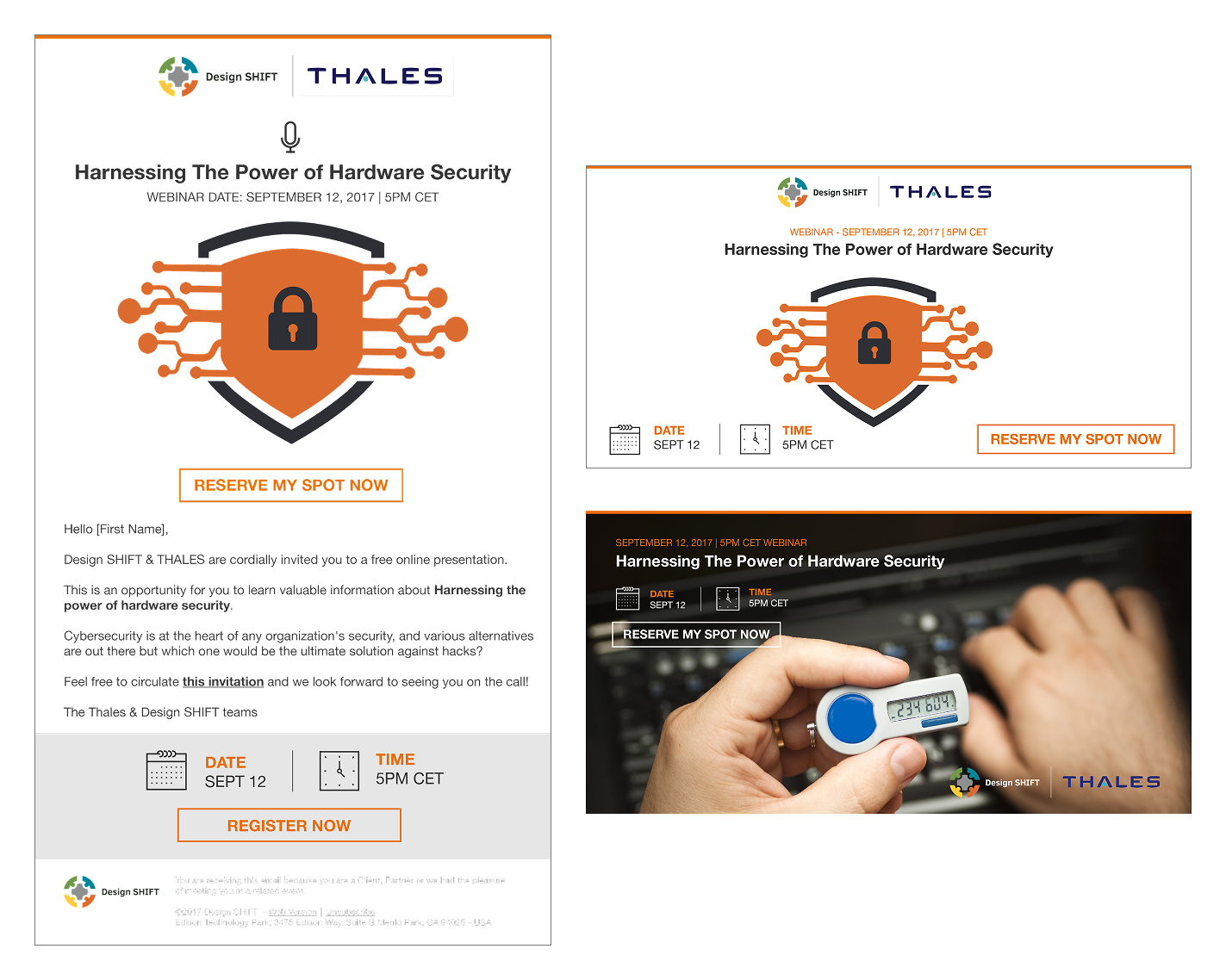
Invitation emails and Twitter assets aligned with Thales partnership communications.
Conclusion
This experience deepened my ability to operate in highly technical environments. By establishing structured brand systems, documentation standards, and packaging consistency, I helped turn ORWL from a technically ambitious product into a cohesive, production-ready offering.
Entering the secure hardware space without prior experience was initially challenging, but I quickly developed the domain understanding needed to collaborate with engineering teams and translate complex systems into clear, credible design.
This chapter shaped how I approach technical industries today: with curiosity, a strong sense of structure, and respect for the people behind the systems.
The collaboration concluded following the company’s financial restructuring.
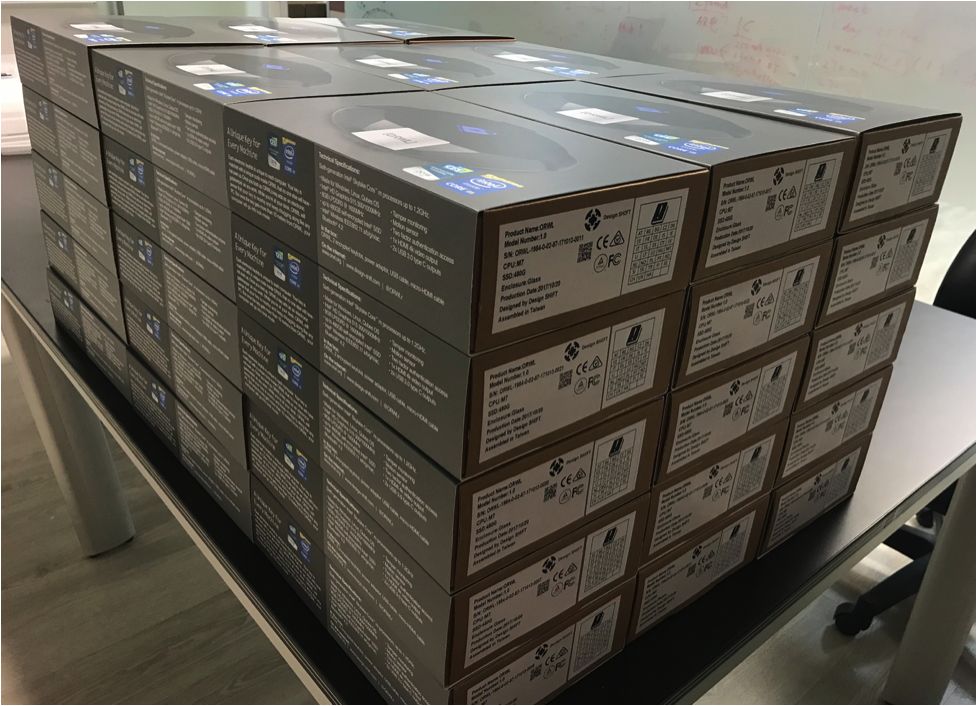
ORWL production units prepared for distribution.
Photo credit: Design SHIFT, Taiwan Team
⁂
Currently open to the right opportunity.
© 2026 Stephanie Lesperance
Original Illustration by Leni Kauffman via Blush.design