Volume Panel Redesign
Roon Mobile App
Estimated read time: 12 minutes
Summary
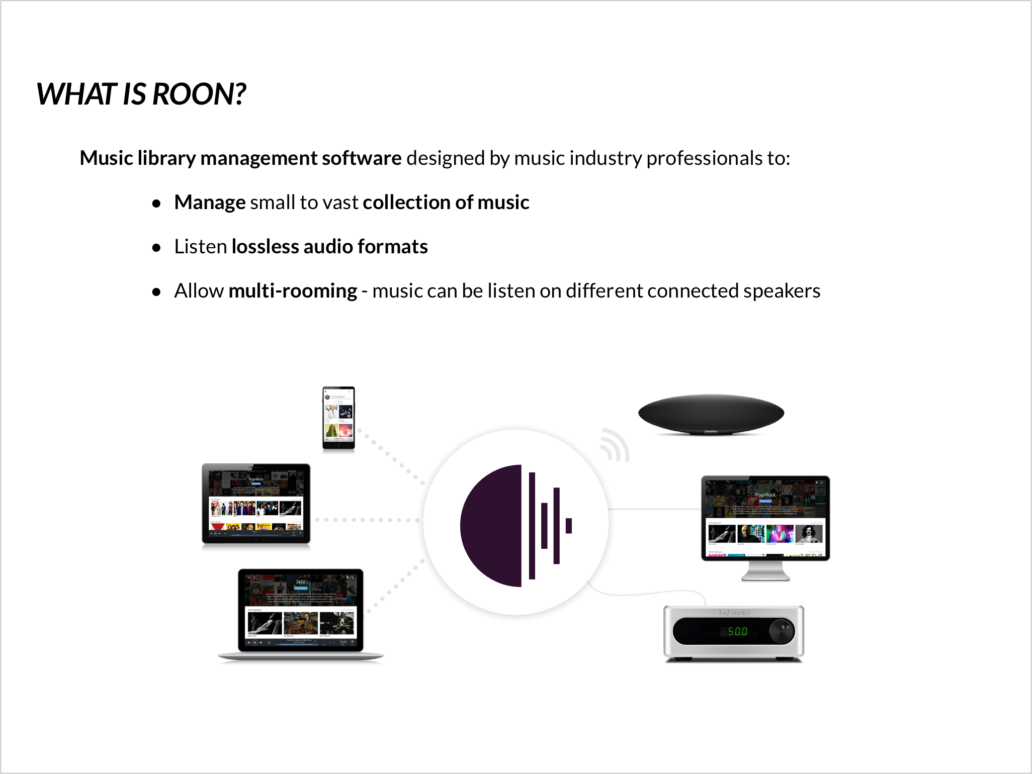
Launched in 2015, Roon is a powerful music library management software & mobile App.
I focused my project on the mobile app. I explored Roon and defined issues to improve its user experience.
Being an adventurous designer, I contacted to Roon Labs. The team was so enthusiastic by the whole project that I had the opportunity to meet personally Enno Vendermeer, CEO and co-founder.
Project type: Music Library Management App
Industry: Music
Duration: 6 weeks
This project was completed as part of a UC Berkeley Extension course.
My Roles
- Product Design Strategist
- UX Researcher
- UX Designer
- UI Designer
What I did
- Business Analysis
- Persona Development
- UX Audit
- User Interviews
- Usability testing
- User Flow
- Task models
- Wireframes
- Prototyping
- Visual Design
Key Achievements
- Conducted ten usability tests and interviews
- Identified three blocking usability issues
- Implementing a solution that respects the actual technical constraints (framework limitations)
- (Re)Design for a niche market, keeping the brand consistency
- Usability testings showed that the final design practically eliminated issues with the volume function
- Presented thise case study to Enno Vendermeer, CEO and co-founder of Roon Labs
Overview
Roon - a powerful music library
Launched in 2015, Roon is a powerful music library management software & mobile app. It was designed as a surfable magazine about users' music.
Roon gathers any music files into the same visual platform, even if these files are stored in different devices. Users can listen to music on any connected speaker, such as Sonos.
Project overview
I focused my project on the mobile app. The app was also designed to be remote: the user can use it to control her audio equipment.
I explored Roon app and defined issues to improve its user experience.
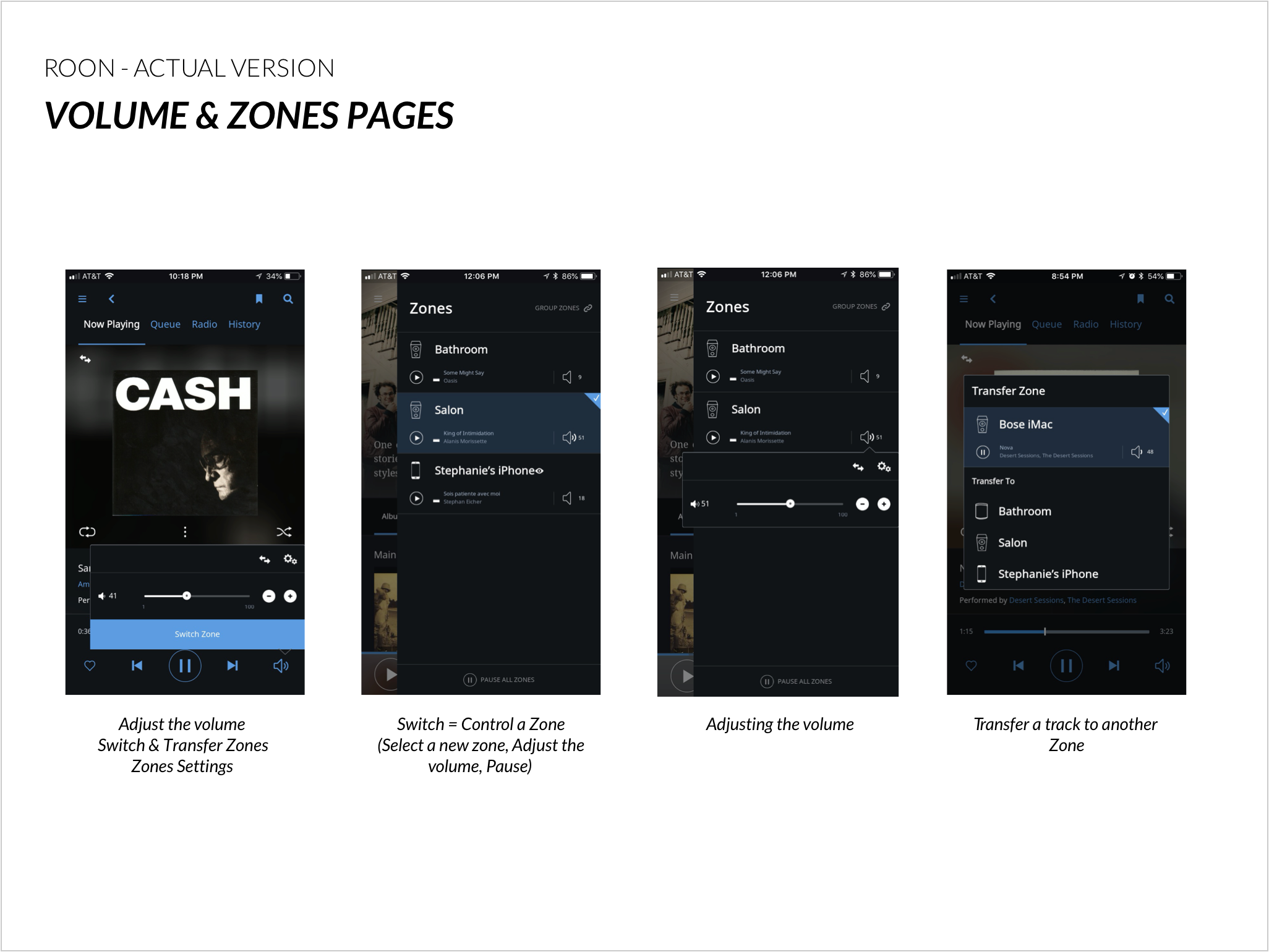
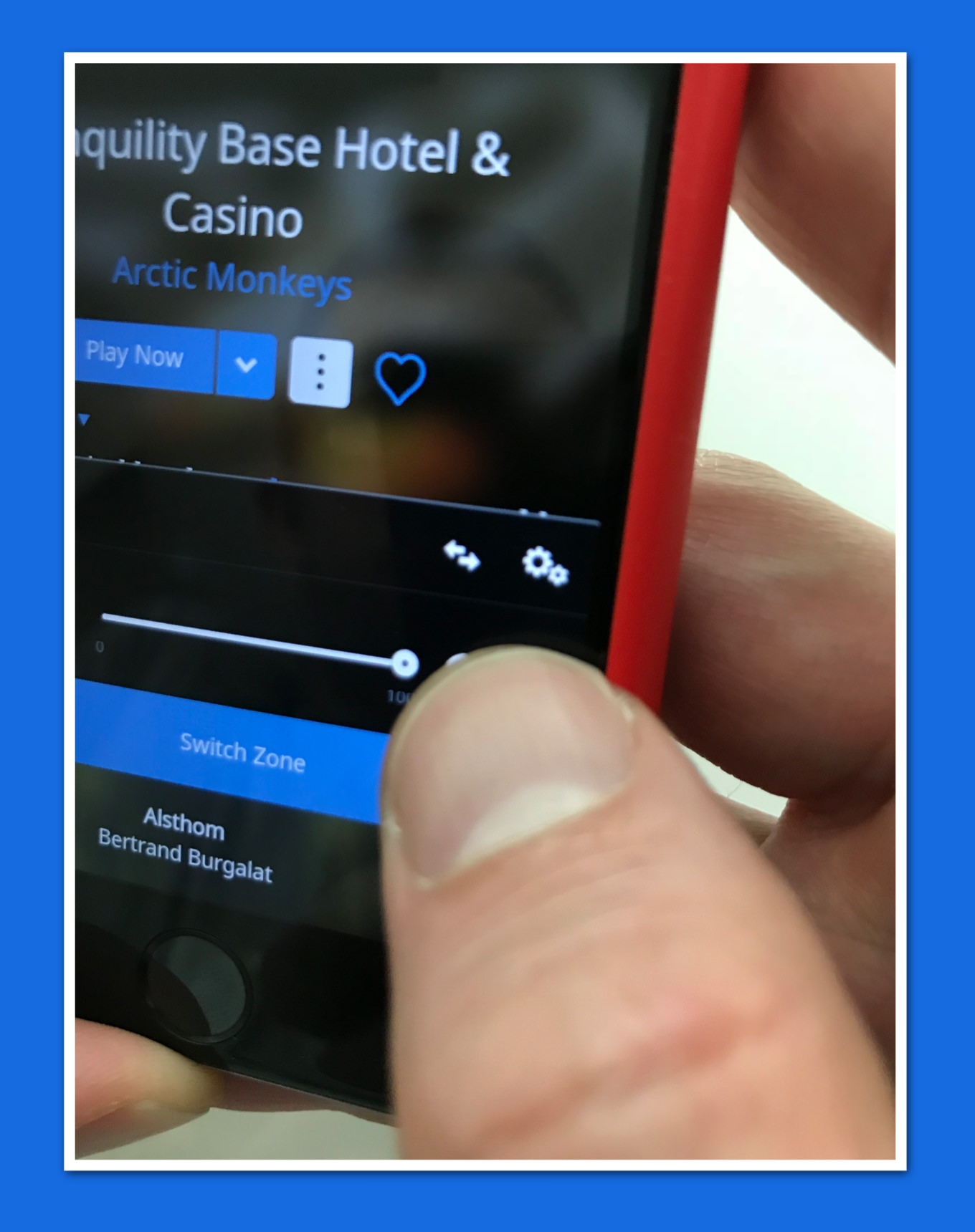
Actual screens of the Volume Panel and Zoning functions
Challenges & Obstacles
How to (re)design for a niche market?
Even if this project was completed as part of a UC Berkeley Extension UX Design course, I conducted the researches as if Roon Labs were a new client.
The main challenge of this revamp project was to create a design solution without having access to Roon Labs' internal knowledge and tools.
The second challenge was its specific demographics: (re) designing some features for a niche market, audiophiles, that don't have the same expectations and needs as the general public. This challenge was one of the reasons why I chose Roon App for my semester project.
The third challenge was to implement a solution that respects the actual technical constraints (framework limitations).
Business Analysis
Music industry trends
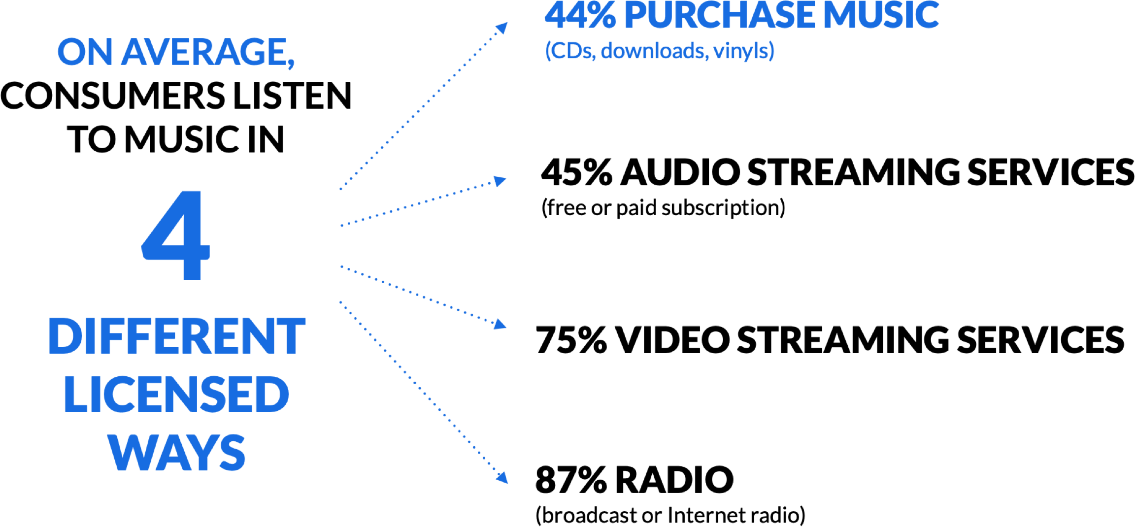
To better understand Roon's market, I started by taking a closer look at the current state and trends of the Music industry. According to the Music Consumer Insight Report published by the IPFI (International Federation of the Phonographic Industry), 44% of people purchase physical and digital music* CDs, Download and... Vinyl!
These 44% represent the largest audience that Roon LLC can target.
*Music Consumer Insight Report, published by IFPI (International Federation of the Phonographic Industry), in September 2017
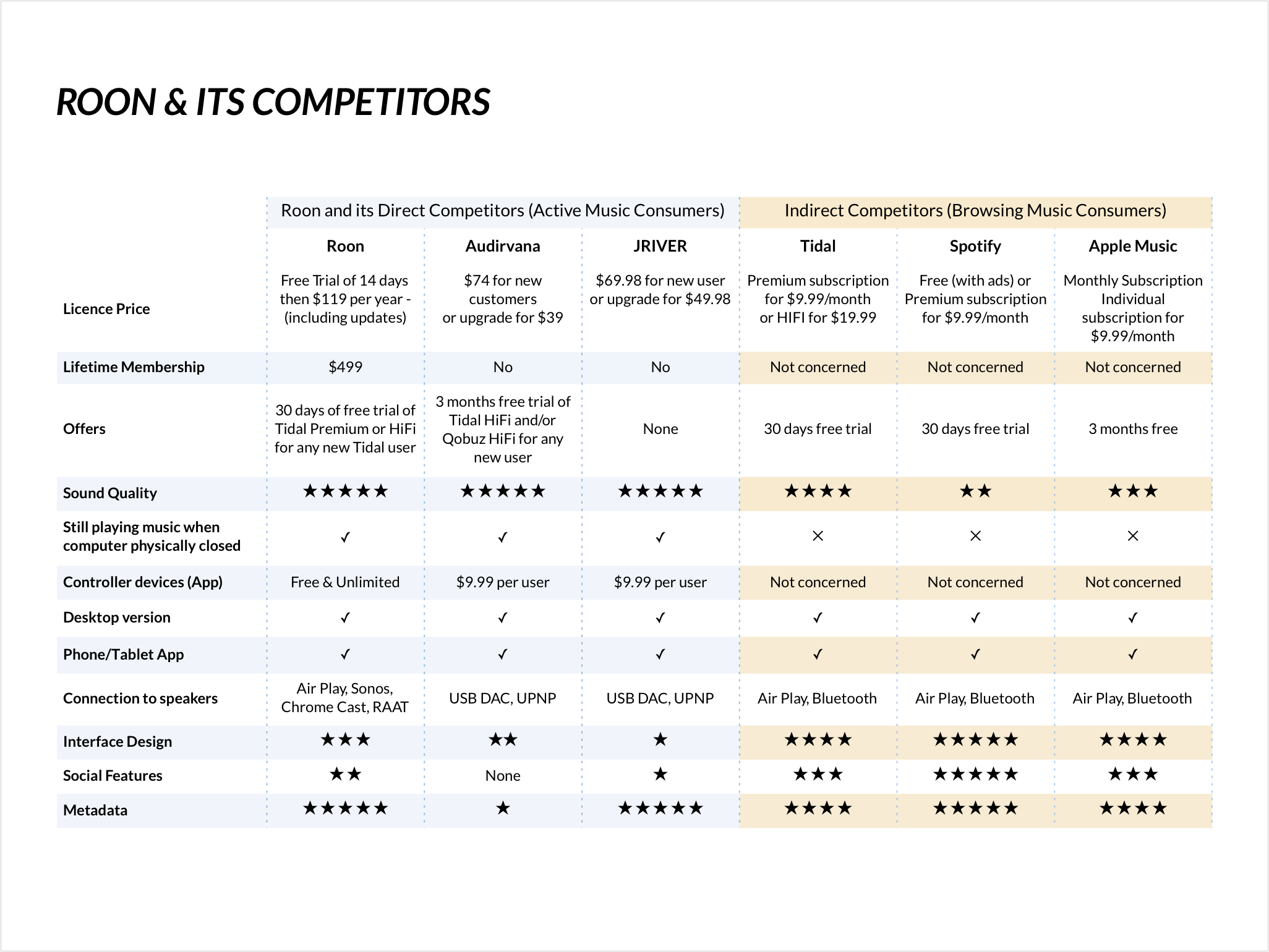
Competitive Analysis
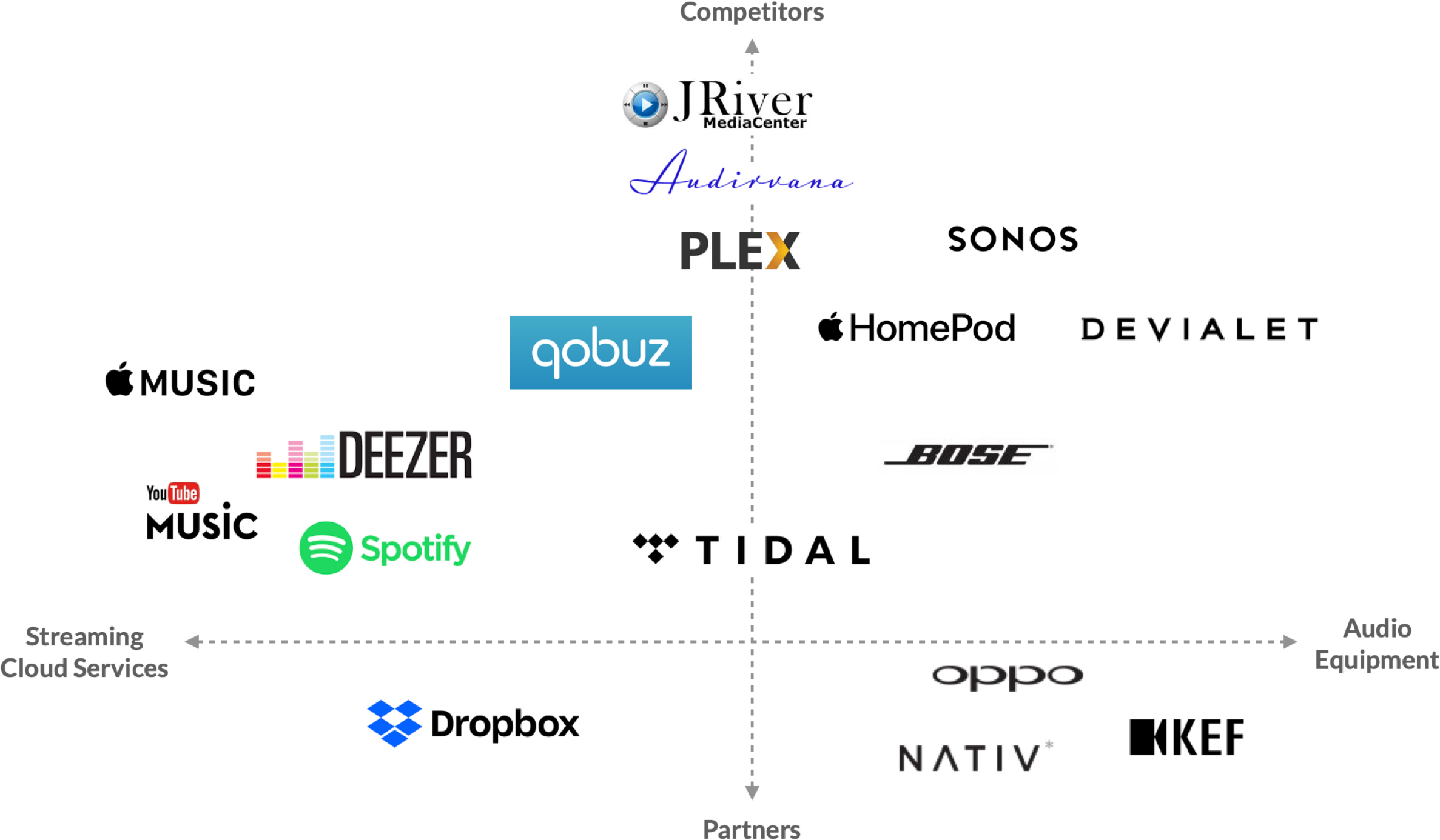
If 44% of consumers purchase off-line and online music, only a few solid audiophile publishers exist on the market. I added to my analysis Roon's indirect competitors: they target the general public, the quality of streamed files is not considered as real high-quality by audiophiles, but they do offer zoning options (AirPlay, Bluetooth.)
Market analysis: a niche market
With only 44% of music consumers purchasing physical copies of music or paid downloads, few robust software editors are actually on the market.
Who's ready to pay $499 for a lifetime license?
This analysis helped me to understand that Roon Labs targets a niche market for their products made up of two different profiles:
- Audiophiles owning high-end audio equipment compatible with Roon's Technology. The typical user is part of the upper-middle class and is certainly tech-savvy.
- Music & audio professionals: they manage audio files or sell Roon licenses when installing home audio equipment.
UX Audit + User Flow
UX Audit
To evaluate and identify problems, I ran:
- A teardown to explore the product and
- Task models: I documented the flows of the experience I was working on.
? The UX Audit helped me to find some issues and design the new solutions more thoroughly.
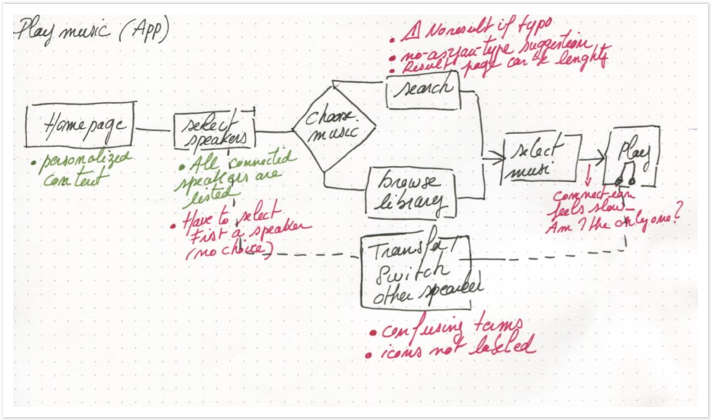
Notes while working on the user flow
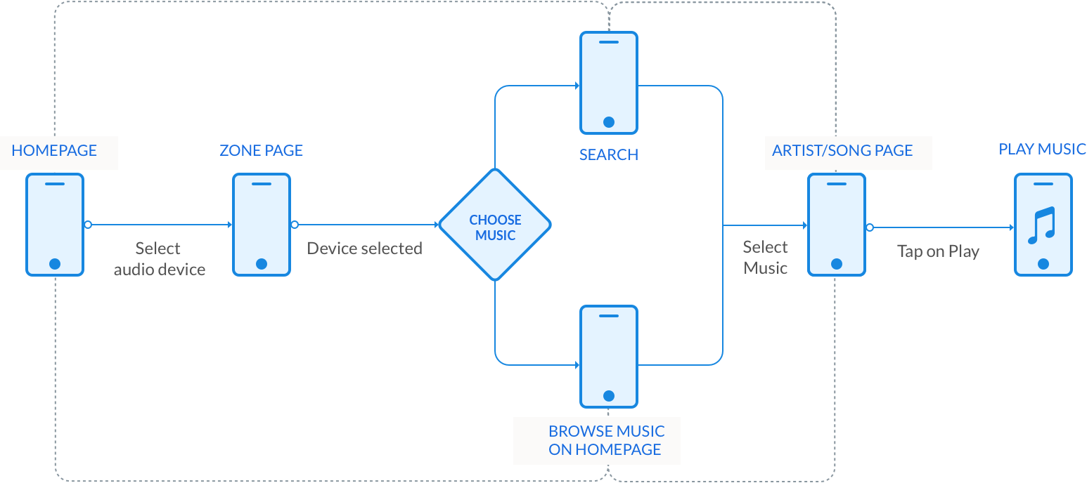
Task model - Listen to Music
I wrote out the core tasks that users do the most often. These included listening to music, adjusting the volume, using the search engine, and using zonings (transfer or switch.) This gave me a good overview of how the app screens were related and the opportunity to find a few features that I had missed in the teardown.
UX Research
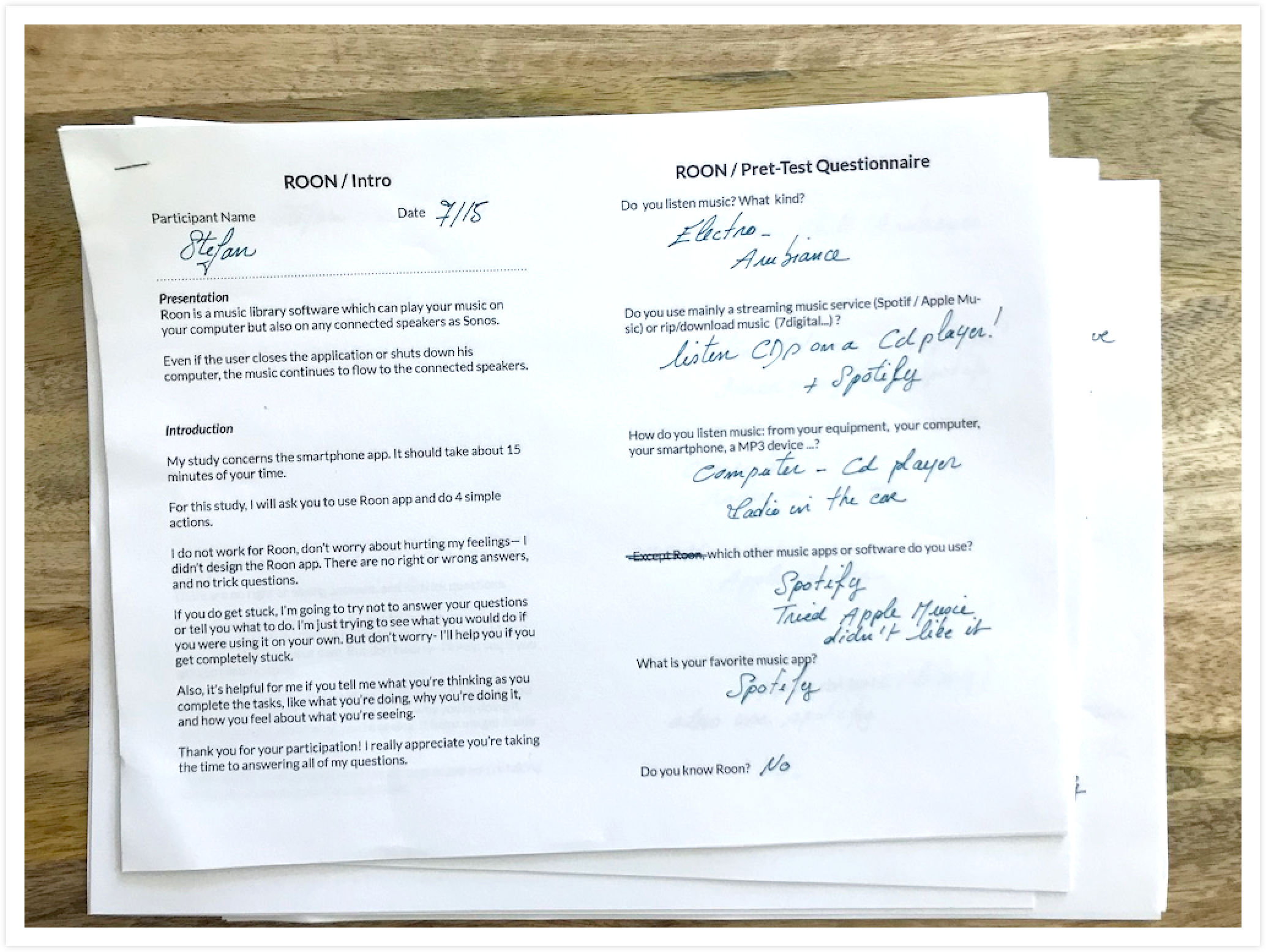
Notes taken during the interviews and usability tests
Interviews & Usability tests
To rank these issues and define which ones I should focus on, I conducted four 1-on-1 user interviews and usability studies, both in-person.
Persona Development
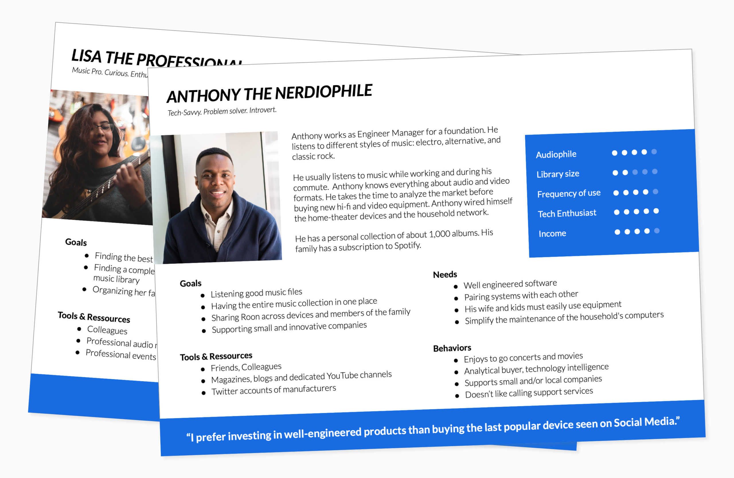
My previous product analysis and research concluded with the development of a suite of two comprehensive user personas.
- Anthony the Nerdiophile: he has a vast music collection, is a Tech Savvy, and already owns high-end audio equipment.
- Lisa the Professional: she has a real interest in using Roon every day in her professional environment
Usability tests
The usability tests showed how real users use Roon App. I didn't imagine that most users would have such difficulties adjusting the volume - as it is such basic and function. The top issues I heard were:
"My fingers are too big. I can't adjust the volume."
"I can't find the transfer button."
"I don't understand the difference between Transfer and Switch."
"There's no search result when I made a typo."
Interviewing a Super User: he set up a volume limitation as he can't adjust the volume using buttons and slide bar.
An impacting Accessibility issue ?
The buttons to adjust the volume are not “fat fingers friendly”: this is one reason why users have such difficulties adjusting the volume. The actual touch target area of the volume button Roon app is only 24 x 24 pixels when the comfortable minimum recommended by the Web Content Accessibility Guidelines (WCAG 2.1) is (at least) 44 x 44 pixels*.
* Understanding Success Criterion 2.5.5: Target Sizes, in Web Content Accessibility Guidelines (WCAG)
and Optimal Size and Spacing for Mobile Buttons, published by UX Movement, Feb 2019
“My fingers are too big. I can't adjust the volume.”
— Anthony
Prioritizing issues
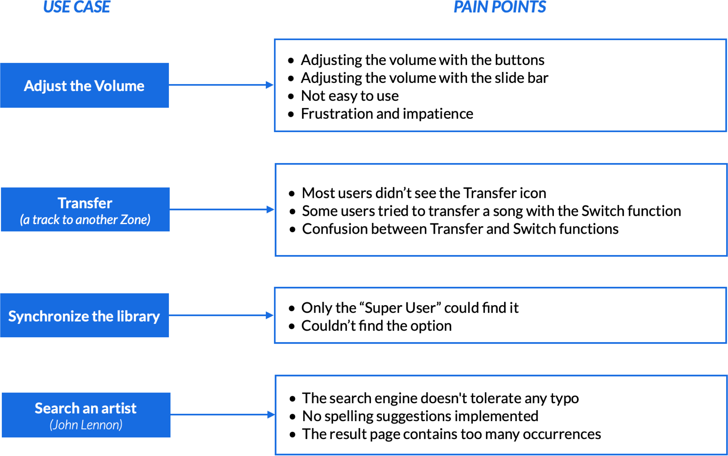
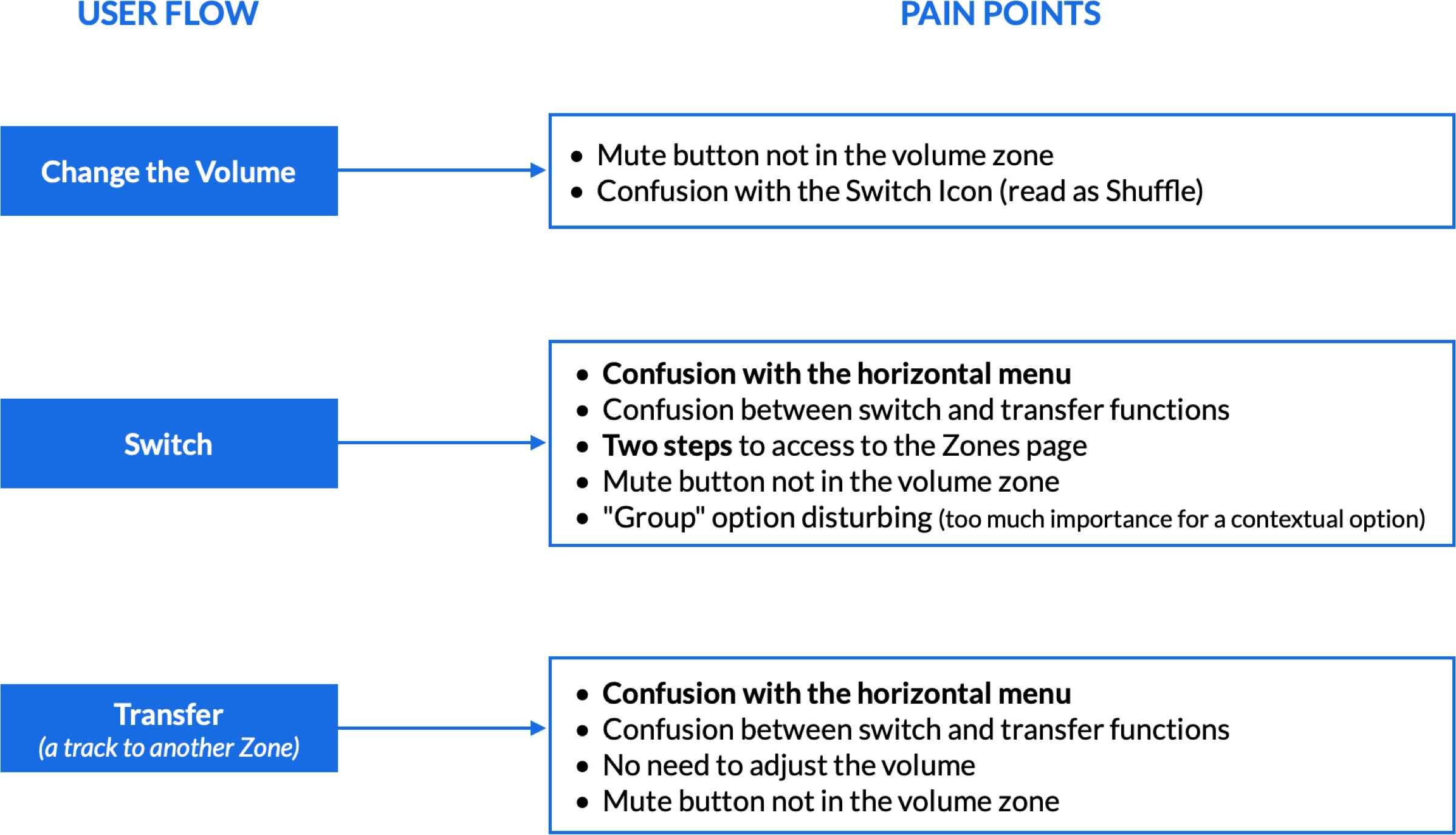
The usability tests revealed issues on two essential functions:
The Volume Control Panel is difficult and unpleasant to use (participants expressed frustration)
Zoning: its hierarchy of information and iconography are unclear (no labels), leading to misunderstanding this function
? Roon app acts as remote control app, and it's very annoying to find some critical issues on major functions!
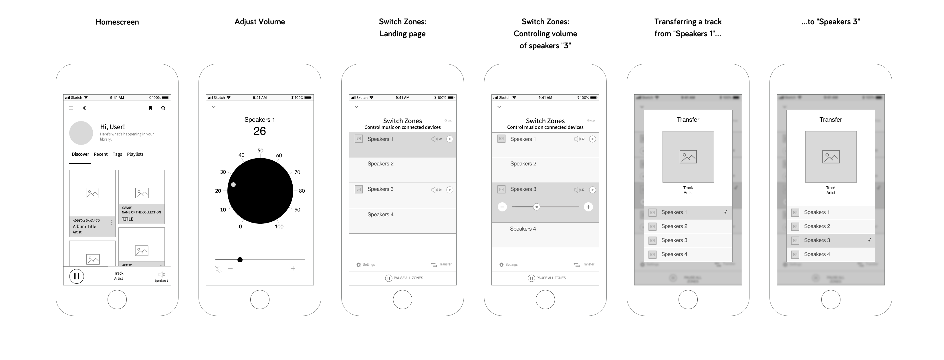
Wireframes
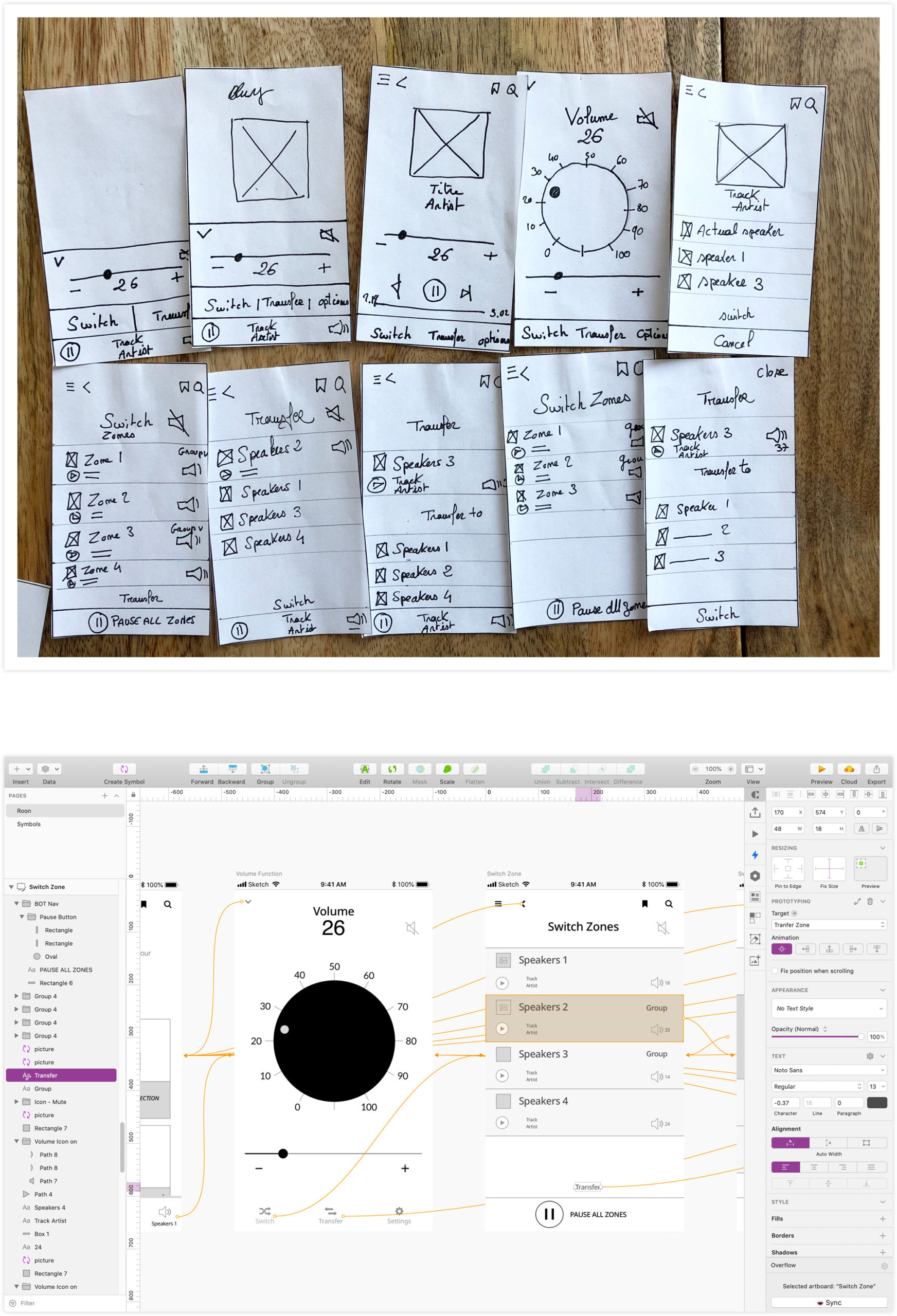
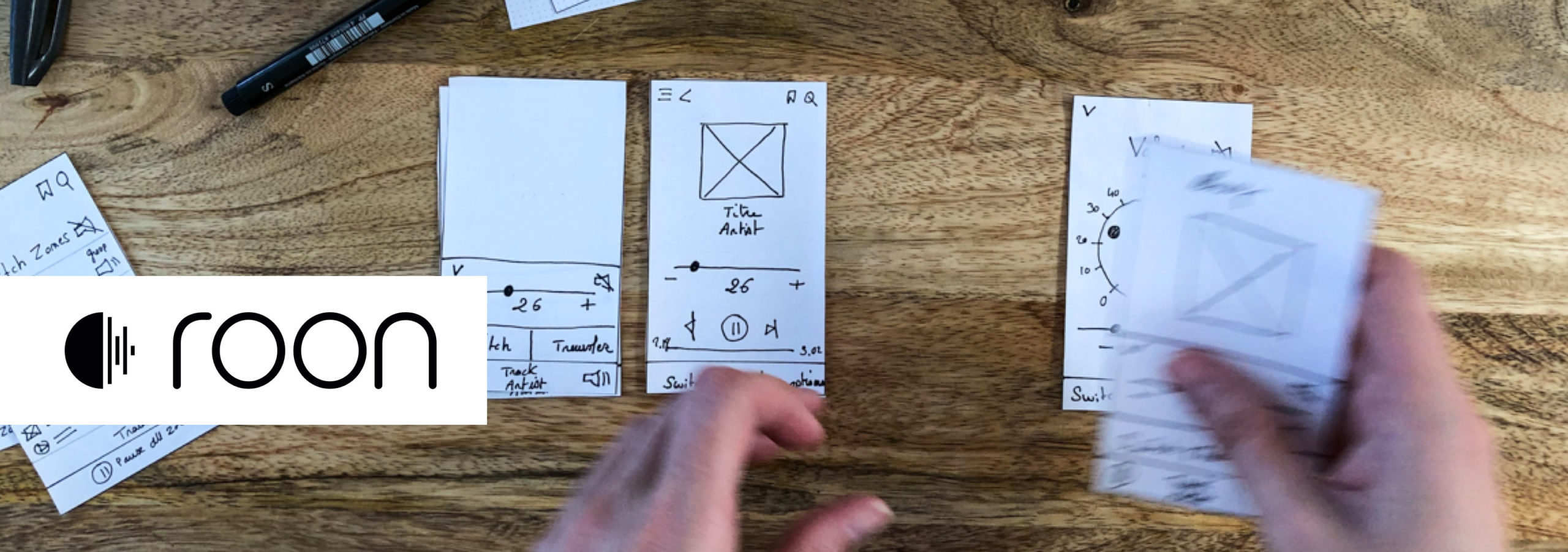
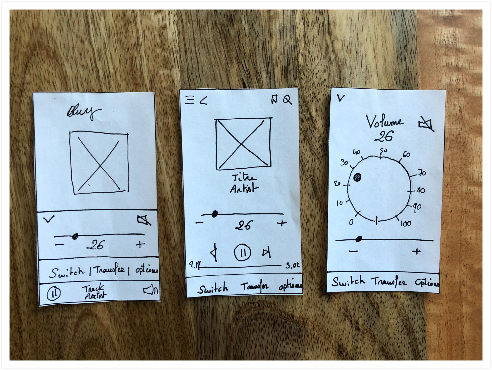
First concepts and wireframes
Wireframes
I initially sketched some ideas/concepts. This method allows rapid tests and ideations. I did my best to be respectful of Roon’s visual identity, and ensure the visual consistency between the existing app and my solutions.
Challenge: (re) design for a niche market
On audio equipment, the volume can be adjusted with a potentiometer. I had then the idea to design a "Big Button", contrasting with the design of the actual user interface, to make the function easier (and fun) to use.
+ Implementing a skeuomorphic element* might please Roon's nerdy-audiophile core users (reference: the Persona Anthony the Nerdiophile?)
? Observing the reactions of the participants discovering and using this new element had been a particularly exciting part of this project!
*Skeuomorphic Design: Don't Apply It Blindly by Bruce "Tog" Tognazzini, Nielsen Norman Group
Early wireframes
- The Volume Panel was redesigned to be more comfortable and pleasant to use.
- Switch & Transfer functions now have labels and are regrouped into a dedicated navigation.
Once a song has been switched to another zone, a confirmation message appears.
Is the "big button" possible? Technical constraints
Roon was developed with a framework (certainly Xamarin.) Before going further into the potentiometer design, I did some research confirming that leveraging HTML 5/JS/CSS3 should be possible to rotate an object*.
Ideal recommendation
If Roon had been a native iOS application, each potentiometer rotation would trigger a slight vibration of the phone.
* Zingtouch, A JavaScript gesture detection library for the modern web
Is that "Big Button" possible? A Designer should always search or ask if a concept is technically possible to develop before going further in its design.
Testing prototypes
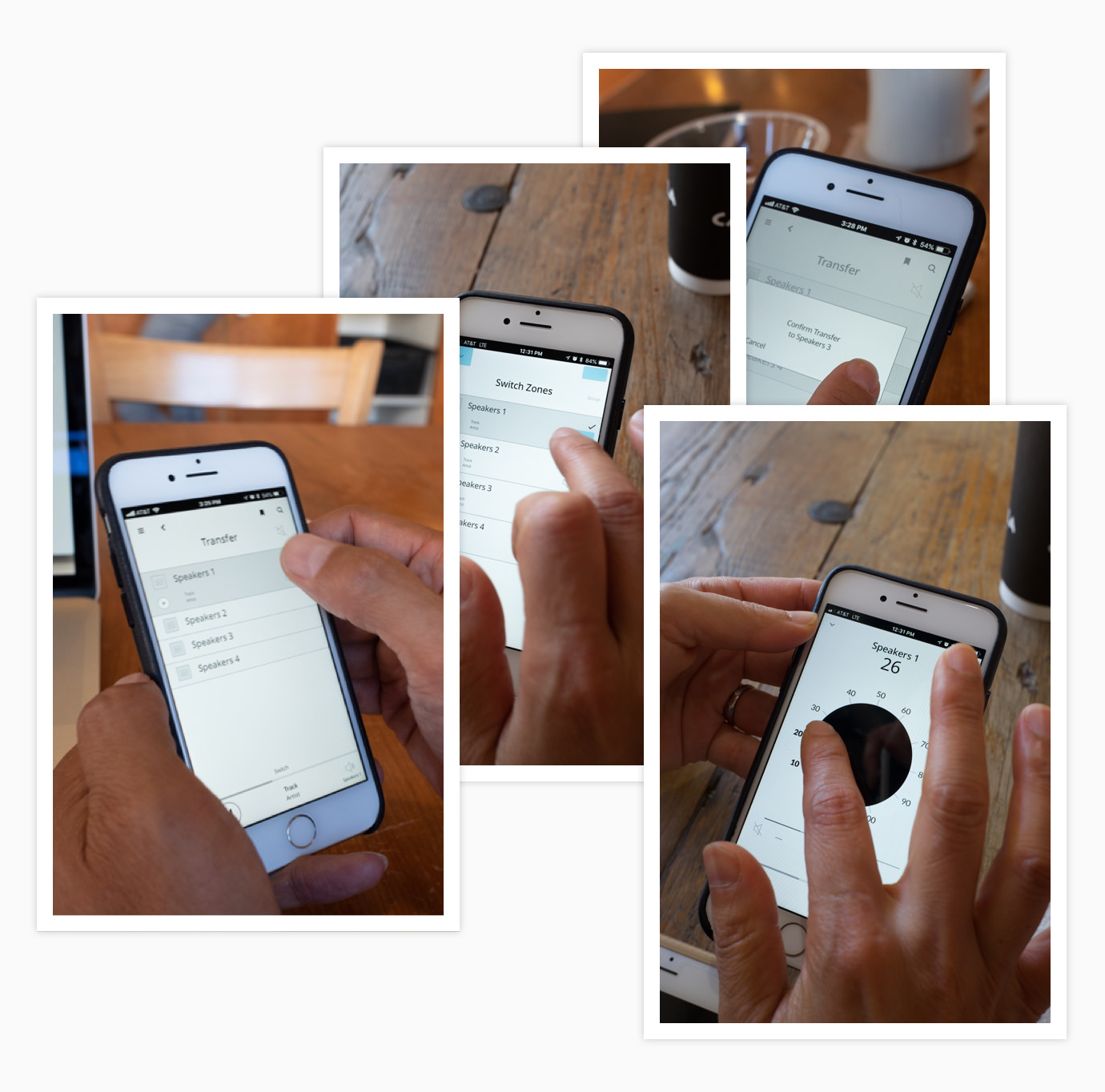
Usability tests
Using Invision to create interactive prototypes, I organized a new round of six one-to-one usability tests with new participants. Some of them tried to turn up the volume button!
? Testing a music app without the possibility to play music was a challenge I didn't think of. Some participants struggled to immerse themselves in the usuability test.
“A big button like on my old stereo!”
- Bin
Paint Points
Volume Panel
The main paint point was that participants didn’t expect that the mute button was close to the volume block on the right top of the screen. “I would put the mute button next to the minus volume, not on the top.”
Switch & Transfer zones
The participants selected the Switch and the Transfer buttons directly but still didn't differentiate between these two functions. The paint points concerned the navigation. The transfer screens need to be simplified: "Transfer is transferring! No need for a confirmation message."
? Ethnography: all different sizes of fingers had enough space to operate the tasks comfortably.
Final Design Solutions
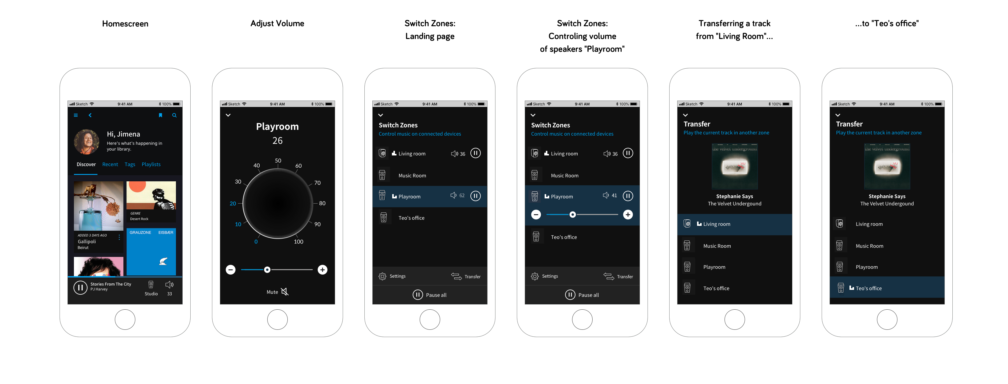
Iterations & final design solutions
After analyzing feedback and observations, I made some iterations:
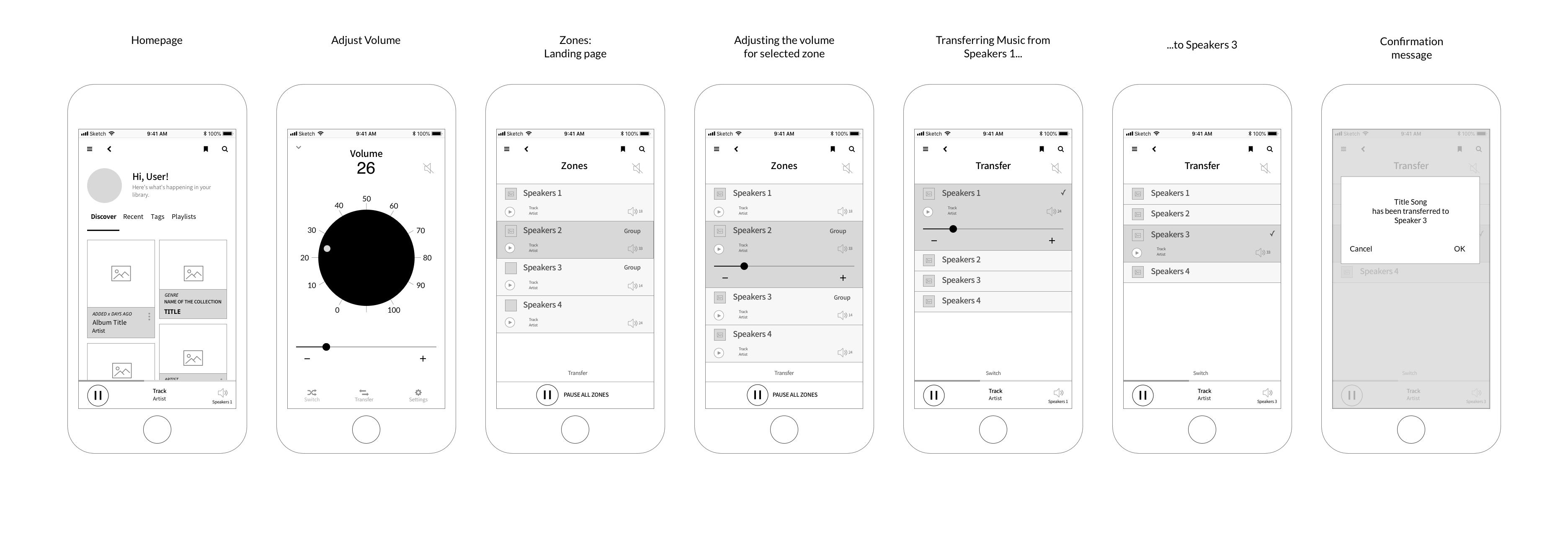
User flow: modify the bottom navigation to access faster to Switch and Transfert zones.
Volume: adding a visual indicator for volume, adding the name current Zone (speaker), the mute button goes near the minus button
Switch: Simplify the screen. Users can now switch directly from the bottom navigation and close the screen by tapping on the drop-down icon
Transfer: the screens have been simplified: the confirmation message once the song transferred to another zone was removed. I added the cover of the current track to make this panel visually more pleasant to use.
UX Writing: adding a sentence explaining what are Switch and Transfer options.
High-Resolution Prototypes
This final step was a good opportunity to modify some original UI elements to improve the accessibility of the app:
Better Color-Contrast Ratio: I modified some UI elements to provide enough contrast between text and its background to optimize the readability (Criterion 1.4.3: Contrast Minimum)
Line height: I modified the line height of the body contents from 120% to 150%. This will improve the reading experience (Criterion 1.4.12: Text Spacing)
Target touch area: I modified the target sizes to be large enough for users to activate them easily (Criterion: 2.5.5 Target Size).
Fonts: I enlarged the size of some contents to improve the readability. I also replaced the Nato Sans Light for its regular version for the same reason (UX & Accessibility best practice.)
Conclusion
Being an adventurous person, I contacted Roon Labs on Social Media to present this case study.
I would never think that the Roon Lab's founder and CEO, Enno Vandermeer, would directly contact me. Enno had the generosity to open his busy schedule to meet with me. We spoke about my research, Roon Labs projects, and of course, about music. What an incredible and intense experience!
What would I do differently today?
If I had to work on this project again:
- I would collect more various feedback and include in my researches 50% of Roon users (both early adopters and new users) and 50% of non-users.
- I would go further while testing the prototypes by organizing an evaluative research: how users modify the volume when they use Roon at home? What is the position of the phone: on a table, in their hands? Do they use the big volume button? Who's using it, who's not?...
Adding a vocal assistant
According to an Adobe Study, 70% of Virtual Assistant owners ask it to listen to music. After conducting a Survey about implementing a Vocal Assistant to Roon. Designing a VUI (Voice User Interface) would be an exciting future project (the current version of Roon app doesn't support VAs.) A Vocal Assistant would also be a great addition for accessibility.
Update 2021: Making Roon more accessible
Since the project, I've been specializing in accessibility. The big button was one solution to control the volume, but it might not be ideal for people that have tremors or can't use their hands. One solution I thought was to design a vertical slider to control the volume**.
- Better accessibility: this gesture complies with the WCAG 2.0 (Web Content Accessibility Guidelines)
- The gesture demands less cognitive effort (can be done with one hand)
- It might be more adapted to older users and people who have less steady hands
- Users with tunnel vision and both left and right-handed users can see the volume values without moving their head or eyes to the top of the screen
- Easier to use when the phone is on a table or desk or while walking in the house compare to turn on or off the Big Button (based on informal usability tests made with friends)
* Study Finds Consumers Are Embracing Voice Services, Adobe Analytics, 2018
** Slider Design: Rules of Thumb, Nielsen Norman Group, Sep 2015
A user with "big fingers" testing the vertical slider to control the volume. The size of the cursor is 60 x 60 pix - the tester was comfortable moving it easily with only one hand.
Contact me ?
Whether you are looking for a Principal Designer to add to your team or just curious to know more about this case study, reach out and tell me what's you're up to. I am always on the lookout for my next challenge!
"Design is nothing but journey." - Rakesh Patwari
⁂
© 2024 Stéphanie Lespérance
Email | LinkedIn | Twitter
Illustrations by Leni Kauffman | Icons by Eucalyp