Accessibility Audit
DemocracyLab website
Estimated reading time: 5 minutes
Summary
Recognizing that the demand for accessibility is increasing, DemocracyLab is committed to continuously improving and innovating the way it supports the connection between skilled volunteers and civic technology projects on its platform.
With a desire to ensure all users can access and use its website, DemocracyLab’s founders and Design Team want to implement continuous accessibility improvements.
I joined Democracy Lab's User Experience team in June 2020 and saw an opportunity to streamline its accessibility processes.
Project type: Web accessibility audit
Industry: Non-Profit Organization
Duration: 3 months
My Roles
- Accessibility Designer
- Mentorship
- Accessiblity Advocate
What I did
Accessibility Audit
Design Audit
Develop accessibility guidelines
Mentoring
Promote Inclusive Design
Key Achievements
Audited the accessibility of the website
- Reviewed the design system
Analyzed each issue and made recommendations to fix them
- Articulated each accessibility issue for the stakeholder audience
Initiated a series of Quick Wins to fix some accessibilities issues I audited
Shared my expertise with Designer team to improve the accessibility of the new projects
Strengthened my mentoring skills through 1:1 design reviews with the team
Challenges
Personal Challenge
I'm a Principal Designer focusing on Web Accessibility. When joining DemocracyLab, I volunteered to review the accessibility of the website. It was my first experience where I leverage my accessibitly skills without a mentor to guide me.
Laura Kalbag’s book “Accessibility for Everyone” helped me to organize and prioritize the project.
How to mesure the value of Accessibility?
An accessible website benefits to all users, disabled or not. One of problematic is that marketing, engineering and UX teams tend to value quantitative audience-based data. Tools like Google Analytics, doesn't mesure if your audience has a disability or use a specific device such as screen reader or a Braille keyboard.
My role was to articulate each accessibility issue to the stakeholder audience, such as they can understand better why having an accessible website is key to open unseen opportunities.
Trainings & Education
Most people in the design team were excited with the idea of designing accessible products, but didn't where to start or what tools to use.
I believe in sharing knowledge and collaboration. This is why I lead the effort of training and educating designers at Democraty Labs. I shougt sharing my expertise with others to improve the accessibility of the new projects. I quikly saw them implementing some of the new practices I shared with them and being empowered to build accessible design solutions.
Obstacles
Incorporating accessibility into a live website
Even if an organization is well aware of the importance of having an accessible website, getting commitment to make accessibility improvements into an existing website is difficult that can't be done with strong allies among stakeholders and team members.
Building empaty
I advocated for having personas with disabilities and usability testing with disabled people. These considerations would have helped the design team build empathy and prompt deeper thinking for creative solutions.
To become more compliant with WCAG criteria, the actual visual guidelines should be deeply revisited. A task demanding a long team effort.
Accessibility Audit
Why conducting an Accessibility Audit?
Accessibility audits aren't only checking for items like color contrast; they often dig into deeper issues such as navigability, understandability, and more.
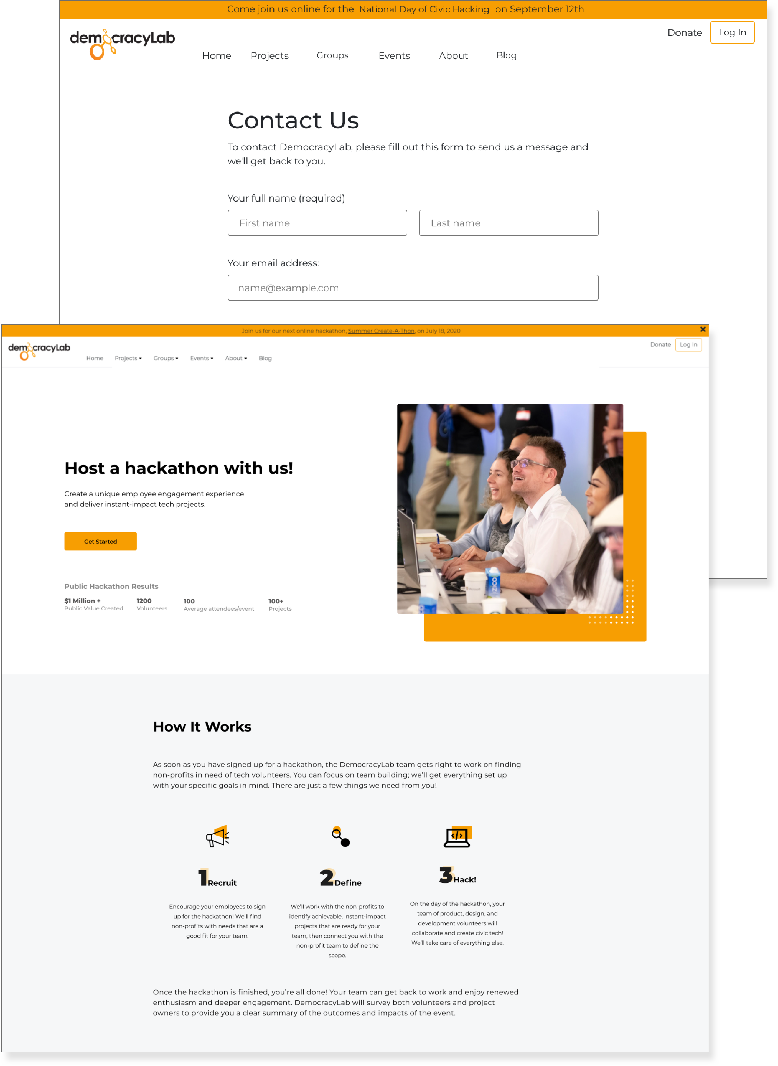
Scrubbing DemocracyLab’s Website
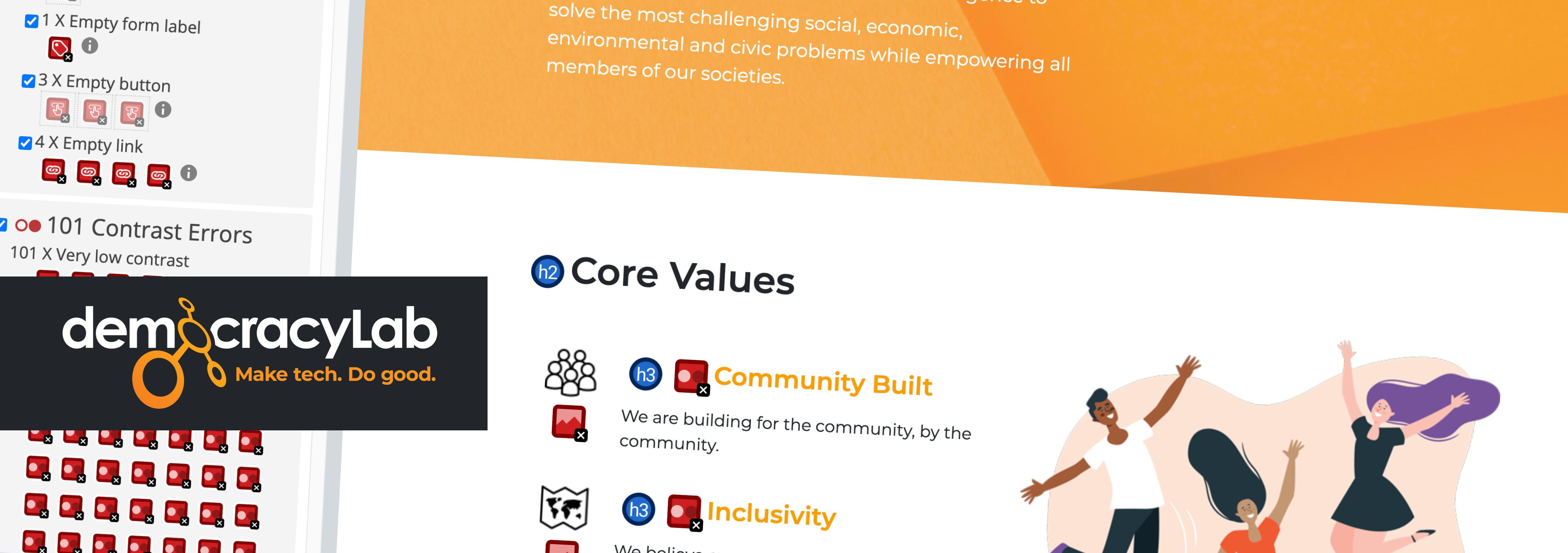
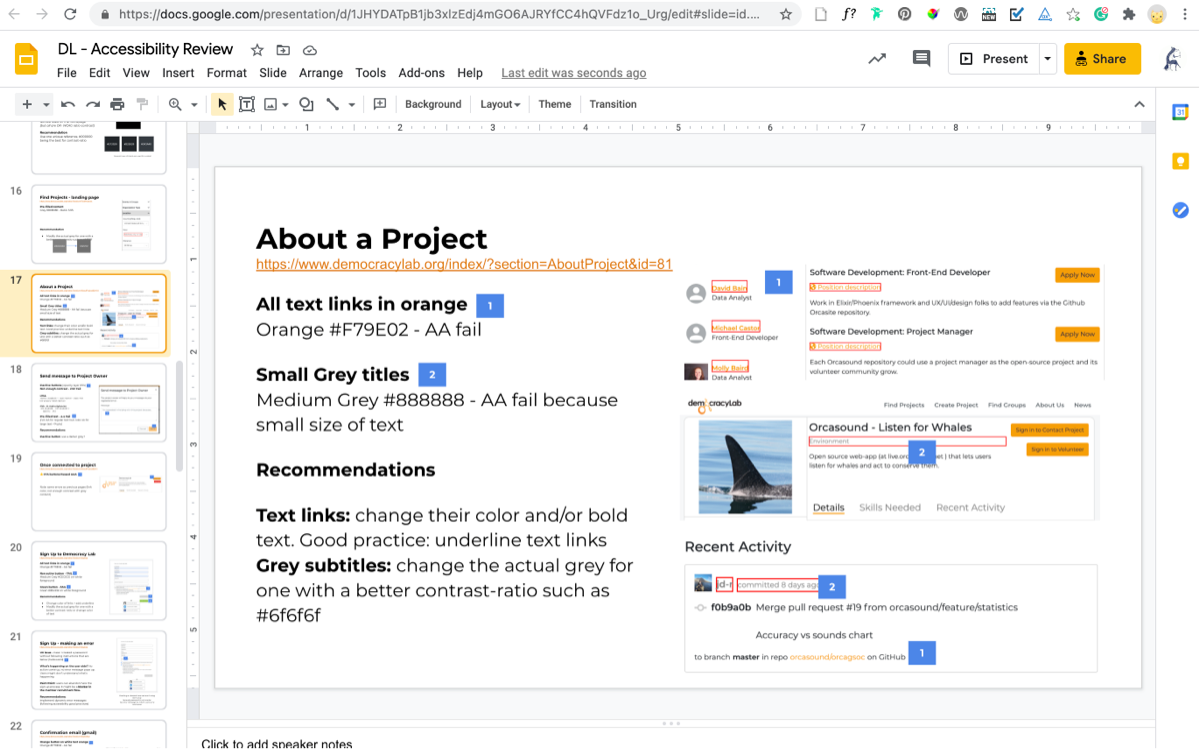
I started by covering the key user journeys to ensure a global picture of the website’s accessibility. I used WAVE Chrome plugin and performed a guided manual testing. In total, I listed thirty-two accessibility issues. For each, I made at least one recommendation to address them.
The process
I presented the findings and recommendations during the weekly Design team meetings. In addition, this audit initiated a series of Quick Wins to fix some UX, UI, and accessibility issues the audit pointed out.
The importance of an Accessible Design System
? About 80% of visual accessibility issues could have been avoided if DemocracyLab had a unified accessible design system.
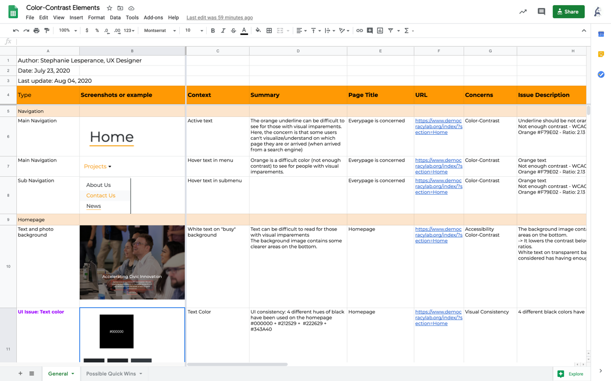
Audit - I listed 32 accessibility issues.
Designers can have a real impact!
This was the first time I was conducting an Accessibility audit. It made me realize how we, designers, could easily impact some criteria:
- Use of Colour: WCAG 1.4.1
- Contrast minimum: WCAG 1.4.3
- Headings and Labels: WCAG 2.4.6
- Visual presentation: WCAG 1.4.8
- Text Spacing: WCAG 1.4.12
Personal notes - they helped me to understand better how designers should follow some accessibility criteria from the first design steps.
Review of the existing component design system
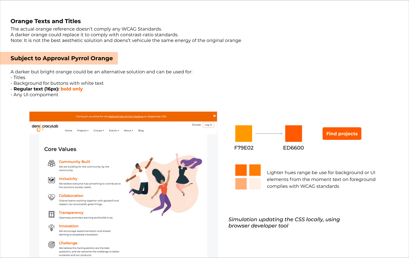
I also analyzed the existing library components to help the designer team complying with WCAG 2.1 Level AA standards. I used two tools: the Colour Contrast Analyser (Paciello Group) and the Stark plugin. Unfortunately, most UI components have a poor contrast ratio that didn't meet the Level AA conformance. I also urged for a unified and inclusive reusable component system shared on collaborative tools such as Bit.
Obstacle
In collaboration with UX & UI designers, I started working on an updated accessible version complying with the WCAG 2.1 Level AA. As a new version of the website was ongoing, unfortunately, the decision was made not to update the existing component design system.
? Lesson learned
For the next accessibility audit, I will first audit the design system, as most visual accessibility issues - 80% here - are rooted in the UI library.
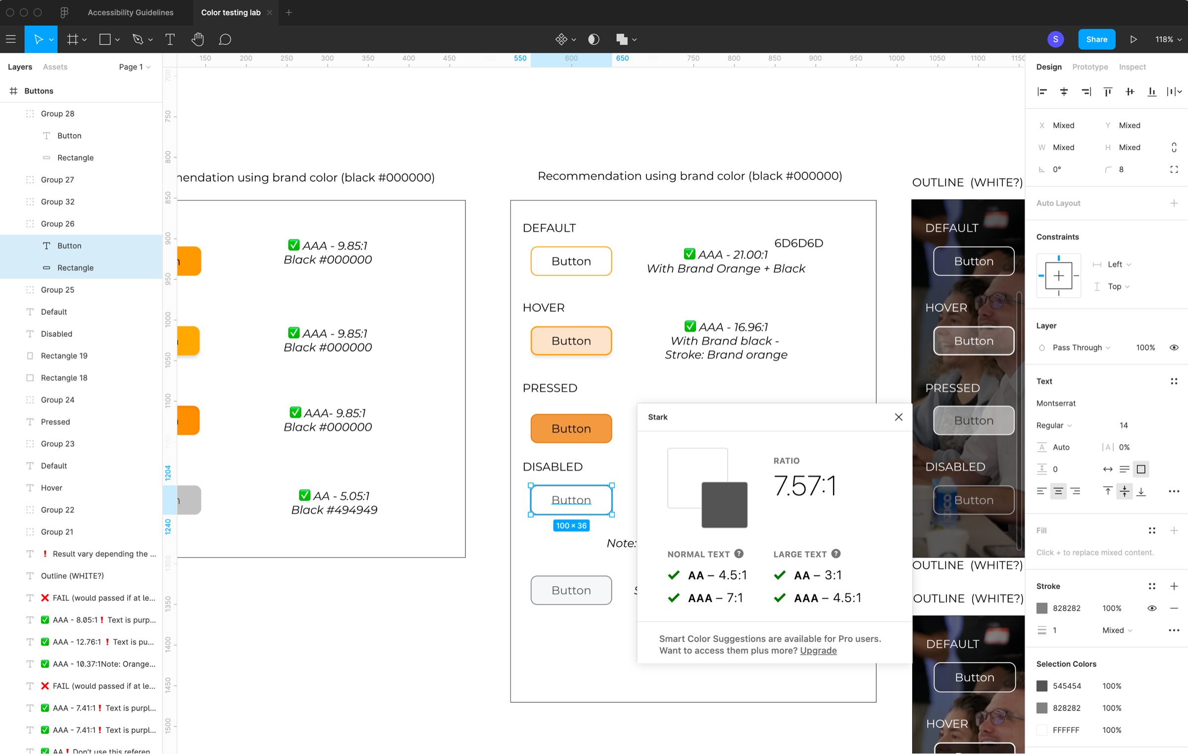
Working on updating the color-contrast ratios of UI components using Stark Figma plug-in to make them accessible
Training & Education
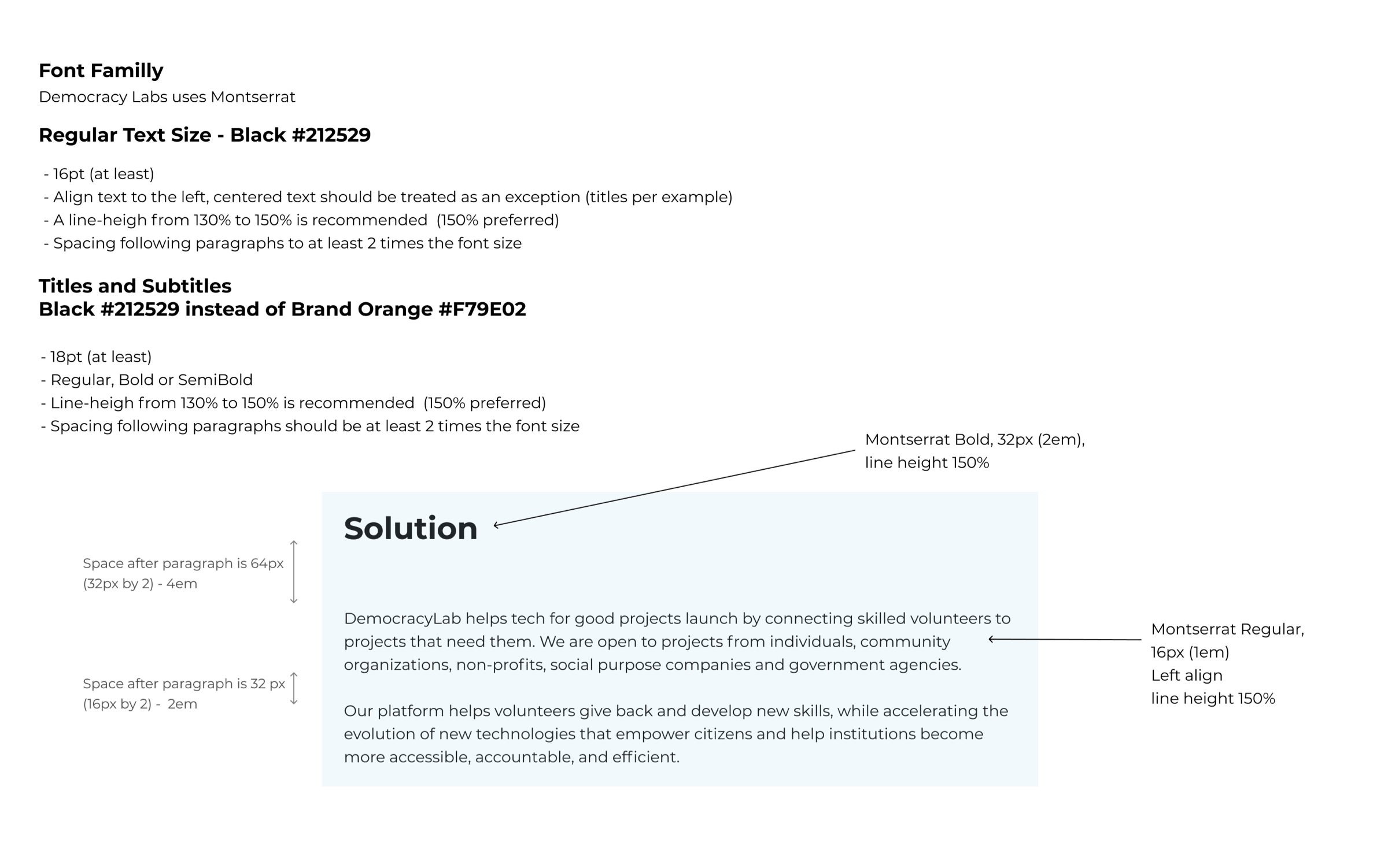
Guideline about typography (size, line-height, alignement)
Best practice guideline for form design
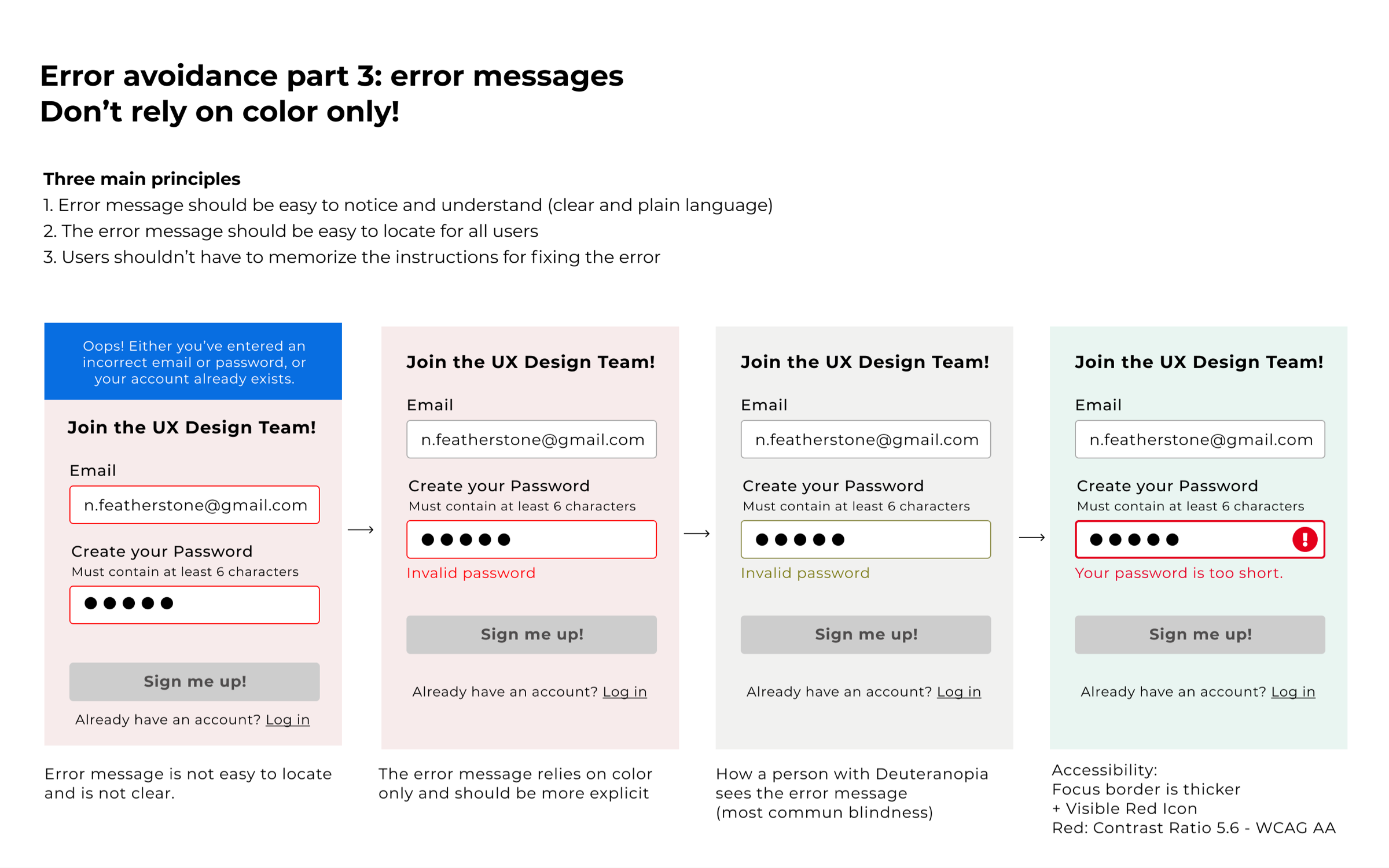
Here, an illustration about why it’s important to not use color only to convey information
WCAG has the sad reputation to be difficult to digest for people who don't code, such as Designers or Marketing professionals. And, from my experience as Lead Designer and Principal Designer consultant, teams won't follow a checklist without guidance. It's the same for an accessibility checklist based on the WCAG 2.1 criteria.
Guidelines for accessibility
This guideline I wrote is articulated around five WCAG criteria UX or UI designers can easily impact:
- Use of Colour: 1.4.1 criteria
- Contrast minimum: 1.4.3 criteria
- Headings and Labels: 2.4.6 criteria
- Visual presentation: 1.4.8 criteria
- Text Spacing: 1.4.12 criteria
Design accessible forms
Forms are components widely used in the digital world. They allow interaction between users and services. I wrote and presented to the Designer team best practice guidelines about making forms accessible from a design perspective.
The process
I presented these guidelines during weekly team meetings. It was an excellent opportunity to share inclusive design principles among stakeholders, dev, and designers. I've particularly appreciated these exchanges.
Conclusion
Designing for all is not that complicated!
The audit initiated a series of Quick Wins to fix some accessibility issues. I had the opportunity to mentor some designers and reviewed each project. Together, we worked on iterations to make them more accessible. I couldn’t be more proud of our team members!
This project helped me understand how complex it can to initiate change across an organization. There were some growing pains, but it has been an opportunity for me to advocate for accessibility among stakeholders and designers.
In the future, I seek to join an accessibility team to improve the design process to build better accessible products or services. I would also enjoy empowering designers with ways to build better accessible products.
Some example of prototypes where I helped designers with accessibility questions.
Contact me ?
Whether you are looking for a Principal Designer to add to your team or just curious to know more about this case study, reach out and tell me what's you're up to. I am always on the lookout for my next challenge!
"Design is nothing but journey." - Rakesh Patwari
⁂
© 2024 Stéphanie Lespérance
Email | LinkedIn | Twitter
Illustrations by Leni Kauffman | Icons by Eucalyp